Currently Viewing Posts Tagged technology

You Can Finally Zoom in on Instagram

Hands holding iPhone taking photo of sunset

Yesterday, Instagram released an iOS update allowing users to pinch to zoom in on photos and videos in the app. This is big news for avid Instagram users, but even bigger news for moms who have been trying and failing to zoom in on Instagram photos for years. We’ve pulled together some of our favorite […]

Yesterday, Instagram released an iOS update allowing users to pinch to zoom in on photos and videos in the app. This is big news for avid Instagram users, but even bigger news for moms who have been trying and failing to zoom in on Instagram photos for years.

We’ve pulled together some of our favorite tweets expressing the frustration experienced when moms try to zoom in on Instagram – now a sure thing of the past:

https://twitter.com/JenningsBrody/status/733122828048830464

https://twitter.com/allrik/status/746801559187623936

https://twitter.com/chancesrgreat/status/760661135381131266

https://twitter.com/hannah_tom12/status/758082996394131456

This update comes shortly after the app introduced Instagram Stories, a feature similar to Snapchat Stories, causing both excitement and rage from users.

The general mood resulting from the zoom feature is positive, with a lot of millennials reminiscing on the good ol’ days:

https://twitter.com/lnhuck/status/771434376630456320

And as for Android users, you’ll have to wait a few weeks for the zoom functionality to become available.

Instagram’s update is leaving a lot of us with the phrase we say so often: ‘Wow, Mom, I guess you were right.”

CONTENT MARKETING MASTER QUIZ

Are you a content marketing master? Take the quiz to
find out.

QUIZ ME

Fundamentals of Responsive Website Design

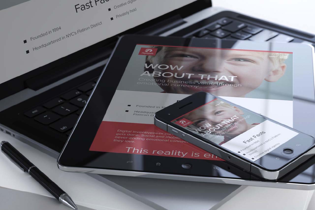
As you probably know, Responsive Web Design (RWD) delivers one website, with one code base, to a multitude of devices from laptops to tablets to mobile phones. At Flightpath, we get so many questions from clients and potential clients about responsive website design these days that we thought it would be a good idea to […]

As you probably know, Responsive Web Design (RWD) delivers one website, with one code base, to a multitude of devices from laptops to tablets to mobile phones. At Flightpath, we get so many questions from clients and potential clients about responsive website design these days that we thought it would be a good idea to briefly summarize some fundamentals and best practices.


Responsive Web Design Benefits


  • Better user experience by supporting a wide range of devices, particularly mobile
  • Better Google search engine ranking – With Google’s recent mobile-friendly algorithm update, websites that are responsive have a higher likelihood of ranking higher than desktop-only
  • Easier and cheaper site management compared to maintaining separate desktop and mobile websites


Responsive Web Design Conventions


  • RWD utilizes flexible images and media atop fluid grids that ebb and flow with a devices’ screen size
  • Major “breakpoints” are established to allow a design to adapt and optimize better to certain screen widths. Typical breakpoints are as follows:

 Screen Shot 2015-09-24 at 11.02.23 AM


Responsive Web Design Creative and Production Considerations


  • A non-responsive site cannot be simply “converted” to a responsive site.
  • The code framework is entirely different
  • Non-responsive website design elements will likely not work well on small screens
  • To start, website content and design should be developed with smaller mobile screens in mind – where the focus is only on core content and functionality.
  • While one of the hallmarks of RWD is to provide the same content to all devices, it is not only permissible but recommended to optimize some site attributes for different device sizes. (Example: Use show/hide button to limit the amount of content that shows at one time on small mobile screen.)


Responsive Web Design and Google Rankings


Google has updated its algorithm to prioritize search results per a variety of criteria associated with mobile usability and responsive design. These include:


  • Font sizes
  • Touch/tap element size & relative proximity
  • Pop-up/interstitial usage
  • Viewport configuration
  • Flash usage

These factors should be borne in mind to ensure optimal search engine visibility for your responsive site. You can learn more about this via this blog from Google.

The State of Umbraco

Umbraco roots are growing in North America! Flightpathers recently participated in training and sessions at the second uWestFest in Orlando, Florida. uWestFest is the annual North American Festival centered around all things Umbraco. For those that don’t yet know, Umbraco is an open source content management system (CMS) built on the .NET stack with commercial […]

Umbraco roots are growing in North America! Flightpathers recently participated in training and sessions at the second uWestFest in Orlando, Florida. uWestFest is the annual North American Festival centered around all things Umbraco. For those that don’t yet know, Umbraco is an open source content management system (CMS) built on the .NET stack with commercial support available from Umbraco HQ based in Copenhagen, Denmark.

Continue reading “The State of Umbraco”

IFB & Intel’s Inside Generation Style Show

Unique brand and blogger collaboration between Intel and Independent Fashion Bloggers and how the major techology company was able to market to tech-savvy women through a fashion show.

I had the pleasure of attending the Ultra Book (#UltrabookStyle) Inside Generation Style Show hosted by IFB (Independent Fashion Bloggers) and Intel on Wednesday and was immediately intrigued by the creative approach on how a launch of a laptop was incorporated into a fashion show.


In case you’re not aware, IFB was founded in 2007 by Jennine Tam of The Coveted and is a community for fashion bloggers to share their experiences in the blogging scene, offering resources on how to take their blogs to the next level.  They provide helpful articles, host a community linking group, forums and offer a new platform where they can connect bloggers and PR in a safe and mutually beneficial way.

It was definitely a unique approach to showcase their new Ultrabook through a fashion show that not only had bloggers as guests, but were integrated in the actual show.  Well, we all know that bloggers work remotely and need a computer, so the lightweight laptop seemed to be the perfect marriage, even in the beauty and fashion space.  From a marketing perspective, this was a seamless way to not only reach the bloggers but to leverage their cult following readers.  The laptops were featured in the show on the arms of the bloggers (or in their purses) among other sponsors such as Bauble Bar, Arrojo, Kamali Kulture, Just Fabulous and Orla Kiely.

Source: IFB, Photo by Dustin Fenstermacher

You can watch the show here and see for yourself.  What do you think of this brand and blogger collaboration?