Currently Viewing Posts Tagged facebook marketing

Ten Millennial Marketing Tips from AdWeek

Millennials are adults ages 18 to 34. There are roughly 80 million Millennials in the United States alone, and each year they spend approximately $600 billion. In marketing, the group has been described as high influencers with a heightened awareness of marketing schemes. According to AdWeek, marketers are constantly working multiple social media platforms and […]

Millennials are adults ages 18 to 34. There are roughly 80 million Millennials in the United States alone, and each year they spend approximately $600 billion. In marketing, the group has been described as high influencers with a heightened awareness of marketing schemes.

According to AdWeek, marketers are constantly working multiple social media platforms and tweaking digital ads to target elusive millennials who don’t respond to traditional advertising. While it is a challenge to market to this ‘elusive’ segment, here are some key tips on engaging Millennials.

  1. Break through the noise by utilizing the tools that are available.
  2. Get the consumer excited with engaging content.
  3. Millennials look for instant gratification. Allow them to personalize/customize their experience.
  4. Be authentic. Fans can detect BS.
  5. Consumers base their purchases based off their perception of the brand.
  6. Mobile first. Two-thirds of Millennials view content on mobile. 70% tweet while watching television or other shows.
  7. Create something people want to watch, and they will share that content.
  8. Be culturally relevant. For brands, find something that is interesting and fits into the cultural space.
  9. Content is designed to engage the consumer regardless of platform.
  10. Listen to your audience. If your content isn’t working, pivot.

Facebook Quick Tips for Community Managers

Community Managers handling social media accounts for clients sometimes want to find the best and fastest way to zip across all channels. We figured, why not increase your Facebook fitness and share some of the tips and tricks we’ve learned along the way to ‘pump you up!’

Community Managers handling social media accounts for clients sometimes want to find the best and fastest way to zip across all channels.  We figured, why not increase your Facebook fitness and share some of the tips and tricks we’ve learned along the way to ‘pump you up!’

SNL Skit Hans and Franz with Arnold Swarchenegger

Image via Tumblr.com


1.  Spelling Fail – How to Edit Post after It’s Out There

Keep in mind; this only applies to posts that have images attached to them.  Nonetheless, good to know when you’re in a pinch and already established high engagement.

Let’s just say you found a tiny little mistake (oops!), well this is how you can fix it after it’s been put out there for the world to see.  The best part is… this also applies for the scheduled posts in your Activity Log.

 Here’s how:

a)  Click on the time stamp of the post you want to edit

Facebook Screen Shot How-To 1


b)  Click on “Edit”

Facebook How-To 2


c)  Then make the necessary edits in the text box and then hit “Done Editing”

Facebook How-To 3

Huzzah!  All fixed.


2. Keyboard Shortcuts for Facebook

Thanks to Mashable we can now do our daily Facebook routine sans mouse.  It’s sort of like playing a game on our keyboard.

Shortcuts are based on your browser so you need to memorize the sequence:

Facebook shortcuts

For the action shortcuts visit Mashable.


3. Organize Your Inbox

Want to move messages that you know you’re done with?  Then you can move them out of your inbox and into the “Other” folder. This way you can control how many messages are in your inbox.

Here’s how:

Facebook How To Move Message to "Other" via Facebook.com

Image via Facebook.com


Tag you’re it!  What other quick tips do you have to share with fellow social media ninjas? Sound off in our comments below.

Can’t get enough of Facebook tidbits and news from Flightpath?  Have no fear just click here.

Facebook isn’t Real…Why This Matters for Marketers

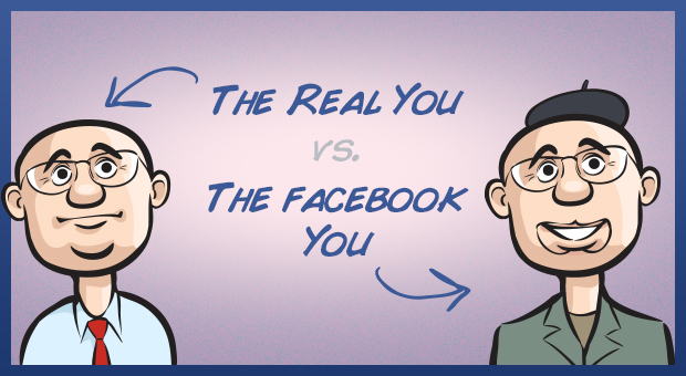
The Facebook you is the best you possible….You are not writing social media content for people, you are writing content for the people your consumers want to be.

Chances are the person you are on Facebook and the person you are IRL are different animals.

The parent you on Facebook shared the most darling thing your daughter said this morning. The Facebook parent you never yells about putting shoes on to go to school or loses it in a homework battle with your 12 year old.

The Facebook you is the best you possible.

The friend that remembers every birthday. The buddy who always knows what to say to a friend in need. The life of the party, a great entertainer, providing an endless stream of amusing images, videos and random thoughts. The supportive spouse “in a relationship” with the most fantastic person in the world.

You are not alone. This is the life we all lead…on Facebook.

There are more than a billion Facebook Yous roaming around Earth right now and all of us “yous” have a lot in common. We try not to share content that is mundane or even worse, a downer. “On Facebook” is the new “in public” so we all mind our language, and post the best moments of our lives as though we live in some sort of never-ending Christmas card.

We all realize on some level that Facebook isn’t real life, like this blogger who refers to Facebook as Fakebook. But, none of us really want to share all the day-to-day difficulties of life when we can use Facebook and the rest of social media as our happy place, especially when everyone is a little paranoid about employers/bosses/recruiters and worst of all their moms reading their posts.

So what does this mean for the Social Media Marketer You?

You are not writing social media content for people, you are writing content for the people your consumers want to be.

Posts that celebrate the best in people will be liked. Images that depict the positive connections we have with others and our environments will be shared. Videos that were created to entertain friends of friends will be shared, embedded, commented on.

Facebook Yous will never share your ad copy, except for the rare cases when it truly entertains, connects or celebrates. When you are creating your next content calendar for a client, ask yourself if you would share it on your own wall. If the Facebook You is happy with it, the rest of us will be too.

Facebook Ads CPC vs CPM vs Promoted Stories – What’s a Social Media Marketer to do?

It was common knowledge among social media folks that CPC ads were a much better value for marketers. You expected to pay a cost of .35 to nearly a dollar a click depending on your targeted audience (like Manhattan moms who are very pricey to target). An average Facebook ad CTR of .05% seemed to be the industry benchmark for judging the success of an ad. But, that has changed.

CPC, CPM, Promoted Stories, Promoted Posts – there are a lot of options facing social media marketers interested in advertising on Facebook. It used to be that there were only two choices for advertising on Facebook CPC (cost per click) or CPM (cost per impressions).

It was common knowledge among social media folks that CPC ads were a much better value for marketers. You expected to pay a cost of .35 to nearly a dollar a click depending on your targeted audience (like Manhattan moms who are very pricey to target). An average Facebook ad CTR of .05% seemed to be the industry benchmark for judging the success of an ad.

For years, if you chose CPM your ad would be relegated to a lowly position on the bottom right hand of the user’s newsfeed and gain very few clicks. CPC ads outperformed CPM ads in all tests that we ran here at the agency as well.

But, that has changed.

While Facebook has talked a lot about the value of their new Promoted Stories ads and Promoted Posts, they also quietly chose a new favorite child in the CPC vs CPM debate. We noticed this at Flightpath when CPC ads that have been performing for years suddenly stopped being even displayed and our testing of CPM ads started showing amazing results.

We switched clients over to CPM ads and saw our average Facebook ads CTR jump from an average range of .05% to .20% jump to a range of  .50% – .80%. Then we added in Sponsored Stories, to run simultaneously with the CPM ads, and the average CTR jumped even higher to a range of .80% to 1.2%.

At the same time, we are seeing the average CPC fall from that .35 – $1 range down to a bargain basement .06 – .15 CPC. So, for the same Facebook ad spend our clients are getting about 6 times the likes they were getting earlier this year. This is really helping to rapidly grow page likes without having to dramatically up Facebook ad spend.

Why are ads suddenly cheaper and performing better?

So, this is why we think this dramatic uptick in Facebook ad performance is happening: remember months ago when advertisers like GM pulled their Facebook ad spend because they didn’t feel they were getting much of a return and remember when Facebook’s stock came out of the gate to dismal results?

Facebook had to devise a plan to get advertisers excited about spending on the platform so investors would be consider buying Facebook stock. Lowering the cost of ads and rolling out Promoted Stories (which not all Facebook users like, but they seem to click on them anyway) is a great way to get advertisers excited and spending.

If you are still running Facebook CPC ads for your clients, set up a separate CPM campaign with Promoted Stories pronto for testing. The results will blow you away.

Connections 2012 in Indy

Not sexy, but has good ROI. No, I’m not talking about the disadvantages and advantages of an Accounting degree. These are some of the popular perceptions of email marketing. It’s tried and true, but there’s nowhere new to go. Is that true? After going to ExactTarget’s Connections Expo last week, I’m tempted to respond with an emphatic “no.”

Not sexy, but has good ROI. No, I’m not talking about the disadvantages and advantages of an Accounting degree. These are some of the popular perceptions of email marketing. It’s tried and true, but there’s nowhere new to go. Is that true? After going to ExactTarget’s Connections conference last week, I’m tempted to respond with an emphatic “no.”
On October 16-18, over 4,000 email marketers from all over North American converged in Indianapolis for the conference. From the keynote to the panels and talks, three themes emerged that chart the course for the evolution of email. These three themes mark not just trends all email marketers should keep up with, but chances to push the envelope on their campaigns and make their medium a bit sexier.


Social ≠ Afterthought


We all know social media is huge. Businesses, agencies, and the like are trying not only to figure out the next big social network, but how to monetize it, turning “likes” into dollar signs. When it comes to email, the standard approach has been to place the icons of the usual suspects (Facebook, Twitter, Pinterest, and maybe Instagram). If you find yourself doing that in your campaigns and you believe that’s all it takes to make your emails “more social,” then you’re missing out on great opportunities to do so much more with all of your channels.
Case in point, during the keynote address, speakers referred to ExactTarget tools designed to send Facebook data from a company’s FB page straight over to their subscriber database. With opt-in controls built right into Facebook’s interface, there can’t be a more efficient form of email capture and list building.
However, don’t expect users to agree to give you access to their Facebook data just because they “liked” your page. Remember to create a promotion first. As mentioned at Connections, an increasing number of businesses are opting for everything from random chance sweepstakes to video contests. As part of the rules and requirements for entering, users have to consent to sharing their email address and possibly some demographic info.
That’s just one of many examples mentioned at Connections of how marketers can leverage their social channels to improve the performance of email, especially in the email capture department. One could even see a bump in their list building efforts by incorporating an email capture form onto their Facebook page. If you’re going to do that however, you should put a good effort into…


Making Your Email Capture Sexier


Okay. So, you’re going to your favorite store’s website because the newest, greatest thing just came out. One component tucked away at the bottom of the homepage catches your attention. It reads “Sign up for our FREE newsletter!” What is your reaction? I can bet it’s not “Whoa! A FREE newsletter? Gimme!” And yet, this is what we see on so many websites.
A number of panels I attended at Connections emphasize the power of the value proposition. Put yourself in the user’s head for a second and think, “Is a FREE newsletter enough to risk getting bombarded by this guy’s email marketers?” Instead, speaker after speaker suggested to us the idea of putting forth an offer. “Be the first to get all the inside deals and sales.” “Only insiders get all the best beauty tips from the pros,” or even “Sign up for our deals and get a 20% off coupon for your next purchase”
Once your email capture efforts begin to take off, pat yourself on the back. However, don’t believe your job is done quite yet. At Connections, another emerging trend impacts the very look and feel of eblast content itself. It’s a factor a lot of us email marketers have taken for granted for years as we thought it would never change significantly: screen size.


Have You Met…mCommerce?


By far, one of the biggest themes that came up at Connections was mobile, and for good reason. Mobile Commerce, or mcommerce, is a rapidly growing sales channel. iPhones, Android phones, iPads. People are using these and other devices more and more not just to check their favorite sites, but to make purchases. Forrester’s Sucharita Mulpuru writes that mcommerce is expect to account for $31 billion, or 7% of overall ecommerce sales by 2016. And this behavior crosses over into email. Based on our case studies, one in every three subscribers will open an eblast or enewsletter with a mobile device. Even if the subscriber doesn’t make the final sale on their iPhone, it’s becoming more and more important each year for businesses to reach their customers in a way that adapts easily to that tiny, tiny screen.
Enter responsive design. According to Smashing Magazine, responsive design is “the approach that suggests that design and development should respond to the user’s behavior and environment based on screen size, platform and orientation.” For example, a two-column layout with 12 point fonts may be perfectly readable on the desktop. In the mobile environment, however, your readers will be squinting and going through the trouble of zooming in to read your well-crafted copy.
For years, this design approach was purely in the realm of websites and landing pages. At Connections, agencies have begun to stress the importance of bringing responsive design over to the inbox. Here at Flightpath, we’ve developed code that allows for responsive design principles to work in the email environment. Never worry again that your sales offer is falling on deaf ears because your customers can’t read it on their Droid.


On the Way Back to New York


As I stared out at the Midwestern sky through that tiny window on my plane back to LaGuardia, I thought about all the information I picked up that week. Until then, I believed campaigns were tweaked according to well-disciplined A/B testing paradigms that bring modest, but consistent results. While that’s part true, a “bigger picture” view of the trends helps a campaign not only stick out from the rest of the pack, but it pays off significant dividends later on in higher engagement, more conversions, and a “sexier” email channel.

Top 3 Things We Learned at Tech Munch

The Tech Munch conference hit the streets of New York and shared insights from both the bloggers and brands on how to work together and how to succeed in the social media space. Here are the top 3 things we’ve learned from Tech Munch.

Last week, we had the pleasure of attending the Tech Munch conference in New York, where food bloggers, writers, editors, foodies and brands unite to learn about the ins and outs of food in the social media space. (And get to enjoy good food and check out a cooking demo or two. Perks!)

The relationship between food and social media is getting stronger and bigger than ever before. We previously wrote about the growing trend of food trucks and how they utilize Twitter to build their voice and communicate directly with their consumers. With events such as Tech Munch show how the two are becoming more and more intertwined.

At Tech Munch, panelists including Food Network, Bake Space (founder and organizer of the conference), Martha Stewart Living, J.M. Hirsch of The Associated Press and more stopped by to talk directly with bloggers about best practices, trends and how to survive in the social media age.

Above: A cooking demo with Alejandra Ramos of Always Order Dessert…and the delicious results.

With a whole day of discussions, there are 3 key things we’ve learned:

PSA for Marketing Executives reaching out to Bloggers

This was a topic that was brought up multiple times: Get to know your bloggers. All you have to do is read their blog since they typically share their personal experiences and latest finds.  NEVER start an email with “Dear Blogger” or “Dear Miss or Sir,” because they will immediately hit the delete button or – even worse – the SPAM button. Make sure you have an understanding of what they are writing about, and approach them with your product accordingly. If you’re not sure, it doesn’t hurt to ask; they are human after all. The more personal you are in the approach, the easier it will be to form a relationship for potential partnerships.

Food Bloggers in the Making

Before you start your blog, make sure you have a clear and concise plan and a voice you want to portray to the public. The one piece of advice that holds true is to find your specialty and create a niche. When editors are looking for sources to cover a new trend, they are looking for those that specialize in that specific category. Make yourself stand out and become a brand so that they can come to you as an expert.

Pinterest, Yay or Nay

Pinterest is still on everyone’s lips and is growing rapidly. It allows the user to showcase his or her personality and ideas through imagery, and the perk is that the pins drive traffic back to the original source. Kate Gold, Social Media Director of Food Network, discussed how they share recipes, beautiful food images and even have curated boards from the community that dictate trends, such as comfort foods. Pinterest adds an element to your site and/or blog and allows the user to get a better picture of your personality and voice.  Do you have to be on all platforms to appeal to everyone? No, but get to know your audience and where they are and you can decide from there if it’s the right move for you or your brand.


Facebook Timeline: Brand Pages Launched

Brands have one month to monitor their competitors’ adoption of Facebook Timeline and figure out how to make Timeline work for them. Here’s an early look at the approach taken by brands who embraced the conversion to Timeline today.

Facebook Timeline for brand pages was announced this morning on the new platform for breaking tech news- The Today Show. Brands have the option of using Timeline starting today, and all brand pages will be converted to Timeline on March 30th. So brands have one month to monitor their competitors’ adoption of Facebook Timeline and figure out how to make Timeline work for them. We thought we would take an early look at the approach taken by brands who embraced the conversion to Timeline today.


Coca-Cola didn’t remove the post from their Timeline when they updated their cover photo to the new larger image required for the transition to Timeline. The Timeline cover photo was updated at 5:06 am EST, which could make Coca-Cola the first brand to make the switch. Coca-Cola has posts going back to the companies founding in 1886, using Timeline to show off the company’s lengthy history. Timeline makes perfect sense for brands who have been around for a long time, but how are brands who haven’t been around for 120+ years using Timeline?


Magnolia Bakery is the New York bakery made famous in Sex and the City. Their approach to Timeline is to make you hungry. By using the Timeline cover photo to show the breadth of the bakery’s line of goods and artistic presentation, they are a great demonstration of how a small business can use Timeline to visually engage consumers.


Apps used to reside in tabs along the left hand side of Facebook pages. With the unveiling of Timeline, tabs are a thing of the past. Apps have moved to the front and center of brand pages. Each app is displayed with an image underneath the cover photo, similar to the old pre-Timeline photo strip.

Lance Armstrong’s Livestrong foundation unveiled a cohesive approach to Timeline. Each app’s image coordinates with the Timeline cover photo. Livestrong also puts their message first. Unlike Coca-Cola and Magnolia Bakery, Livestrong opted out of using space within their app bar to promote the number of likes their page has. Instead they are using the space to promote apps where people can invite friends and become involved in the Livestrong cause.

Facebook Timeline for brand pages is just hours old, it will be interesting to see how brands roll out innovative uses of Timeline over the next 30 days.

Facebook Timeline: Add Life Events and Marketers Could Thank You

Facebook Timeline was released last month as an invitation for all of us to share our whole lives (including pre-Facebook lives) on Facebook. What Facebook wants you to include in your Timeline isn’t restricted to your newborn picture. When you click on a point in the past on your Timeline, you have a number of […]

Facebook Timeline was released last month as an invitation for all of us to share our whole lives (including pre-Facebook lives) on Facebook. What Facebook wants you to include in your Timeline isn’t restricted to your newborn picture.

When you click on a point in the past on your Timeline, you have a number of options many of which are familiar.  You can add a comment in the form of a status update to a point in your past, photo from your 1st grade class picnic or check into the dorm you lived in freshman year of college. These are all variations of the options that users are used to seeing when they create a normal present-day status update. However, there is one new option- “Life Event” that is very different than the rest.

Clicking the Life Event button brings up a list of events that are common to a lot of people’s life stories. Marking the day you had a baby, broke a bone, lost a loved one or changed your religious beliefs are just some of the options Facebook presents.

Social media is supposed to be about transparency and honesty. Although it seems people would be reluctant to share major illnesses they have had in the past, divorces long settled and weight gained or lost in reality this is what Facebook does best. In Timeline Facebook has created an even better space where we can feed the human need to connect and learn more about people we care about, though maybe not enough to actually call.

From a social media marketing point of view, “Life Event” could be a game changer.

Currently advertisers can target Facebook users for ads based on the basic information user’s provide as well as their likes and interests. If Facebook allows advertisers to display ads to users who have had certain life events, or even better- users who have had certain life events within a select time frame, this could be very exciting for brands.

Car insurance ads could be displayed to parents of children they had 16 years back on their timeline and orthopedic surgeons could target those who have broken a bone in the last few months.  Ads could be even more highly targeted, which means higher click-through rates for advertisers and more revenue for Facebook.

Facebook has yet to allow advertisers to target users based on their life events, however if they do look for even more relevant Facebook ads coming to your Facebook profile.

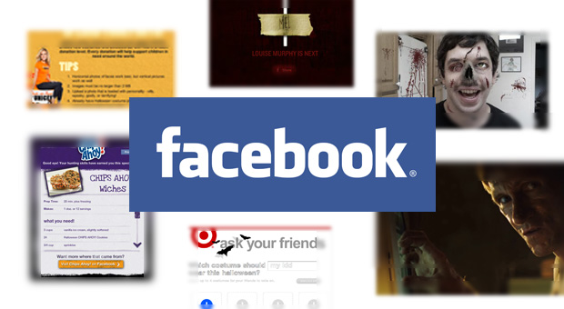
5 Facebook Halloween Campaigns We Love

Facebook Halloween Campaigns

Halloween is one of those holidays that allows brands to be just a little more creative, and honestly, a little more fun than they usually are or can be. With the rise of Facebook, many companies use Halloween to present their products in new ways that call on user interaction and clever ideas, which show […]

Halloween is one of those holidays that allows brands to be just a little more creative, and honestly, a little more fun than they usually are or can be. With the rise of Facebook, many companies use Halloween to present their products in new ways that call on user interaction and clever ideas, which show that A) these brands do have a sense of humor and B) they’re cooler than you thought they were. Below are five favorites by brands (actually, four are by brands – one isn’t linked to any product or company, but it was just too good to leave out) that captured the spirit of Halloween and built intuitive apps to support their creativity. Selected by Flightpath’s John Whitcomb and Dan Brooks, in no specific order.

Take This Lollipop – Let’s kick off the list with a bang – or in this case, a little stalking. This site has quickly become a viral sensation with its clever use of the user’s personal information and profile, playing on our fears of the big bad Facebook man watching our every move and ignoring privacy concerns of their users. After all, this is Halloween, and no fear should be left unturned.

Connect to this application and you are quickly transported to a dark hall of some creepy building. In it we find the main character, who is clicking away on the Internet. He decides to login into Facebook, but not as himself…he logs in as you! As he goes through your profile and glances at images he slowly starts tweaking out. A map is displayed of your house and he turns towards you with an evil grin on his face. Next, he is driving to what is supposedly your neighborhood with your profile picture pinned to his dash.

The best part about this whole experience is that it has nothing to do with marketing – no brand is attached – it is simply the sick and twisted mind of an individual who knows how to turn a social network into a “scary network.”

Visit the site now…If you dare! – John W

Mike’s Hard Lemonade: Zombifier – There are few things I love in this world more than zombies. Whether it’s The Walking Dead comics, George Romero’s films, or the Resident Evil games, zombies occupy a surprisingly large percentage of my entertainment pie chart. But I don’t like bad zombie stuff; I’m picky with my zombies. Also, since we’re here to talk about Facebook, it’s worth noting that I’m quite selective about my corporate Facebook likes. The last thing I want is my Facebook feed filled with junk messaging from brands I don’t really care about.

So it probably speaks pretty highly of Mike’s Hard Lemonade that I converted to “liking” its Facebook page just to use its new Zombifier, which allows you take a photo of yourself and zombie it up with easy-to-use tools. What actually sold me on the like conversion was the great landing page image: a Zombified photo of a female fan that looked really, really good.

From there, I selected a photo I wanted to use, chose the right gashes, decomposed nose and decaying eyeballs, and I was done! Zombie Dan was posted to my wall and made into my profile picture in about two minutes. What I also really liked: the zombie photo was not branded with a Mike’s Hard Lemonade logo. It may not seem like much, but I appreciate that liking them was enough, and I don’t have to actually advertise the brand with my new photo. – Dan

Target: Get Gourdeous – The main reason I chose this campaign, besides the word play in the title, was because of its simplicity. A user uploads a picture, which is then placed on a virtual pumpkin. The pumpkin can then be posted to the wall of the user or sent to a friend and, voila! Customized Facebook Jack O’Lanterns.  

Pumpkin carving is an activity that I look forward to every year, and now Target allows me to take that idea online. Now as long as no one smashes my virtual or real pumpkin carving masterpieces, this will make for a great Halloween. – John W

Unicef: Trick-or-Treat Costume Party – Not all Halloween campaigns have to be scary; some can actually be charitable, as this example from Unicef shows. Their Trick-or-Treat Costume Party campaign is a great way to not only have some fun but also help out a great cause as well. Users upload a photo either direct from Facebook or their computer, and then use the costume creator to see what various costumes look like superimposed on their photo. The charity part comes in with a great and simple tie-in from the organization, where for a small donation amount, more costume choices are unlocked.

There is also the shareability factor built in with messaging and the ability to share the photo to your wall, or make it your profile image. Additional options such as hosting a Halloween party and other things you can do to assist the organization make this a treat for them and you – with none of the tricks. – John W

Kraft Foods: Halloween Hunt – This is a basic tab/landing page, but it’s really effective and contains more content than one would think. On the page, you’re looking at a classically spooky, cartoonish haunted house in the moonlight, complete with a grave in the front lawn and other details that you don’t see until you look deeper. Your mouse turns into a skeletal hand, and as you move it over different objects, things pop-out and animate. Click that pie in front of a tombstone, and zombie hands reach out from the ground, followed by a quiz about Jell-o popping up. Get the quiz right, and you win access to a Halloween-themed recipe. Click on Kool-Aid Man, who’s staring out of one of the windows of the haunted house, and he flies away, dressed as Dracula, while a different quiz pops up.

I like the well-produced Disney-esque music and monster groans and grunts (and I usually hate the music and sound effects with these things), the basic-but-fun animation, and the interface. But I really love the way it encourages interaction and exploration in an exciting, simple way. Really well done. – Dan