Currently Viewing Posts in Tools, Apps and Platforms

How B2B Companies Can Leverage GA4

google analytics 4

The latest version of GA4 is scheduled to take over Universal Analytics on July 1st, 2023. In this post, we highlight some of the key differences between UA and GA4, how to prepare for GA4, and how B2B companies can leverage GA4 changes.

Key Differences Between GA4 and Universal Analytics

Google’s GA4 is a recent version of Google’s analytics platform intended to support the future of analytics reporting. The key difference is that GA4 is set to run seamlessly across various platforms and does not depend on cookies. 

It gathers both website and app data and uses event-based data instead of session-based data. This offers a more inclusive and user-oriented approach to scrutinizing website performance, thus enhancing the customer experience.

It employs an event-based data model to measure website traffic and user engagement. Moreover, GA4 comes with privacy controls, advanced reporting features, and the capability to measure cross-device performance at the property level.

How to Prepare for GA4 

It is highly advisable to create parallel GA4 properties alongside UA properties in order to compare data. The sooner the better. More details here: “Make the switch to Google Analytics 4”. A few tips to prepare for Google Analytics 4:

  • Begin building historical data on GA4 well before the deadline.
  • Creating GA4 properties now will allow getting ahead of any potential issues in setting up events and conversion tracking.
  • Understand how paid media tracking will get impacted by GA4.

How B2B Companies Can Leverage GA4

GA4 is here to change and improve the way B2B marketers measure and track performance. Here are some ways B2B companies can leverage GA4 for increased efficiency.

1. Identify Customers With Highest Lifetime Value

With advanced machine learning and predictive capabilities, GA4 provides marketers with real-time insights into user behaviors and conversions. GA4 also offers an easy way to create lookalike audiences based on high-value customers, enabling marketers to expand their reach to similar potential customers.

These features will allow businesses to streamline their data analysis and decision-making processes without the need for complex analytics models, saving time and resources.

2. Better Understanding of Complete Customer Journey

B2B Companies will be able to better understand the complete customer journey with GA4’s event-based measurement model. This model provides a holistic view of the customer lifecycle that is not limited by individual sessions or platforms.

GA4 will help easily track data across various applications and devices, providing a comprehensive and accurate understanding of how customers are interacting with your brand.

3. Data-Driven Attribution for Improved ROI: 

Data-Driven Attribution is a model for distributing credit for conversions that relies on data for each conversion event. It calculates the actual contribution of each click interaction using data from your account.

This feature will help improve the return on investment (ROI) of brand’s marketing campaigns by analyzing the customer journey from the first touchpoint to the final conversion. It can also provide a more accurate and detailed picture of how different marketing activities contribute to conversions.

It can help identify which marketing channels and campaigns are most effective in driving conversions and allocate your budget accordingly. Allowing to optimize marketing efforts and achieve better results with less investment.

4. Cross-Channel Insight Integration

GA4 provides enhanced integration with diverse Google offerings such as Google Ads, Search Console, Merchant Center, Display and Video 360, BigQuery, and Search Ads 360. This integration enables you to blend web and app data, extract valuable insights, and utilize them to refine marketing campaigns.

By blending web and app data, GA4 allows valuable insights into customers’ behavior, interests, preferences, and needs. These insights can help identify trends and patterns in customers’ behavior, such as how they interact with websites, which products or services they are interested in, and where they are located. This data can then be used to refine marketing campaigns and optimize online presence.

Looking Ahead of GA4

Google Analytics 4 is a powerful analytics tool that provides businesses with valuable insights about their customers. However, more than insights are needed to drive engagement and conversions. An integrated marketing strategy that incorporates these insights into various marketing channels is crucial for businesses to achieve their marketing goals.

To put these insights into action and optimize marketing ROI, B2B companies need to employ a digital marketing solution that can help them apply data-driven learnings across multiple touchpoints including programmatic advertising, social media marketing, website design, and email marketing.

Why Chatbots Work: Tips for Top Customer Service

robot in speech bubble

Back at the start of computer AI, things were a little more clunky, and a lot more sci-fi feeling. But over the last 50+ years, since the time when the first chatbot name ELIZA was developed, artificial intelligence has definitely come a long way. 

What used to be simple question and answer-type computing has now evolved to something almost human-like. Enough to make some of us do a double-take at who/what we’re really chatting with. 

Did you know that 84% of customers have stopped doing business with a brand due to a poor customer experience? That can feel like a lot of pressure to get it right. So let’s get down to what makes a good chatbot, and how employing one can improve your brand image. 

What do consumers want from an AI Chatbot?

We as consumers can be quite fickle these days. New trends in shopping can seem to appear overnight, but can also quickly die out. Audiences can switch focus on what entertains them, where they find their news, and how they research brands and topics on their radar.

But not all is lost, because there are plenty of noticeable consumer habits that are predicted to last (at least in some iteration) for years to come. Things like monthly subscriptions, digital shopping, grocery deliveries—all amplified by the events of 2020—have become fast habits for many households. 

Consumers need a chatbot that can help them with these tasks. When a delivery doesn’t come as planned, they have questions about what they received. Many consumers look to chatbots as an updated form of a website’s Q&A, but others need support with more nuanced issues. 

Utilizing a system that can help with all of these things is key. Especially options that allow for a human customer service representative to be called into that chat as necessary. No one wants to be going in circles with automated responses that aren’t solving their problem. 

Do you have a chatbot incorporated into your site? The best way to know if it’s providing proper CX is to try it out yourself from time to time. How does it handle conversation? Did you get your answer in the least amount of steps? How easy is it to access a customer service representative? 

Facebook chatbots, and other social options

The other major thing to consider with chatbots, and really all customer service, is how they may differ across all the platforms your customers are using to interact with your company. Do you have Facebook or other social accounts set up? Does your website chatbot integrate with these channels? 

In addition to a chatbot service, it may be valuable for your company to utilize a dashboard-type service for the backend that allows you to aggregate all of the platform messages into one place. These types of services allow you to give a unified front.

Many of these aggregate platforms can save money by employing AI of their own. One computer system can organize chatbots and customer service representatives together, and determine what an incoming message needs before handing it over to the correct area. 

Although chatbots are computer systems ready to spit out planned answers, they can still play into how customers view your brand on a human level, just like the stat we shared at the start of this article. Chatbots can be used to save customers time, help them find answers more quickly, solve their problems, and move them along to customer service associates when needed. 

Choosing the right chatbot

As with most things, finding the correct chatbot platform depends on your needs. Website traffic, customer interactions and budget all play into how robust of a service your company should use. 

For larger companies and ecommerce sites, running several platforms with customer interactions, a premium service like Botsify is a good option. They can connect to multiple platforms to help customers in a variety of aspects to simplify customer service.

Another great option out there is Freshchat. This company provides multiple tiers of services, including a free trial, which can really be useful for a growing business. Every tier has slightly different levels of support, and can be increased as your needs grow without the trouble of changing chatbot companies. 

Chatfuel is a third, and possibly more cost effective option of the three. The benefit to this platform is they have a free option for those needing only basic support, but also options to scale up to paid plans if desired. 

How you utilize your chatbots may differ depending on your customer needs, but the one thing that should remain a priority: how your offerings can save them time and hassle, and keep their customer loyalty strong.

It’s 2021, Is Your Website Still ADA Compliant?

When building a website a lot of the focus goes to design, business needs and user experience. But beyond the things that are easily “seen” on a website, it is also important to think about less obvious needs, like ADA compliance. While it’s useful to consider compliance when building your website, it’s imperative that ADA solutions are monitored on an ongoing basis to ensure things are up to a standard that meets user needs. 

ADA Compliance Basics

Unless you work very closely in the world of digital ADA compliance it can be a tricky thing. The ADA basic standards say that a website needs to be accessible to people who have disabilities, including hearing, vision or physical capabilities. These things range from using properly contrasting colors to readable fonts to alternate text for images. 

The tricky part comes because of so many nuances to websites, and business needs, making it hard to know what does or doesn’t fit the standard.

Tools to Check Compliance 

There are a myriad of digital tools out there to assist in checking and keeping your website compliant. These are a few we use for different aspects:

  • WAVE: This application should be used on a regular basis. It provides a manual scanner plug-in on your browser that allows you to scan any website to check for compliance and callout where standards are missing. The benefit is that it simultaneously scans for errors while letting you evaluate the page yourself. 
  • JAWS: The acronym stands for Job Access With Speech, and is a screen reader which helps you view the website as someone with an impairment. This should also be done on a regular basis, but not necessarily as often as a manual scanner like WAVE. 
  • accessiBe: The benefit of a tool like this is that it works as an overlay to your current site. Basically it adds a button to the corner of your website that anyone can click on to help navigate according to their needs. When selected, the overlay will change your website to meet the settings chosen by the user. While this can be a benefit for companies who have restraints on their website updates, there are critics who say using it can make you a target for those looking to serve non-compliant lawsuits. 
  • Siteimprove or Pope Tech: Both of these tools work in similar ways. For monthly or annual fees they will automatically scan your site on an ongoing basis and alert you of any problems they come across. This is a great solution to keep an eye on a constantly-evolving website, but does not completely negate doing manual scans with tools like WAVE and JAWS. 

Accessibility Statements

Beyond checking that your website is up to ADA standards, having an accessibility statement on your site shows users that you care about accessibility and about them. It helps make your site more navigable as well.

A good accessibility statement should contain, at minimum, the following items:

  • A commitment to accessibility for people with disabilities
  • The accessibility standard applied, such as WCAG 2.1
  • Contact information in case users encounter problems

In addition, we recommend the following information be included as well:

  • Any known limitations, to avoid frustration of your users
  • Measures taken by your organization to ensure accessibility
  • Technical prerequisites, such as supported web browsers
  • Environments in which the content has been tested to work
  • References to applicable national or local laws and policies

When to Assess Compliance

Because websites are fluid, and can have small changes made all the time, most websites can’t be 100% compliant. The idea is to be as compliant as possible. This includes doing regular checks with the tools we listed above, and keeping communication lines open so that users can callout problems they may have. 

When problems arise, either from user feedback or regular scans, a plan should be in place that allows updates to be made within a 60-day window. Taking these steps helps ensure your website is a complaint as it can be at any given time.

Read This Before Trying Headless CMS for Your Website

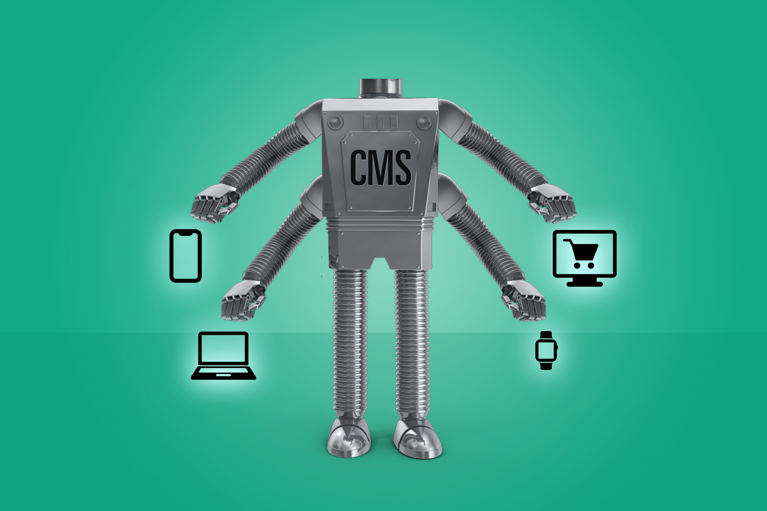
A depiction of headless CMS using a robot extending to different viewing platforms.

Audiences are continually consuming information in different capacities, and your website is no different. Remember when everyone accessed content on a desktop? Fast forward to mobile entering the picture, then overshadowing desktop consumption. Along came mobile-optimized and responsive websites. 

Now we’re seeing content consumed across multiple platforms, including mobile apps. From a user experience the most important thing is to connect with your customers in a way that most resonates with them–for websites that translates to building something that is easy to use and quick for them to digest what’s important, and what they’re searching for. 

From a development standpoint, building something that can easily adapt is key. Creating a well-built website is no joke. It takes time, planning and man hours–all things that most companies need to work into their budget and growth strategy. So how do you share all that content without building out the front-end for each separate device? Enter the headless CMS. 

What is a headless CMS?

A headless CMS is a content management system (CMS) with only a backend. The function is to be more of a repository, think about it like the database storing all of your website information. The content is then accessible via a RESTful API that can be displayed on any device.

The term “headless” is fairly literal to what is happening. The concept is that we are removing the “head” (the front end, or website) off the “body” (the back end, or content repository). A headless CMS’s core functions are to store and deliver structured content.

Why use a headless CMS?

Just like most solutions, a headless CMS is not a need for every company or website. It is built as an option for those who could benefit. For one example, a headless CMS creates greater flexibility for developers but not designers. At a basic level, a headless content management is best used for:

  • Content that needs to be published across various platforms
  • Websites with a lot of content across many pages
  • Websites and apps utilizing JavaScript frameworks (e.g., VueJS, React or AngularJS)
  • Websites created with a static site generator (e.g., Gatsby and Jekyll)

Headless CMS Options

Two of the most popular options are WordPress and Drupal. While these can have multiple ways to create a website, both can be fitted to accommodate headless CMS.

In the case of WordPress, your data can be made headless by using plugin functions like the WordPress REST API and Create React App. This allows the functionality and flexibility a headless CMS needs. 

Drupal 8 is also referred to as “decoupled Drupal,” and is a very popular option for headless CMS. This system has an API-first architecture. This focus helps if your company strategy involves targeting mobile, resellers, or the multi-platforms we’ve discussed here already. Drupal core comes with the RESTful Web Services module. Drupal 8 is currently used by Weather.com, The Tonight Show, and Warner Music Group. 

Should You Use Headless CMS? 

Like all good planning and management, the best way to decide if a headless CMS would benefit your data would be to have a clear strategy for your audience and their needs.

  • How is your audience consuming content?
  • What flexibility do you need?
  • How many pages of content do you need? 

Asking a few questions like these can help uncover the pros and cons for your brand, and lead developers to create the best solve for your website. 

Create Stronger Connections with LinkedIn Live

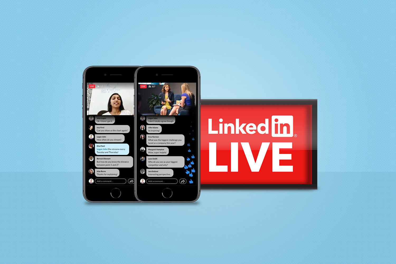
LinkedIn Live example on mobile.

LinkedIn Live has been around for a little over a year, but it has remained an underutilized platform for many businesses. Now, with companies getting more comfortable with digital experiences, and looking for more meaningful ways to connect with their audiences online, LinkedIn Live is getting the second look it deserves. 

While the name implies a lot about what it does, this feature shouldn’t be seen as only for live videos. Pre-recorded and edited videos are just as easily shared through this feature as live conferences or webinars. 

Live events and live videos allow for another facet to connect with professional users in a way that resonates with them, and provides more opportunities for two-way conversation and brand loyalty. 

Find Your Level of Professionalism

Keeping with the professional atmosphere, LinkedIn Live uses professional partnership services to stream your videos to viewers. These third-party services range from free options to paid tiers depending on what your company needs. Services include things like multiple filming angles, professional editing and customer support for your attendees. 

Engage Your Audience

To get the most out of LinkedIn Live we really push strategy. Asking questions like: who is the intended audience, how can we reach them, and what is relevant to them? Answering these will help layout a plan about how to market, connect and speak to relevant users to make the strongest connection with potential viewers.

For example, if you are only promoting your LinkedIn Live video through organic posts and to users who already follow your brand, this cannot be thought of in terms of conversion-based KPI’s. The topic can maybe be more specific, since you know more about what they want. 

On the other hand, if you’re looking to reach a new audience, your marketing plan needs to reflect that. This is a good time to utilize LinkedIn advertising, or create a LinkedIn Event that people can join and easily share with others. 

No matter what way you choose, it is paramount that you get the word out effectively. This means multiple posts or ads building up to your LInkedIn Live stream. Additionally, engagement early on helps people have time to share and remember so they don’t miss out.

Connect, Follow-up, Repeat

Just like any in-person event your company attends or develops, it’s important to follow up with your attendees to keep that connection going. Share on LinkedIn and other platforms post-stream, email attendees with additional information, and continue to invite them to connect with your brand in meaningful ways. This strengthens the bond and keeps them excited for future events, live streams, or other opportunities you develop and share. 

Consumers vs. Marketers & Native Mobile Advertising

Not shockingly, the average person looks at their phone 200 times a day. But only 10% of that time is spent browsing the web; The rest of the time is spent using native apps. Unlike like traditional cookie-based tracking typical in PPC advertising, the insights gathered on users via native apps has virtually no bounds. […]

Not shockingly, the average person looks at their phone 200 times a day. But only 10% of that time is spent browsing the web; The rest of the time is spent using native apps. Unlike like traditional cookie-based tracking typical in PPC advertising, the insights gathered on users via native apps has virtually no bounds. On an aggregate level, marketers can collect data on age, gender and behavior such as where you ordered dinner or where you went to happy hour etc. All this data, but what are they doing with it? The more marketers know about their users, the more they can tailor advertisements and that’s exactly what they want. Creep factor aside, some would say this works in the user’s interest because marketers are more likely to present ads you’re actually interested in seeing. However, most users only see ads as an annoyance they instinctively “skip” or ignore. And with ad blocking software becoming more ubiquitous in web browsers (80% of Americans will be using some kind of ad blocker by 2017), that makes tracking in native apps the most logical path. Not to mention, some estimate that up to 1/3 of PPC traffic is fraudulent (that translates to $7.2B in 2016). That doesn’t make it easy to place the right ad in front of the right person at the right time. Brands and marketers still need to be smart and careful about how they position themselves in a market where consumers are becoming increasingly concerned with privacy and jaded with the typical banner ad or “pre-roll” video.

I attended a meet-up during Internet week hosted by Jun Group, presented by their CEO Mitchell Reichgut titled “Don’t Call it a Phone – How to Advertise on Smartphones and Tablets in the Age of Applications.” Here are key insights on how to stay ahead of the herd and adjust your digital marketing strategy to meet this ever changing market:

  • No interruptions: That means absolutely no auto-play ads (that you can’t skip) and no pop-ups – ever.
  • Consider context: How and where users see your content is just as important as the content itself. Opt for custom placement (visible, relevant but not in the way) and tailor content specifically to the website or app’s audience. Yes, this will require development of more versions of ads but it’s worth it in the long run.
  • Know where your ads are: Many advertisers buy placement but don’t really know exactly what websites or apps will display them and what placement they’ll receive.
  • Look at media differently: it doesn’t always have to be banner ads or pre-roll videos. Many marketers have had success with value exchange programs within games. For example, a user might be asked to watch a 30 second video (between levels) in exchange for bonus points or a gameplay advantage. However, be careful that the games demographics align with your intended audience, which can be tricky to figure out.

Above all, measurement is the most important component of a successful ad campaign. Some of the above tactics may actually result in seemingly less impressive metrics but If you’re still measuring the success of your campaigns on impressions and clicks alone, don’t forget there’s a good chance much of that data is fraudulent.

Flightpath Certified as NYC’s First Umbraco Gold Partner

We are pleased to announce that Flightpath has been designated as a Certified Gold Umbraco Partner. We are one of a handful of gold partners on the east coast of the U.S. and the only digital agency in NYC certified as an Umbraco partner. Umbraco is a free, open-source web content management system (CMS) built […]

We are pleased to announce that Flightpath has been designated as a Certified Gold Umbraco Partner. We are one of a handful of gold partners on the east coast of the U.S. and the only digital agency in NYC certified as an Umbraco partner.

Umbraco is a free, open-source web content management system (CMS) built on the ASP.NET platform with an emphasis on simplicity and ease-of-use. It has the flexibility to run anything from microsites to complex applications for Fortune 500’s.

Flightpath has been building sites with Umbraco since 2008 and we have increasingly turned to it to build easy-to-maintain content managed websites. The Umbraco CMS has matured considerably since the launch of Umbraco 7 in 2013. The CMS has improved in almost every way including:

● Improved editor’s interface including a grid editor great for building responsive web sites

● Powerful developer programming interfaces using modern technologies (ASP.NET MVC, Angular JS)

● A rich ecosystem of plugins that provide enhanced functionality including support for multilingual sites, e-commerce, and much more.

Over the last three years, as we have seen the Umbraco CMS improve, Flightpath has invested in becoming Umbraco experts. Three years ago we became certified Umbraco partners — a designation that signifies that we have obtained at least four developer certifications. We are also active within the Umbraco community: for the last two years we have hosted the New York Umbraco meetup and every year we have participated in uWestFest, the annual North American Umbraco conference which began in 2014.

Becoming a Gold Partner was a natural next step in our continued commitment to the platform. Becoming a Gold Partner benefits all our current and future clients that want to use Umbraco. First of all, Gold Partners such as Flightpath support Umbraco by financially supporting Umbraco HQ, the company that maintains the open source project. This directly translates into ongoing improvements that benefit all Umbraco users. Secondly, by being a Gold Partner, Flightpath gets direct access to the Umbraco core developers and exceptional support for our Umbraco projects.

We are excited about the future of Umbraco and look forward to growing and riding our association with it in the years to come, for clients in the New York City area and beyond.

Which Social Media Network Are You?

Which Social Media Network Are You?

It’s the 21st Century and nearly everyone is using a social media channel. Whether it’s the selfie-obsessed Millennial or your aggressively political Uncle Joe, there’s a social network out there for everybody! Each network appeals differently to each user. Pinterest offers users the ability to discover and bookmark, while Snapchat allows youngsters to share their […]

It’s the 21st Century and nearly everyone is using a social media channel. Whether it’s the selfie-obsessed Millennial or your aggressively political Uncle Joe, there’s a social network out there for everybody! Each network appeals differently to each user. Pinterest offers users the ability to discover and bookmark, while Snapchat allows youngsters to share their daily stories through a series of transient photos and/or videos. With an array of unique users out there, it’s no surprise why there are so many different social networks.

Are you feeling a bit overwhelmed with all of the social media options? Check out our inforgraphic to see which platform is best for you:

Flightpath-Infographic-Andi-Revised

While each channel has its own purpose, all social networks are extremely useful tools in connecting with others, getting your message out and staying active in the social stratosphere. So whether you’re an avid book-marker or a GIF enthusiast, one thing’s for sure, there’s a social network with your name on it!

Social Media Builds Hype for #MayPac

Mayweather vs Pacquiao

I’ll admit I’m Flightpath’s biggest boxing fan. I attend weigh-ins and fights. I’ve had the opportunity to interview famous boxing personalities. I even have a collection of autographed boxing gloves. Heck, I’ve got boxing gloves on my business card (It’s quite a conversation starter).

I’ll admit I’m Flightpath’s biggest boxing fan. I attend weigh-ins and fights. I’ve had the opportunity to interview famous boxing personalities. I even have a collection of autographed boxing gloves. Heck, I’ve got boxing gloves on my business card (It’s quite a conversation starter).

Continue reading “Social Media Builds Hype for #MayPac”

Calling All Foodies! @TwitterFood is here!

Exciting news on the social media and food fronts! Today Twitter launched @TwitterFood, a dedicated account that sifts through the thousands of food-related content shared on the social network and shares a curated selection of posts from the general public and food personalities including Mario Batali and Alton Brown. While I follow thousands of folks […]

Exciting news on the social media and food fronts! Today Twitter launched @TwitterFood, a dedicated account that sifts through the thousands of food-related content shared on the social network and shares a curated selection of posts from the general public and food personalities including Mario Batali and Alton Brown.

TwitterFood
While I follow thousands of folks on Twitter, I do see a lot of junk food tweets. It’s great to see the best of the best come through in one handle, and probably it could drive people to tweet more enticing tweets than a random self-promo posts, which I’m guilty of doing. Here we go, I’ll step up my food tweet game. I’m hoping one of my foodie tweets from my foodie account, @deeCuisine, will get picked up so I can have a Twitter moment of fame.

In addition to @TwitterFood, Twitter also has other curated feeds – @TwitterMusic and @TwitterSports.

Building Great Editor Experiences with Umbraco

At Flightpath we love building websites with the Umbraco content management system (CMS) because it gives us complete control over how the site is rendered while providing the content editor with a great, easy-to-use experience. Last year the core Umbraco team overhauled the ‘back office’ with an improved interface and they have continued to refine […]

At Flightpath we love building websites with the Umbraco content management system (CMS) because it gives us complete control over how the site is rendered while providing the content editor with a great, easy-to-use experience. Last year the core Umbraco team overhauled the ‘back office’ with an improved interface and they have continued to refine the editors’ experience with subsequent releases.

Continue reading “Building Great Editor Experiences with Umbraco”

The Ever-Evolving Sophistication of eMail Marketing – Square Breaks New Ground

I often tell the story about the first client assignment I got when I first founded Flightpath back in 1994 – managing the nascent email (listserv?) list for Bon Jovi on behalf of Mercury Records. Email marketing has certainly evolved since then but it took a very interesting new leap last week with the introduction […]

I often tell the story about the first client assignment I got when I first founded Flightpath back in 1994 – managing the nascent email (listserv?) list for Bon Jovi on behalf of Mercury Records.

Email marketing has certainly evolved since then but it took a very interesting new leap last week with the introduction of a new email marketing platform called Square Marketing. Yes. Square Marketing comes from the company that to date has been known as an innovator in the credit card payment space.
Continue reading “The Ever-Evolving Sophistication of eMail Marketing – Square Breaks New Ground”

How to Create B2B Marketing Videos for YouTube & Beyond

how to create b2b marketing videos

Historically business video has mostly been a stepchild (or worse) of brand and consumer agency culture. That has all changed. Today, given the accessibility of amazing content creation and editing tools and even more amazing and widespread talent, business video has emerged as top tier content.

The time to know how to create compelling B2B marketing videos is now! Historically business video has mostly been a stepchild (or worse) of brand and consumer agency culture.  Low on production and portfolio value, the world of great “how to” instructional or corporate storytelling showcases were never top tier emotional or financial investment priorities.

That has all changed.  Today, given the accessibility of amazing content creation and editing tools and even more amazing and widespread talent, business video has emerged as top tier content.  In a way, just like “IT” came from the backroom to superstar status, B2B video is as likely now to have pixel rich and infographic led animation as a gorgeous 30sec. Ford truck spot featuring Denis Leary.

But as we all know and hear virtually daily, great content be it websites,  video, whatever is about story.  Because we live in a content world, people know good content from drek- both are available on YouTube, Vimeo, Netflix, everywhere.

This is what makes B2B video content incredibly compelling to create today- our ability to tell a compelling story.  It is no longer about a “modest” production budget under minding a great idea. And, while the expectation for truly engaging and immersive content is higher because of its ubiquity, great visual language and tight writing always excites. Just like a truly emotional movie never fails to get to us.

In polling our design and production team about five keys for going beyond even a B+ video, they said in no particular order:

  1. Short is better than long. People are trained to watch 30sec. bits of content. 3:00 is to long, by maybe 100%. 1:30-1:45 is a great length for framing a brand or corporate vision or overview.
  2. Beginning, Middle and End. Not needing to be equally distributed lengthwise but with undeniable cues and segues.  And, I quote “don’t screw with William.”
  3. Funny is good. Compelling is better. Find something compelling to say and show and do it early in the video.
  4. Create movement within screen moves. Back drops for b-roll or  animation work. It is eye candy and engages the audience to never let go.
  5. Given the option to have voice over or good music, music totally wins. Not in all cases, but in many. Tell the story on the screen, let people feel the story through the music. Works for me!

Pinterest Best Practices for Brands 2013 – How to Get Consumers Pinterested!

We just released our best practices for brands on Pinterest! Here is a sneak peak at the whitepaper, and top tips to ensure your brand is getting the most out of Pinterest.

We just released our best practices for brands on Pinterest! Here is a sneak peak at the whitepaper, to view it in it’s entirety download it here.

If you have an interest in marketing online, then you have an interest in Pinterest. Pinterest provides an opportunity for brands to reach consumers in the golden moment when their intent to purchase is forming- as their boards of product images are growing.

Announce your arrival

Pinterest does not offer promoted content or advertising to brands yet. So how can a brand announce their arrival on Pinterest if not through ads? Here are 3 sure fire ways to jump start your Pinterest presence:

  • A magic formula that is 2 parts Facebook and 1 part Pinterest. Create a Pinterest app on your brand page and support it with Facebook ads aimed at Pinterest users within your brand’s target demo.
  • Email! What happens when you take an old fashioned email and insert ready to pin images? BOOM- pinning a plenty!
  • Add Pin It! buttons to images on your website to remind visitors to share their fav pics on their own

Use awesome images

Want to be repinned? A perfect Pinterest image is 600 pixels wide. There is no maximum length on Pinterest, so aim for pins that are long. Images, taller than 800 pixels will stand out in the crowd.

Fill your brand’s boards with images beyond everyday product shots. Funny, beautiful and touching images have better odds at being repinned. Whether you are creating images for your pinboards or scouring the Internet for cool, repinnable images, chose high contrast images. Break out of the photo mold and create pins that include text, just make sure it is brief and bold.

Read the rest of our tips for marketing on Pinterest by downloading our latest white paper: Pinterest Best Practices for Brands 2013.

Facebook Quick Tips for Community Managers

Community Managers handling social media accounts for clients sometimes want to find the best and fastest way to zip across all channels. We figured, why not increase your Facebook fitness and share some of the tips and tricks we’ve learned along the way to ‘pump you up!’

Community Managers handling social media accounts for clients sometimes want to find the best and fastest way to zip across all channels.  We figured, why not increase your Facebook fitness and share some of the tips and tricks we’ve learned along the way to ‘pump you up!’

SNL Skit Hans and Franz with Arnold Swarchenegger

Image via Tumblr.com


1.  Spelling Fail – How to Edit Post after It’s Out There

Keep in mind; this only applies to posts that have images attached to them.  Nonetheless, good to know when you’re in a pinch and already established high engagement.

Let’s just say you found a tiny little mistake (oops!), well this is how you can fix it after it’s been put out there for the world to see.  The best part is… this also applies for the scheduled posts in your Activity Log.

 Here’s how:

a)  Click on the time stamp of the post you want to edit

Facebook Screen Shot How-To 1


b)  Click on “Edit”

Facebook How-To 2


c)  Then make the necessary edits in the text box and then hit “Done Editing”

Facebook How-To 3

Huzzah!  All fixed.


2. Keyboard Shortcuts for Facebook

Thanks to Mashable we can now do our daily Facebook routine sans mouse.  It’s sort of like playing a game on our keyboard.

Shortcuts are based on your browser so you need to memorize the sequence:

Facebook shortcuts

For the action shortcuts visit Mashable.


3. Organize Your Inbox

Want to move messages that you know you’re done with?  Then you can move them out of your inbox and into the “Other” folder. This way you can control how many messages are in your inbox.

Here’s how:

Facebook How To Move Message to "Other" via Facebook.com

Image via Facebook.com


Tag you’re it!  What other quick tips do you have to share with fellow social media ninjas? Sound off in our comments below.

Can’t get enough of Facebook tidbits and news from Flightpath?  Have no fear just click here.

Facebook isn’t Real…Why This Matters for Marketers

The Facebook you is the best you possible….You are not writing social media content for people, you are writing content for the people your consumers want to be.

Chances are the person you are on Facebook and the person you are IRL are different animals.

The parent you on Facebook shared the most darling thing your daughter said this morning. The Facebook parent you never yells about putting shoes on to go to school or loses it in a homework battle with your 12 year old.

The Facebook you is the best you possible.

The friend that remembers every birthday. The buddy who always knows what to say to a friend in need. The life of the party, a great entertainer, providing an endless stream of amusing images, videos and random thoughts. The supportive spouse “in a relationship” with the most fantastic person in the world.

You are not alone. This is the life we all lead…on Facebook.

There are more than a billion Facebook Yous roaming around Earth right now and all of us “yous” have a lot in common. We try not to share content that is mundane or even worse, a downer. “On Facebook” is the new “in public” so we all mind our language, and post the best moments of our lives as though we live in some sort of never-ending Christmas card.

We all realize on some level that Facebook isn’t real life, like this blogger who refers to Facebook as Fakebook. But, none of us really want to share all the day-to-day difficulties of life when we can use Facebook and the rest of social media as our happy place, especially when everyone is a little paranoid about employers/bosses/recruiters and worst of all their moms reading their posts.

So what does this mean for the Social Media Marketer You?

You are not writing social media content for people, you are writing content for the people your consumers want to be.

Posts that celebrate the best in people will be liked. Images that depict the positive connections we have with others and our environments will be shared. Videos that were created to entertain friends of friends will be shared, embedded, commented on.

Facebook Yous will never share your ad copy, except for the rare cases when it truly entertains, connects or celebrates. When you are creating your next content calendar for a client, ask yourself if you would share it on your own wall. If the Facebook You is happy with it, the rest of us will be too.

Pinterest Asking Brands What Features They Want – Pinterest Analytics Anyone?

Buried deep within the Pinterest Help Center for Businesses is a page that may outline Pinterest’s roadmap for rolling out product features for brands.  Pinterest is asking brands to vote for features they are interested in seeing, but as of this writing each proposed feature has less than 90 votes.

Getting inside the heads of the minds behind the fastest growing social media platform has been an interest of marketers ever since Pinterest came out of seemingly nowhere a few years ago. While there has been a lot of speculation about the platform offering brands analytics, advertising opportunities and other tools to make creating and monitoring Pinterest content, Pinterest has remained silent.

Buried deep within the Pinterest Help Center for Businesses is a page that may outline Pinterest’s roadmap for rolling out product features for brands.  Pinterest is asking brands to vote for features they are interested in seeing, but as of this writing each proposed feature has less than 90 votes.

Features Pinterest wants to know if marketers are interested in:

  • Hashtag Searches
  • Business Analytics
  • Scheduled Pins
  • Moving/Editing/Upload Pins in Bulk
  • Nested Boards/Sub-Boards

Hashtag Searches

Pinterest: “Right now, our search does not support hashtags (ex: #hashtag). It’s a feature we know would be useful for pinners and businesses and that we may add in the future. If you’d also like to see hashtag searches on Pinterest, vote for it using the “Me too!” button below.” 

People are already using hashtag searches on Twitter and Instagram (and you even see people use on Facebook even though they don’t work there).

On Twitter, creating a hashtag generates a link so when a user clicks a hashtag they will see all content in which people are using that tag. On Pinterest, people have been using hashtags, though they do not work to create links to other content. Pinterest search is notoriously bad and much of the reason Pinterest search is so bad is because users do not add text to the images they are pinning.

For marketers, this is frustrating because we can’t track content intended for a sweepstakes entry or discussion around our brands very well. So hashtag searches would be a great improvement- make sure you click “Me Too!” here if you would also like to see this feature.

Business Analytics

Pinterest: “Right now, we don’t offer analytics tracking for business accounts.  It’s a feature we know would be useful for business accounts and that we may add in the future. If you’d also like to see this feature on Pinterest, vote for it using the “Me too!” button below.”

There are no Insights for brands on Pinterest. Clients are always dumbfounded by this. Brands are spending time on developing Pinterest followings that they know are effective, because they see the inbound traffic from Pinterest as a referring source Google Analytics. If you have ever had to compile Pinterest metrics for a client report you know what a headache it is. Save your intern from manually adding up likes, comments and repins by voting “Me Too!” for this one as well.

Scheduled Pins

Pinterest: “Right now, we don’t have a way to schedule the time at which a board or pin is published.  It’s a feature we’re thinking about carefully and may add in the future. If you’d also like to see this feature on Pinterest, vote for it using the “Me too!” button below.”

Scheduling content via Facebook’s relatively new tool is useful for brands. However, social media marketing 101 is to post content at the time of day when you get most traction and how do we know when our content is getting the most attention if we have no analytics. This one seems less urgent to me than rolling out analytics and hashtags, but it would be a nice feature to have.

Moving/Editing/Upload Pins in Bulk

Pinterest: There is no way to move, edit or upload pins in bulk right now. We know this would be a useful feature for pinners and businesses and it’s one we may add in the future. If you’d be interested in this feature, let us know!”

So here is my hesitation with this one. While the marketer in me says go for it upload content, content, content! The person inside me doesn’t want to see The Gap upload 700 pins on a Wednesday afternoon and flood my home feed, forcing me to unfollow them. So this seems as though it would only truly work for brands if it was released with a baked in scheduling feature so brands can control the flow of their output otherwise if content from brands gets too high, Pinterest could throttle brand posts out of necessity- Facebook style.

Nested Boards/SubBoards

Pinterest: “There is no way to nest one board within another. If you’d like to show content from one board on another, you can repin the pins from the first board to the second. If you’d be interested in this feature, let us know!”

This one seems like the least interesting idea of all. Creating a Pinterest rabbit hole of boards within boards within boards seems like it may make content more difficult to find- already a huge headache for brands.

What Pinterest should have on this list of proposed features:

  • API Development
  • Promoted Pins
  • Other Advertising Opps.

Leave a comment and let us know what you think about Pinterest’s ideas for the platform, better yet- go here and tell Pinterest which features you would like to see by clicking the “Me Too!”

Yummly vs Pinterest: Social Media Marketing for Food Brands

Yummly is a new player poised to steal the foodies from Pinterest. There are some key differences between Pinterest and Yummly that may influence where brands spend their time and their money.

Yummly is a new player poised to steal the foodies from Pinterest. There are some key differences between Pinterest and Yummly that may influence where brands spend their time and their money.

Food continues to be one of the hottest topics for pins on Pinterest, and food brands and publishers like Kraft Recipes, Goya Foods and Food Network have all jumped aboard the Pinterest train looking to drive brand awareness and traffic back to recipes nested on their brand’s website.

Meanwhile other image sharing and aggregation sites have begun to emerge. Yummly was launched in 2010, but it had some strong players back the site last year. Unilever saw enough promise in the startup to become an investor in Yummly’s Series A funding round and is one of the site’s main advertisers.

Differences Between Pinterest and Yummly for Brands

Pinterest

Promoted Pins: A major frustration for brands is the lack of advertising opportunities available in the form of promoted pins on Pinterest.

Metrics: Brands accustomed to the analytics provided by Facebook Insights and YouTube Insights continue to struggle with the lack of metrics available from Pinterest.

Accounts: Both brands and people create similar accounts (though brand accounts can now be verified Twitter-style). Other than verification, there is no difference in available features between an individual user’s Pinterest account and a brand’s Pinterest account.

Driving traffic: While Pinterest has been a great source of traffic for brands, users have to click twice on a pin to be directed to an image’s source page. There is no prompt to drive users to the pin’s originating source.

Search: Brands have experimented with using hashtags, keywords and other ways to ensure their content ranks high in a Pinterest search. However, Pinterest search lacks the ability for user’s to narrow their search.

Recently unveiled verified brand accounts have helped users distinguish branded accounts from those created by fans. Do a Pinterest search for “Martha Stewart” and you will see why this was a necessary move.

pin1

Sharing: This is where Pinterest excels. One click repinning exposes content to the pinners follower. Users can also view the pins and profiles of other Pinterest users/brands to discover additional content to share. Pinterest is also designed to be a destination, rather than a tool.

Yummly

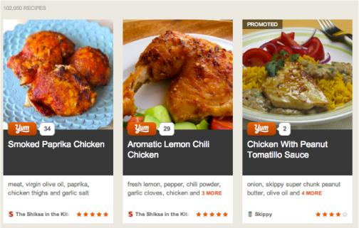
Promoted Recipes: Yummly allows brands to advertise in the form of Promoted Recipes. These recipes, such as the one shown below for a Skippy peanut butter chicken recipe (Skippy is a Unilever brand) found in a search for “chicken”, rank higher than other recipes to ensure maximum visibility in Yummly search.

yum1

Advertising- Suggested Products: When a user searches for a specific recipe, they will be shown a list of suggested products that match the ingredient list of the recipe they were searching for. For instance, a search of Kraft prompts an ad for I Can’t Believe It’s Not Butter, another Unilever brand. Clicking on the ad drives the user to the product website.

 yum2

Metrics: Flightpath contacted Yummly to inquire about brand analytics. According to a Yummly rep, they are starting to offer analytics for brand partners.

Accounts: Branded accounts house all recipes generated from a publisher or brand. Accounts also exist for food bloggers who supply content to the site.

Driving Traffic: Prompts for users to read full recipes and visit publisher’s website are prominent, a call to action that does not exist on Pinterest.

Search: Yummly offers users incredibly relevant results due to its semantic search engine. Users can also narrow their search using the prominent search tools on the left hand side of the site. Yummly’s focus on food is also a plus. A search for chicken on Pinterest pulled up chicken recipes alongside a chicken coop and Pedigree’s new chicken flavored dog food.

Sharing: When users click “Yum” this action is shared to their Facebook wall. Users can also see how many “Yums” different recipes have, which serves as an endorsement of the recipe. All images are sized to be pinnable via the Pinterest bookmarklet. However there is no social sharing within the platform itself. Unlike Pinterest which is designed to be a social destination, Yummly is a tool for finding recipes and sharing them on other social platforms.

Since the Pinterest craze hit over a year ago, frustration among brands at Pinterest’s lack of promotional opportunities has been building.  Why Pinterest didn’t see this void as a dangerous opportunity for a startup to charge in and steal brand dollars is a mystery, but that startup has arrived in the food and beverage category and it is Yummly.

Facebook’s EdgeRank Algorithm – What Brands Need to Know

Unless you’ve been living under a buzzword-free rock (and if that’s the case, please share your location so that others might seek refuge), you’ve undoubtedly heard about EdgeRank, the algorithm that Facebook uses to determine what users see in their News Feeds. While the method itself remains elusive, there is solid information that brands can […]

Unless you’ve been living under a buzzword-free rock (and if that’s the case, please share your location so that others might seek refuge), you’ve undoubtedly heard about EdgeRank, the algorithm that Facebook uses to determine what users see in their News Feeds. While the method itself remains elusive, there is solid information that brands can use to navigate the News Feed and stay on top of fan engagement and in front of fan faces.

The Algorithm :: What is it?

Every piece of content or interaction on Facebook is known as an “edge,” from uploading a photo to joining an Event or Liking a status update.

EdgeRank accounts for three determining factors, known as “signals,” regarding posts themselves: affinity, weight, and time decay. Affinity reflects how friendly you are with your fans. Weight is a basic formula that is used to determine what types of content are more likely to be shared. Time Decay is a simple measurement of which content is the most fresh.

While there have been hints that Facebook may be introducing a new signal (or more) into the equation, this trifecta currently makes up the mix.

The Latest :: What’s the word?

In late September, Facebook announced an update to the EdgeRank algorithm, sending the digital marketing world into a tizzy as organic reach levels dropped suddenly and dramatically across the board. Phrases like “pay to play” flew across our screens rapid-fire, and brands began to panic over losses in revenue. The algorithm still remains elusive, but there are a few key changes that have become apparent.

Negative Feedback is now weighted more heavily.  Users are now equipped with simple controls at the forefront that allow them to hide, block, and report posts. Because the objective of the updates is to combat spam pages, there is far more attention paid to this type of feedback from users. In addition, if pages have received a substantial amount of negative feedback in the past, they may have been hit even harder by the update.

The Popular Post Paradox creates new opportunities for negative feedback. Yes, that’s right. We’ve coined a new paradox. (While no one at Flightpath fancies himself or herself a philosopher, we’d argue that critical thinking skills and a love for alliteration go a long way.) Thanks to EdgeRank, the most popular posts make their way into the News Feeds of many a Facebooker who isn’t necessarily a fan of your content. While this is a great opportunity to make new friends, it’s also an easy way to get your posts hidden in the case that we don’t like what we see.

Status Updates Are the New Black. Once the updates went into affect and widespread suffering was reported from the depths of editorial teams across the globe, there was a single glimmer of hope: Status Updates. The oft-forgotten content type actually showed improvement in performance as a result of the algorithm, and brands that have strategically revitalized the status update have seen positive EdgeRank results.

Optimal Post Frequency hovers around once per day. Talk about high stakes-statuses. Many an analyst agrees: the most engagement is garnered when a brand posts once per day – and interactions begin to decrease substantially as frequency increases. It’s up to you to determine the best time of day to hit “Post,” as well as the ideal type of content to share. The good news? There’s plenty of room for experimentation.

The Implications :: What’s it to you?

EdgeRank exists to further personalize the experience of logging in to your virtual world by weed out irrelevant content and promoting pieces of interest. The fact is, except for the rare occasion on which a rapper launches a video game, we aren’t generally clamoring to canoodle with brands.  EdgeRank recognizes what we are clamoring for, however, and rewards those pages who are posting killer content, at the right frequency, at the ideal time of day. If you’re not using EdgeRank Checker already, create your account and get moving – many of the optimizations that can be made are easily measure and reported within the tool, which also allows for real-time monitoring.

At the end of the day, I’m still subjected to far too many baby pictures (and when will we start punishing college buddies for gratuitous sorority poses?), but technology has only come so far.

Facebook Gifts – Presents New E-Commerce Opportunity for Brands

Remember Facebook’s Virtual Gifts of yore? When you could send your Facebook friends a “beer”, “rose” or “birthday cake?” Facebook closed its virtual gift shop in August 2011, and has replaced it with the ability to send Facebook friends real beer, roses and birthday cakes (or at least cupcakes). All from the status box on their friend’s timeline.
At this time, the gift selection is somewhat limited. For instance there are only 10 gifts available in the pets category. So, Facebook is going to have to expand their selection to appeal to more buyers. Which is great news for brands who are interested in coming aboard.

Facebook has rolled out another value add for brands. Facebook Gifts, which have been available through chain invites since September, are now available to all users and open for brands to submit products as consideration for Facebook Gifts.

Remember Facebook’s Virtual Gifts of yore? When you could send your Facebook friends a “beer”, “rose” or “birthday cake?” Facebook closed its virtual gift shop in August 2011, and has replaced it with the ability to send Facebook friends real beer, roses and birthday cakes (or at least cupcakes). All from the status box on their friend’s timeline.

So what is the benefit of this for brands? Your brand’s products can be offered via Facebook Gifts, which offers a seamless e-commerce experience and new platform for driving sales. Now, when a user sees a friend announce they are expecting a baby that user can quickly send an appropriate gift without having to leave the confines of Facebook for, say Amazon and perhaps get distracted along the way to purchasing your brand’s product.

Facebook has also done a great job of removing the shipping address barrier of sending gifts to people you are friends with on Facebook, but are not close friends with in real life. The sender doesn’t have to enter any shipping information. The gift recipient is notified via Facebook private message that they have a gift waiting and they are prompted to accept the gift, at which point they enter in their own shipping information. This lowers the barrier to purchase for the gift giver and also encourages surprise, and impulse gifting (it’s a little hard to surprise someone with a gift when you have to text them and request their shipping address).

The social media/word of mouth marketing aspect of Facebook Gifts is also alluring to brands. Every time a user sends a gift, a tantalizingly wrapped gift image appears on the recipient’s timeline by default, encouraging them to unwrap it and reveal what is inside. Senders can opt out of the share. Below is an example of the image a recipient sees on their timeline:

At this time, the gift selection is somewhat limited. Potential senders first land in the “Recommended Gifts” section, which is mostly gifts of food, but also include Starbucks and iTunes virtual gift cards. The user then has the option to navigate into the following gift categories:

  • Food & Drink
  • Wine
  • Fun
  • Home & Kitchen
  • Fashion & Body
  • Flowers
  • Baby & Kids
  • Gifts that Give Back
  • Pets

According to Facebook, there are multiple safeguards in place to ensure that alcoholic beverages are not purchased by or sent to underage users, including carding recipients at their physical door during delivery and barring users with a stated age below 21 from even seeing alcoholic beverages as Facebook Gift options. This could be a great sales platform for those brands in the wine and spirits category.

At this time, the gift selection is somewhat limited. For instance there are only 10 gifts available in the pets category. So, Facebook is going to have to expand their selection to appeal to more buyers. Which is great news for brands who are interested in coming aboard.

So, what brands are taking part in the initial roll out of Facebook Gifts?

  • Apple
  • Baby Gap
  • Harry & David
  • Fab
  • Brookstone
  • Gund
  • Sesame Street
  • Warby Parker
  • And more…

Want to get your brand’s products on board with Facebook Gifts? Just fill out this form to submit your products for consideration.

Facebook Ads CPC vs CPM vs Promoted Stories – What’s a Social Media Marketer to do?

It was common knowledge among social media folks that CPC ads were a much better value for marketers. You expected to pay a cost of .35 to nearly a dollar a click depending on your targeted audience (like Manhattan moms who are very pricey to target). An average Facebook ad CTR of .05% seemed to be the industry benchmark for judging the success of an ad. But, that has changed.

CPC, CPM, Promoted Stories, Promoted Posts – there are a lot of options facing social media marketers interested in advertising on Facebook. It used to be that there were only two choices for advertising on Facebook CPC (cost per click) or CPM (cost per impressions).

It was common knowledge among social media folks that CPC ads were a much better value for marketers. You expected to pay a cost of .35 to nearly a dollar a click depending on your targeted audience (like Manhattan moms who are very pricey to target). An average Facebook ad CTR of .05% seemed to be the industry benchmark for judging the success of an ad.

For years, if you chose CPM your ad would be relegated to a lowly position on the bottom right hand of the user’s newsfeed and gain very few clicks. CPC ads outperformed CPM ads in all tests that we ran here at the agency as well.

But, that has changed.

While Facebook has talked a lot about the value of their new Promoted Stories ads and Promoted Posts, they also quietly chose a new favorite child in the CPC vs CPM debate. We noticed this at Flightpath when CPC ads that have been performing for years suddenly stopped being even displayed and our testing of CPM ads started showing amazing results.

We switched clients over to CPM ads and saw our average Facebook ads CTR jump from an average range of .05% to .20% jump to a range of  .50% – .80%. Then we added in Sponsored Stories, to run simultaneously with the CPM ads, and the average CTR jumped even higher to a range of .80% to 1.2%.

At the same time, we are seeing the average CPC fall from that .35 – $1 range down to a bargain basement .06 – .15 CPC. So, for the same Facebook ad spend our clients are getting about 6 times the likes they were getting earlier this year. This is really helping to rapidly grow page likes without having to dramatically up Facebook ad spend.

Why are ads suddenly cheaper and performing better?

So, this is why we think this dramatic uptick in Facebook ad performance is happening: remember months ago when advertisers like GM pulled their Facebook ad spend because they didn’t feel they were getting much of a return and remember when Facebook’s stock came out of the gate to dismal results?

Facebook had to devise a plan to get advertisers excited about spending on the platform so investors would be consider buying Facebook stock. Lowering the cost of ads and rolling out Promoted Stories (which not all Facebook users like, but they seem to click on them anyway) is a great way to get advertisers excited and spending.

If you are still running Facebook CPC ads for your clients, set up a separate CPM campaign with Promoted Stories pronto for testing. The results will blow you away.

Why Awesome Facebook Posts are Your Brand’s Best Mobile Strategy

As brands watch more and more of their traffic come from mobile devices it may be a good time to evaluate what your brand is doing on the one part of your Facebook presence that mobile users can see: Timeline.

Facebook is facing a quandary when it comes to brand pages. While an increasing number of Facebook users are utilizing the platform on their smartphones or tablets, the Facebook tab content that brands spend so much time and money to develop are not visible to these users. We know more users prefer Facebook brand pages to brand websites and we also know that smartphone usage is on the increase.

So what is a brand to do?

Facebook app development remains an integral part of a brand’s presence on Facebook. The brand immersive experiences, like sweepstakes and other fun apps are designed to engage and inspire users to share and they do. But, as brands watch more and more of their traffic come from mobile devices it may be a good time to evaluate what your brand is doing on the one part of your Facebook presence that mobile users can see: Timeline.

The best Facebook brand posts have must-see, must-share content. So how do you take your branded posts from meh to marvelous?

1. Use user generated images in your posts

I know that everyone social media expert on the planet will tell you that social media posts with an image get more attention than those that don’t. But, this advice is a bit different.

Ask your community to share pictures, not highly posed shots of them holding your product at salesmanish angles, but real photos of the sort they probably already have. Pictures of their home, kids, pets and the like- whatever category is relevant to your brand. Use them in all of your posts and you will see interaction skyrocket.

People like to see themselves represented and I for one could go the rest of my life without seeing another stock photo used in a Facebook brand post. We implemented this with a client at the beginning of the year and have seen monthly unique interactions grow from a respectable 6% to a totally awesome 40%.

2. Make your posts relatable

 How many times have we seen a post with copy like this: “It’s back to school time! Like this post if your kids are ready for school.” Ugh, snore. Sounds like the opening line of a very boring PTA meeting.

Take that basic idea and add copy with an accompanying image that the mom you are speaking to can relate to: “Here is Barbara from Poughkeepsie enjoying her coffee in peace this morning. Like this if you are enjoying the silence of back to school time!” It’s better, more from a mom point of view and the consumer you are trying to engage will have a higher likelihood of interacting with the post.

3. Create inspirational branded images

 A lesson we can all learn from the popularity of Pinterest is that inspirational images get shared. That lesson applies to Facebook as well.

Take an inspirational quote about life, home, self-care whatever makes sense for your brand and put it meme style on an image (even better an image shared by a user). Ask your community to share and boom, your branding is out there being shared with a larger audience and is connected with a powerful, inspiring message which is all good. We have been using this tactic for a few months and have had some images shared 20,000+ times.

Creating better Facebook posts means higher engagement from all users, especially those viewing your brand page on a smartphone. Creating killer Facebook apps is still important, but until Facebook allows tab content to be viewed via mobile spending time creating content designed for interaction and sharing is a win.


Leave a comment if you have tips for making the most out of Facebook posts for the brands you represent.


Apple Patents Videogame Controller: Why This Is Huge News

Earlier this week, news broke that Apple had patented a wireless videogame controller for use with its iPhone, iPod and Apple TV platforms. At this point, details about the controller and information on its release are scarce to non-existent. But make no mistake – this is huge news. An Apple game controller has the potential […]

Earlier this week, news broke that Apple had patented a wireless videogame controller for use with its iPhone, iPod and Apple TV platforms. At this point, details about the controller and information on its release are scarce to non-existent. But make no mistake – this is huge news. An Apple game controller has the potential to change the videogame industry, from the games we play to the major players involved.

With casual games – a market Nintendo essentially invented with the Wii, only to see it stolen by mobile devices with titles like Angry Birds – touch screen controls were the gateway entrance for people who found classic game controllers to hard a hill to climb. At the same time, touch screen controls have also been a turn off to the still-large hardcore gamers audience; they just don’t offer the same precision that a controller with a joystick and buttons can. But now that an official Apple controller will be released, there is a chance that the hardcore will spend more time with mobile games, maybe taking a significant chunk of that audience away from console-makers. Not only that, but mobile games may evolve due to the option of the controller, offering a more console-like gaming experience that will appeal directly to the hardcore. It’s something that Sony, Microsoft and Nintendo should be worried about.

Perhaps most importantly, however, is the fact that the controller makes Apple more of a force in the videogame arena than ever before. Fans have wondered why Apple had yet to develop a game console and enter the market, or at least do something. This is that something. The truth is, with the proliferation of mobile gaming via the iPhone and iPad, Apple were surprise entrants into gaming, but this puts them in more direct competition with The Big 3. As videogames move towards a cloud-based future, the controller puts Apple in a position to play a role in the gaming landscape. And if Apple TV is home to console-quality, cloud-based gaming, they could truly change the industry.

That is, of course, if it’s actually released. Time will tell.

Pinterest Brand Pages: Our Favorites

Pinterest is all the rage these days, and for good reason: it’s a social platform that actually offers something new and unique. If you are a brand rep looking for Pinspiration, here are some of the best examples of brands on Pinterest.

Pinterest is all the rage these days, and for good reason: it’s a social platform that actually offers something new and unique. And unlike Facebook or Google+, it really allows brands to get creative with their pages, from layout to content to overall purpose. If you are a brand rep looking for Pinspiration, here are some of the best examples of brands on Pinterest.


Coolest Design: Uniqlo


A quickly growing fashion retailer, Uniqlo only sells through its brick-and-mortar shops, which makes its digital acumen all the more impressive. Their website is great, their Facebook updates are fun, and their Pinterest page is staggeringly creative. If you scroll down their page, it animates a la a cartoon flip book, making logos spin, shirts move, and giving off an overall wow factor:


Funniest Use of Pinterest Boards by Brands: Oreck


So… you are a vacuum company and you want to create a Pinterest board, what do you do? Pin pics of messes of course, but how to make a pinnable mess? If you are a pet owner you will appreciate Oreck’s Furry Friends board filled with adorable pics of dogs and cats who fill hearts with happiness and floors with fur:


Best Non-Profit Brand on Pinterest : ASPCA


Of course it helps to have an endless supply of adorable and highly pinnable pet photos at your disposal, but the ASPCA on Pinterest does more than just post cute pics of pets.

They are using Pinterest as a tool to promote pet adoption and further the cause of closing puppy mills. By creating Pinterest boards that balance cute pics with highly shareable text based images, pinning from the ASPCA page is like slapping an end animal cruelty bumper sticker on your Subaru- it let’s everyone who follows you know where you stand.


Most Interactive: Bauble Bar


Social media, as we all know by now is not supposed to be a soliloquy but rather a conversation. This is always tough for brands. One brand doing a great job is Bauble Bar. This online jewelry retailer scours Instagram and Twitter for fans of their collections who have posted photos. Bauble Bar then pins the fans photo to their Pinterest board, which is the highest form of compliment on Pinterest and goes a long way to building community and customer loyalty.


Best Celeb Brand: Martha Stewart
Martha Stewart’s Pinterest boards look like what Stewart’s refrigerator would look like, if she allowed magnets on it. As the most followed celeb on Pinterest, Stewart is one to watch.


Leave a comment and let us know what Pinterest brand pages you like.

(Dan Brooks contributed to this post.)

Facebook Tutorial: How to Change Facebook Page Username or Vanity URL

If you have been wanting to change your Facebook username, now is your golden opportunity. But before you rush to seize the moment and change that Vanity URL or username that you have always regretted, take a moment.

Wondering how to change your Facebook Vanity URL or username? You are not alone, until very recently the Vanity URL chosen when a Facebook page was created could never be changed. This created problems for a lot of businesses who have had a name change or just second thoughts about the custom URL they chose years ago.

Facebook has just changed this policy and now allows Facebook Page admins to change their Vanity URL. If you have been wanting to change your Facebook username, now is your golden opportunity.  But before you rush to seize the moment and change that Vanity URL or username that you have always regretted, take a moment.

Things to Consider

Be Really, Really Sure

Before you start the process of changing your Facebook Vanity URL be sure you are 100% sure of your new choice and the spelling. Facebook will only allow for a Facebook Page Vanity URL to be changed one time, so if you change your mind or screw up the spelling you cannot change it again. So give your new URL and it’s spelling some thought.

Vanity URL vs Facebook Page Name

Changing your Vanity URL or User Name will not change your Facebook Page name. The Facebook username is the unique portion of the custom Facebook URL which is referred to as a Vanity URL, so a Facebook username is the “name” portion of the Vanity URL. For instance in the case of our agency, “FlightpathNY” is our Facebook username, and “www.Facebook.com/FlightpathNY” is our Vanity URL.

Your Facebook Page name is the name of your page that appears in Facebook search and in bold type just below your cover photo. In our case, our Facebook name is “Flightpath”. Changing your Facebook Page name is a different process than changing your Vanity URL.

If your page has over 200 likes, you have to fill out a form and request a Facebook Page name change. You don’t get a shot at changing it yourself like the username/Vanity URL, unless you have less than 200 likes in which case you can change the name of your page from the Basic Information tab within the admin tools. If you have over 200 likes and want to request a new Facebook Page Name you can do so by following these instructions.

Keep in mind the rules.

Facebook has a lot of rules regarding what Vanity URL you can snag. This is not your great chance to be Facebook.com/Pizza, since generic Vanity URLs are not allowable. Stick with your business’s name.

Double check that your desired Facebook Vanity Url or Username isn’t taken. When Facebook first rolled out Vanity URL’s for personal Facebook profiles, some people decided to use nicknames, place names or surnames that are also business names. Do yourself a favor and check the URL before you try to change it.

Another common issue is a company’s CEO has the company name as his or her personal Vanity URL. If this is the case, ask them to change it (or offer to do it for them) thereby releasing the URL and making it available for the company page.

Change Your Links

Changing your Vanity URL means you need to change all links to your Facebook Page. Once you change your username your old Vanity URL will not work, so make sure to update the links from the buttons on your company’s website, blog and everywhere else your Facebook URL appears.

Making the Change Step By Step:

  1. Click the “Edit Page” button at the top of your Facebook Page and select “Update Info” from the drop down menu.

  2. This will bring you to the page where you enter your new username. (Remember to check the spelling!)

  3. Click to verify availability of your new username.

  4. Click to save your new username and voila! You are done!


Mobile App Review: eBay – iPhone, iPad & Android

ebay mobile app review

Welcome to the latest installment of Flightpath’s running series of mobile app reviews, where we explore all different kinds of apps, both paid and free. Today we’re looking at the app for the world’s biggest online auction site.

Welcome to the latest installment of Flightpath’s running series of mobile app reviews, where we explore all different kinds of apps, both paid and free. Today we’re looking at the app for the world’s biggest online auction site.

The App: eBay

The Platform: iPhone, iPad & Android

How Much: Free

The Deal: eBay has long been synonymous with online auctions. Looking for a vintage Optimus Prime right fist? Check eBay. Trying to find that issue of Fangoria missing from your collection? Check eBay. Have buyer’s remorse for that trumpet you bought, which has never been removed from its case? Sell it on eBay.

An eBay freed from the chains of desktops (I don’t have to be at the computer at 4:27am when the auction for that weird thing no one else on earth except two other dudes care about is ending? Sign me up!) is a no-brainer. But how is it in reality?

ebay mobile app

Features: As far as I can tell, everything from eBay desktop has been ported over to eBay mobile. There’s buying and selling, of course, as well as your complete My eBay profile and options. Additional functionality includes push notifications for messages, ending auctions, re-listings and more.

The success of this app lies not so much in its breadth of features, but in their ease-of-use in a mobile format. And it is very successful in that regard. With searches, everything displays properly, and with all relevant info and photos (see above screen shot, taken after a search for “Wayne Chrebet jersey”). On item pages, everything is condensed into smart menus (Description, Item Specifics, Bidding Activity, etc.), allowing the page to be presented cleanly and clearly. At the bottom of the screen are three large buttons, really representing the core of eBay: Place Bid, Sell one like this, and Share this item. It makes browsing and bidding a really pleasant experience.

ebay mobile app

What’s Missing: Truthfully, not much. Even re-listing items (I’m trying to get rid of an MST3K Crow statue, if anyone’s interested) is a breeze. If anything, the way messages are handled is a little clunky; it seems as if the desktop message is displayed on the mobile screen, and options for replying are limited. But that’s a nitpick.

ebay mobile

Overall: One of the best mainstream apps available, and one of the best desktop-to-mobile adaptations I’ve ever seen. I was continually amazed at just how much functionality is packed in here, and the second nature feel of navigating through it all. Browsing item photos is startlingly easy, as you just scroll through them as you would the photos in your gallery; changing alert settings is actually easier than the desktop version. The presentation is simplified as much as possible without sacrificing anything, and it’s a real accomplishment.

The only place the app falters slightly is in the typing interface; typing on a mobile phone is still a bit of a pain (at least, for me) and eBay didn’t find a way around that, so writing out a detailed description or message is a bit cumbersome. But I don’t really hold it against them. Ultimately, this doesn’t try and replicate the desktop experience; it re-imagines it and surpasses it.

Grade: A

Pinterest Analytics Tools Comparison – PinReach vs Pinerly

We took a look at 2 of the most popular Pinterest analytics tools available, Pinerly and PinReach and put them head to head to find out which offered the best Pinterest account analytics tools for brands.

We took a look at 2 of the most popular Pinterest analytics tools available, Pinerly and PinReach and put them head to head to find out which offered the best Pinterest account analytics tools for brands. So you can know  if your content is reaching an audience and also gather the stats you need to report back about your Pinterest campaign to your client.

Pinerly

Pinerly is a complete Pinterest account management platform. In our opinion, this is the best Pinterest analytics tool for marketers. It offers lots of great stats (or Pinalytics) on your Pinterest account including number of repins and likes on individual pins.

On the downside, in order for pins to be tracked by Pinerly each pin must each be created through Pinerly. This means that pins show the URL of origin as Pinerly.com,  instead of your brand’s URL. The good news is that any clicks of your pins are still directed to the URL of your choice.

Perhaps once Pinerly is out of beta, there will be a white label option as part of a premium package for brands (not anything we saw on Pinerly just guessing they are going to have a monetization strategy unlike Pinterest). It would also be great if brands could promote pins by paying to be featured in Pinerly’s suggested pins. However, there are currently no opportunities for brands to pay to promote content to other Pinerly users.

What we like:

  • Scheduling coming soon- a huge bonus for marketers since Pinterest activity peeks during off hours.
  • Analytics good enough to report back to a client with
  • Looking for feedback from users

What we don’t like:

  • Pinerly.com shown as pin URL
  • No brand promotion opportunities
  • No comment tracker
  • Still in beta- though you can request an invite here

PinReach

Billed as a tool for understanding and measuring the impact of your Pinterest account, PinReach is a lot like Klout for Pinterest.  Users are assigned PinReach scores  based upon the amount of engagement (repins, likes and comments) their Pinterest content receives.

Scores range from 0-90+. According to PinReach, most accounts fall into the 30-39 score range, and there are no PinReach users who have scored above an 89 (Etsy must not have checked their score yet). Certain types of interactions have more influence on a  PinReach score. While you get points for filling your boards with pins, you get more when others repin, like or comment on your content.

One stat that PinReach provides that Pinerly does not is the amount of comments received. While the metrics available through PinReach are mostly identical to those available through Pinerly, that’s ok because PinReach has a different goal- it was designed to be less of a dashboard and more of a high level look at the influencers and top images on Pinterest.

What we like:

  • PinReach is very straight forward and user friendly.
  • Looking at trending pins can be great inspiration for creating your own.
  • Much like a Klout score, a PinReach score is a fun way to gamify Pinterest. If you are aiming to brag at BlogHer, having a high PinReach score is just the ticket.

What we don’t like:

  • No brand promotion opportunities
  • From a social media marketer’s point of view, the PinReach score, is not necessary. (You know what we mean if you have ever watched a client’s eyes glaze over while explaining a Klout score).
  • Not the in-depth analytics you need for reporting purposes.

What Pinterest analytics tools are you using? Leave a comment and let us know.

Facebook: Passion Speaks Louder Than Clicks

While Facebook has been dominating the news the past two weeks,one side of the social network story that has gone under-reported is the undeniable passion Facebook has created.

While Facebook has been dominating the news the past two weeks – GM saying no mas to $10 million in paid media, the market/investors saying IPNO (no!) to $38 a share and many interesting stories of the personal and financial lives of Facebook insiders past and present – the one side of the social network story that has gone under-reported is the undeniable passion Facebook has created.

Facebook, to the 13-year-old creating his or her account and getting a profile up, is huge: A rite of passage so dynamic, so intense, that if you have a son, daughter, niece or nephew, you wonder if they are even breathing the first few days. In fact, it makes getting the driving permit so yesterday. For jaded investors and longtime social media enthusiasts, Facebook may be easy to discount (crazy hype can do that!) or connect to the beginning of the end – like a replay of the ‘90s dotcom collapse – but given the scale of people who connect through, engage on, and live loud because of Facebook, that couldn’t be more ridiculous.

Simply, Facebook is the passion engine of our time. I am going to keep this simple and single-minded. Take Facebook’s photo uploading and sharing. Billions are uploaded monthly, so that alone emotionally and socially has had a tremendous ripple effect given the old idiom, “a picture says a 1000 words,” in terms of humans connecting. Family and friends smiling happiness or sharing sadness all is second nature because of and through Facebook. The bottom line is, whenever a new technology platform or even a re-defining idea (think: “The 99 Percent!”) enables human passion to flourish in any area of life, there is no looking back.

The way I see it is, scale doesn’t make passion – passion makes scale. Facebook has scaled up so big so fast because of its relentless pursuit of passion. The way they have screwed up – like in the privacy area – seems perfectly normal, given how fast they have moved. Their corrective steps reinforce an ability to listen and learn is why their dynamic growth continues.  Clearly, Facebook understands and practices, maybe better than any company in history, the idea of “Fact Based Passion.”  Introduced at Nabisco in 1994, CEO John Greeniaus espoused Fact Based Passion as connecting data and information to empower human energy and commitment to make remarkable things happen.

So, while I imagine people at Facebook are working hard day and night (especially at their Hackathons) to get people to click more on ads, I believe brands will figure a way to work with them to drive effectiveness and success. People are too passionate about Facebook and about Skittles or Coca-cola or GM to not find a new way to thrive symbiotically. Fan pages prove that today.

I’ll end by reminding us that the DVR didn’t kill television – it just made some brands re-imagine how to message. As Facebook continues to explore new pathways for commercial engagement, the opportunities for brands to leverage all the emotional currency they have garnered will be incredibly exciting and powerful.

Mobile App Review: Spotify – iPhone, iPad & Android

Welcome to the latest installment of Flightpath’s running series of mobile app reviews, where we explore all different kinds of apps, both paid and free. Today we’re looking at an app for one of the biggest names in online music. The App: Spotify The Platform: iPhone, iPad & Android How Much: Free for trial download; […]

Welcome to the latest installment of Flightpath’s running series of mobile app reviews, where we explore all different kinds of apps, both paid and free. Today we’re looking at an app for one of the biggest names in online music.

The App: Spotify

The Platform: iPhone, iPad & Android

How Much: Free for trial download; $9.99 monthly subscription fee

The Deal: In the Summer of 2011, the Swedish-born/UK-raised music streaming service, Spotify, had finally made its grand entrance into the US. It served as the ultimate answer for music lovers who craved an “eat-whatever-you-want-whenever-you-want” music diet and alternative for those who wanted streaming music other than Pandora.

Compared to Spotify’s full-featured desktop application, the iPhone app is a stripped-down, bare bones version that still contains all of the essentials needed to stream music to your phone. Unfortunately, there’s one huge catch: You have to be a paid subscriber of Spotify’s premium service ($9.99/month) in order to access its entire streaming library. If you’re not a premium subscriber you can still use the app without access to the library, but it basically acts like the iPhone’s built-in music app, where it plays music stored locally within the device. This review will be based on the app that is using a premium subscription; that’s when most of the good features kick in.

Playing "936" by Peaking Lights

Features: For starters, most of the things you do on your own Spotify account, whether you’re on a PC/Mac or iPhone, gets automatically synced between all devices. This means if you’re adding or sorting your playlists on the desktop version, the changes get reflected when you start up the iPhone app. Or, if a friend at work is making attempts to get you hooked on his/her favorite band and bombarding you with Spotify playlists (“I am now flooding your Spotify inbox with Guided By Voices.”), they will all be sitting there on your iPhone waiting to be played (…or ignored).

What We Think/Like: The app also tracks your listening habits and sends them off to social media platforms like Facebook and Last.fm. Personally, I like this feature because it serves as an online “pulse” that lets my friends and family know that I’m still kicking around:

Hey, have you seen Tyler lately?
No, but it says on Facebook that he’s currently listening to early DJ Shadow.
Oh, that must mean he’s cleaning his apartment right now.

Another great feature is the “Offline” mode, where you can store Spotify playlists directly on the iPhone and listen to it without a wifi or cell phone connection. This is perfect for underground subway commutes, avoiding data overage charges from your phone company, and occasional shuttle trips to distant planets where over-the-air connections are non-existent.

What’s Missing: The “Premium Subscribers Only” restriction is a bit off-putting given that there’s still a lot of features available on the Spotify desktop application that could’ve been enabled on the app for basic/free subscribers.

Third-party apps that you can install on the desktop application (like The Guardian or Last.fm) aren’t available on this mobile app, which severely cuts down on a lot of music discovery on the iPhone (or Android). On top of that, even Spotify’s own “radio” app (not as smart as Pandora, but still okay) was never ported over to the mobile app.

Overall: It’s unfortunate that the mobile app cuts back on a few features, especially when you compare it against the desktop app. But the heart and soul of Spotify—the on-demand, unlimited access to a huge and constantly expanding online music library—is still there, and that’s what really matters. If you’re a Premium subscriber, take advantage of this free app right away, and take your library on the road.  If you have a basic/free subscription with Spotify, the app definitely loses it’s shine without all the streaming capability, so you’re probaly better off just sticking with the built-in music app you’ve always been using.

(If you’re not a Spotify subscriber at all, I suggest you give you it a try and overindulge yourself with the infinite choices of music it provides.  Oh, and they have Milli Vanilli on there, in case you’re wondering.)

Grade: B+

New YouTube Changes Present Opportunity for Marketers

Long known as the destination for time killing quick videos of waterskiing squirrels, biting babies and Bieber, YouTube now wants to be thought of as a true alternative to traditional cable. With the controversial changes to YouTube’s homepage firmly in place, users are now encouraged to not just watch the latest viral video, but to subscribe to entire channels. So how can marketers benefit from YouTube’s changes?

YouTube wants to change the way consumers think about YouTube. Long known as the destination for time killing quick videos of waterskiing squirrels, biting babies and Bieber, YouTube now wants to be thought of as a true alternative to traditional cable.

With the controversial changes to YouTube’s homepage firmly in place, users are now encouraged to not just watch the latest viral video, but to subscribe to entire channels. YouTube is also calling on content producers to switch gears and create regularly scheduled content, instead of sensational one-offs.

So how can marketers benefit from YouTube’s changes?

Approach your brand’s YouTube content strategy the same way as  Facebook or Twitter content. In social media marketing, it is well known that regularly scheduled Facebook and Twitter content drives engagement. No brand creates a Facebook page with the intention of creating one or two great posts a year, but many brands do exactly that on YouTube. Now that YouTube is promoting channels instead of single videos, your channel needs regularly scheduled programming.

Choose a schedule and stick to it. Commit to a schedule, whether it is monthly, biweekly or weekly and follow through. Imagine if MadMen was scheduled to air Sunday night and there you are all snuggled down to watch the drama unfold on AMC, only to be presented with an old western movie. How would you feel? When subscribers come to depend on your brand’s content, they will look forward to your next video. If you promise new videos every Wednesday at 6pm, if there is no content up at that time you could be in for negative comments.

Ask for your viewers help. Asking viewers to subscribe and share is an important part of getting your video seen by more people. Make YouTube’s new focus on channel subscriptions, your focus too and your brand will have the best chance of YouTube homepage glory.

Pinterest – 5 Tips to Get Your Brand’s Pins Repinned

80% of pins on Pinterest are repinned, while only 5% of tweets on Twitter are retweeted. The challenge is to fill pinboards with content that will get repinned. Here are our top 5 tips to get your brand’s image repinned:

Pinterest continues to grow and grow. Many brands are jumping on Pinterest looking to build brand awareness and drive traffic back to their sites. Pinterest can be a easy platform to gain spread brand messaging and product images quickly, as opposed to other social media platforms. 80% of pins on Pinterest are repinned, while only 5% of tweets on Twitter are retweeted. The challenge is to fill pinboards with content that will get repinned. Here are our top 5 tips to get your brand’s image repinned:

Don’t Upload, Pin: When you upload content to a pinboard, you are missing out. If your goal is to get people from Pinterest to your site, they cannot do that without a link. Always pin images from your site instead of uploading. If you want to pin photos that are not on your site, start a blog to hold your photo content and pin from there. This way not only will your site’s URL be featured at the top of the pin which helps with awareness, but users can click through to your site.

Be Bold & Brief: Whether you are creating images for your pinboards or scouring the internet for cool, repinnable images, chose high contrast images. If your image includes text, make sure it is brief and bold.

Pin Faster: By highlighting the text and image you wish to pin and clicking the Pin It bookmarket, the text will automatically be incoporated into the comments of your pin. For pinners pressed for time, this is a valuable tool to use.

Use hashtags: A tip for social media marketing that seems to work everywhere. Hashtags work on Pinterest just like they do on Twitter, adding hashtags to the comments on your pin makes them easier to find in search. Contests are also being conducted on Pinterest using hashtags.

Price it: If you represent an online retailer, always be sure to put a dollar sign in front of your price. This way, your pin will be pulled into the Pinterest gift section, which has a button in the navigation bar on the Pinterest homepage. The price will also appear in a banner across the left hand corner of your image.

Google Subway Ads Show the Power of Print

Google Subway Ads

Google subway ads have been popping up in train cars (both in New York and other cities) for awhile now. They’re clever, featuring cartoons and smart copy, promoting or discussing everything from Google+ Circles to privacy tips. They’re traditional; they often appear where one would expect to see a Budweiser or local college ad; and […]

Google subway ads have been popping up in train cars (both in New York and other cities) for awhile now. They’re clever, featuring cartoons and smart copy, promoting or discussing everything from Google+ Circles to privacy tips. They’re traditional; they often appear where one would expect to see a Budweiser or local college ad; and they’re 100% disruptive and successful.

The first time I saw a Google ad (on the F train, coming from Brooklyn), I was surprised  and impressed. On the subway, one usually does one of the three things: reads a book (which takes place more and more on a Nook or Kindle), plays a video game, or zones out listening to music while fiddling with his or her iPhone. They’re mostly activities that take place in the digital landscape, which Google plays a large role in shaping.

Ironic, then, that they rely on one of the oldest forms of advertising to get our attention. And because of that – in addition to the fact that the ads are, well, good – it works. The print ad, in its stillness and marriage of text and image, is still powerful – maybe more powerful than ever. Google realized this.

But it’s that subtle irony of a web innovator using print that makes the ads a real success. You’re surprised to see a print ad from them in the first place and you’re surprised to see one from them on the subway. It’s an added factor that makes the campaign even more compelling.

Here are some snapshots of Google subway ads taken over the last few months.

Google subway ad hello my name is david
Photo by Melanie Phung.

Google subway ad spot the difference
Photo by Melanie Phung.

Google subway ad privacy
Photo by Brooklyn Or Bust.

google subway ad 2 step verification
Photo by Matt Pekar.

What do you think? Are they a success? Do they miss the mark? Let us know in the comments section below.

Pinterest for Brands: How to Get Followers Using Facebook

Pinterest continues to struggle with a monetization strategy. What Facebook figured out early on was that when social media sites offer brands space and a way to pay to promote their content through paid promotion, there is money to be made.


Pinterest continues to struggle with a monetization strategy. What Facebook figured out early on was that when social media sites offer brands space and a way to pay to promote their content through paid promotion, there is money to be made.

Meanwhile, brands are trying to devise ways to promote their content within Pinterest without the ability to drive users to their content through advertising or paid promotion.

What seems to be working? A magic formula 1 part Facebook and 1 part Pinterest.

Lowe’s has promoted their presence on Pinterest by driving followers from their Facebook page. This worked because Lowe’s (like almost all brand pages) uses Facebook ads to drive new visitors and likes. So Facebook users click on Lowe’s Facebook ads- which then drive them to the default landing tab. Lowe’ set their default landing tab as a Pinterest app within their Facebook page and boom- success.

According to MediaPost, Lowe’s saw some Pinterest boards followings jump 60% and enjoyed an overall boost in their Pinterest account following. So using Facebook ads and a well established Facebook brand page to ultimately drive Pinterest followers and repins works.

Lands’ End Canvas does not have a Pinterest app within their Facebook page. Instead, they are using Facebook to promote a Pinterest “Pin It to Win It” contest.  In order to enter, Pinterest users repin images from Lands’ End Canvas’ Pinterest boards onto a board of their own creation. The user then emails Lands’ End Canvas with a link to the board in the hopes of winning a gift card.

Facebook plays an integral role in the Lands’ End Canvas Pinterest contest. Instructions for entry and rules for the contest are hosted in their Facebook notes, rather than on the Lands’ End site or within a pin on Pinterest. The contest is also being promoted to the Facebook page’s 141,000 fans with repeated Facebook wall posts.

On the other hand, this leaves Facebook richer and Pinterest with no revenue.  It is also a pretty roundabout way to promote brand content. However, until Pinterest offers brands a way to promote content through paid promotion within the site- it is the best way to build a following on Pinterest.

Mobile App Review: comiXology – iPhone, iPad & Android

In the latest installment of Flightpath’s running series of mobile app reviews, we’re looking at an app that brings comics to mobile.

Welcome to the latest installment of Flightpath’s running series of mobile app reviews, where we explore all different kinds of apps, both paid and free. Today we’re looking at an app that brings comics to mobile.

The App: comiXology

The Platform: iPhone, iPad and Android

How Much: Free

The Deal: As we’ve previously documented on the Flightpath blog, digital and mobile have opened new doors for comic books. For an industry so steeped in the print tradition, it’s ironic, but at the same time, essential for the medium’s survival. While it took a long time to get here, essentially every major publisher is now on board with the idea of digital comics, publishing them day-and-date with the print editions. comiXology, launched in 2007, is the app that allows you to conveniently purchase and view digital comics from all the big boys (Marvel, DC, IDW, Dark Horse and more), whether in single or multi-issue form. It is the leading distributor of digital comics, bar none.

comixology

Features: comiXology opens to the main “Featured” menu, a.k.a. the store front, which highlights a sale as well as new comics released the same day as print (which is every Wednesday). There’s a horizontal nav on the top of the screen that features a “Just Added” button, which takes you to freshly digitized comics, either new or from years past. The bottom nav, in addition to the Featured button, also includes a “Popular” menu (divided by “Top Issues,” “Top Series,” and “Top Free”); “Browse,” which lets you look by series, publisher, genre and more; and “Purchases,” which contains your complete download history. You can access the comics you’ve downloaded at all times with the “My Comics” button in the upper right corner of the screen.

Prices for comics vary, but you can get some great deals. New releases are priced the same as the print editions (usually $2.99 or $3.99), and are then dropped $1 after the first month; graphic novels are in the $9.99 and higher range. Some comics are specially priced as low as $.99, and sales are routine.

What We Think/Like: First and foremost, reading comics via comiXology is awesome. You may be worried that the text in word balloons are too small to read on an iPhone or Android, but the comics use an auto-zoom feature to go from panel to panel, balloon to ballon, that makes for an easy, intuitive read. On an iPad, the backlit art looks pretty amazing.

As for the app itself, it’s an overall gem. Content is easy to find, the menu navigation is a breeze, and it all looks fantastic. I especially love the “Featured” page. As small as the screen of my iPhone is, the featured content (see screenshot above) is truly eye-catching. In addition, downloading is a breeze, some comics are later upgraded for an improved reading experience, and the omni-presence of the My Comics button ensures that your digital collection is always within reach. This is really smart design.

comixology my comics

What’s Missing: Maybe these features are coming, but I feel that there is some potential for editorial content here: interviews, video features, articles. You name it – something to make the experience a little more human and comic shop-like. Now, comiXology is just an online store, so I don’t hold the lack of this content against it, but this type of stuff would keep me coming back on a more regular basis. The “People Also Liked” feature is appreciated, but it doesn’t quite hit the mark as far as suggesting similar titles to the ones you enjoy. After downloading a free issue of Tiny Titans, an all-ages book, it suggested Flash: Rebirth and American Way, two very dissimilar series. And maybe I’m missing it, but it would be nice to be able to file the comics the way I want: by publisher, or by title, or by creator, etc.

comixology g.i.joe screenshotOverall: This is an essential download for comic book fans and those who may want to give comics a try, but either don’t want to venture into a brick-and-mortar comics shop or don’t know where to begin. Fast, simple and stylish – it hits all the right buttons of what makes for a great app.

Grade: A

Email Marketing: Building Your Email List

All email campaigns start with a subscriber list. With email marketing so popular, most of us are on at least a few of theses lists. You may even be wondering how to build one of your own. Of course, there are plenty of ways, both bad and good, to do this.

This is part of a series of blog posts aimed at raising awareness of email marketing, its advantages, and its best practices — from designing your first eblast to deploying your newsletter to millions of customer inboxes, and beyond.

All email campaigns start with a subscriber list. With email marketing so popular, most of us are on at least a few of theses lists. You may even be wondering how to build one of your own. Of course, there are plenty of ways, both bad and good, to do this. As I mentioned in my last post (“Email Marketing: More Relevant Than Ever”), federal law requires the informed consent of all your email recipients.

So, if you can’t just buy a list from marketers, what are you supposed to do? You make one from scratch. With the right tools and tricks at your disposal, you won’t just have a simple subscriber list, you’ll have a fully engaged email legion of fans for your brand.

Mailing Lists Callouts

Got a popular website? Build a mailing list component. Make it highly visible. Going “above the fold” increases the chances people will happen upon it. Also, make it easy to use. Place as few fields in the component as possible. In the snapshot below, Groupon has a large, intuitive, and simple mailing list callout. The user has to only designate an email address and a city and they’re in. No difficult questions, no invasive requests, no intimidating forms that send their users running for the hills.

By contrast, the Steve Madden mailing list below feels like you’re filling out a tax form.

Social Media and Email

There’s been a lot of talk of social media competing with email as the dominant form of digital communication. In reality, the two are better complements than rivals. If you have a Facebook fan page or Twitter feed with a lot of followers, use it as a platform to encourage them to sign up for your eblasts and enewsletters.

You can even use emails to drive your mailing lists. Include “forward to a friend” links in your enewsletters. Give calls to action to sign up for your list in your company’s email signatures.

Offline Methods

Get in the habit of bringing up your mailing list in 1-on-1 conversations and phone calls with business contacts, but be tactful. In your pitch, make it clear what special offers or value they’re going to get out of your emails. It couldn’t hurt to incentivize them with a free gift upon signing up. For networking events, put a link on your business card to your company’s email signup page.

Welcome Emails

Once you win over email recipients, make them feel valued. Send them a welcome email, thanking them for signing up. Use it as an opportunity to better acquaint your clients and future customers with the goods and services you offer. And of course, let them know what’s in store for them in terms of email content.

And Once You Get Your List…

Email represents another channel to keep the conversation going with customers and/or clients, but once you have them, don’t take your recipients for granted. It only takes one click of the “Spam” button in their email client to end the conversation for good. If you want to keep your subscribers on your list, it is also important to have meaningful, engaging, relevant content for them. Catch my next blog post for best practices on email campaign content.

Facebook Timeline: Brand Pages Launched

Brands have one month to monitor their competitors’ adoption of Facebook Timeline and figure out how to make Timeline work for them. Here’s an early look at the approach taken by brands who embraced the conversion to Timeline today.

Facebook Timeline for brand pages was announced this morning on the new platform for breaking tech news- The Today Show. Brands have the option of using Timeline starting today, and all brand pages will be converted to Timeline on March 30th. So brands have one month to monitor their competitors’ adoption of Facebook Timeline and figure out how to make Timeline work for them. We thought we would take an early look at the approach taken by brands who embraced the conversion to Timeline today.


Coca-Cola didn’t remove the post from their Timeline when they updated their cover photo to the new larger image required for the transition to Timeline. The Timeline cover photo was updated at 5:06 am EST, which could make Coca-Cola the first brand to make the switch. Coca-Cola has posts going back to the companies founding in 1886, using Timeline to show off the company’s lengthy history. Timeline makes perfect sense for brands who have been around for a long time, but how are brands who haven’t been around for 120+ years using Timeline?


Magnolia Bakery is the New York bakery made famous in Sex and the City. Their approach to Timeline is to make you hungry. By using the Timeline cover photo to show the breadth of the bakery’s line of goods and artistic presentation, they are a great demonstration of how a small business can use Timeline to visually engage consumers.


Apps used to reside in tabs along the left hand side of Facebook pages. With the unveiling of Timeline, tabs are a thing of the past. Apps have moved to the front and center of brand pages. Each app is displayed with an image underneath the cover photo, similar to the old pre-Timeline photo strip.

Lance Armstrong’s Livestrong foundation unveiled a cohesive approach to Timeline. Each app’s image coordinates with the Timeline cover photo. Livestrong also puts their message first. Unlike Coca-Cola and Magnolia Bakery, Livestrong opted out of using space within their app bar to promote the number of likes their page has. Instead they are using the space to promote apps where people can invite friends and become involved in the Livestrong cause.

Facebook Timeline for brand pages is just hours old, it will be interesting to see how brands roll out innovative uses of Timeline over the next 30 days.

Mobile App Review: Fab.com – iPhone, iPad & Android

Fab.com logo

Welcome to the latest installment of Flightpath’s running series of mobile app reviews, where we explore all different kinds of apps, both paid and free. Today we’re looking at an app that offers flash sales of designer and high-end products, often from smaller, lesser-known companies.

Welcome to the latest installment of Flightpath’s running series of mobile app reviews, where we explore all different kinds of apps, both paid and free. Today we’re looking at an app that offers flash sales of designer and high-end products, often from smaller, lesser-known companies.

The App: Fab.com

The Platform: iPhone, iPad and Android

How Much: Free

The Deal: The Fab.com website launched in 2011 as an invite-only destination. Specializing in flash sales of designer products (think vintage-style maps, hand-crafted wood furniture, Japanese vinyl toys, etc.), the site has grown enormously, reaching 1 million members by November 2011.

Each day, Fab emails its members previews of items that will be for sale later on in that day’s featured deals, which usually run for one week or until items sell out. (I’ve actually bought a couple of maps from one designer. Trust me, they’re awesome.) Sometimes, however, I see items for sale but just forget, as often happens in this opened-an-email-then-got-distracted-by-something-else world we live in. Or I miss the sales altogether. So the idea of an app, where I could have quicker, constant access to Fab, is very appealing.

Fab.com mobile app

Features: The Fab.com app opens to the “Fab Home” menu tab, which hosts a New section (recently added items), Shops (Art, Bed & Bath, Books & Media, etc., which groups items by genre), and Ending (sales coming to a close). There’s also a Calendar tab, showcasing items and shops coming in the next week, an Invite tab, and a More tab, featuring your order history, shipping info, a contact form and more.

What We Think/Like: Fab is a essential app for those who are already fans of the website. The look and feel distinctly match the desktop version, which is very smart; it feels as if the app is in continuity with the Fab emails and site experience. The images look excellent, the design and layout are intuitive and visually striking, and it’s very easy to use. If you select an item on sale, the screen shifts to feature a large picture of the item with a corner tag saying how much it’s discounted, and the bottom of the screen features the price and a big “Buy Now!” button. What else do you need?

Fab mobile app

What’s Missing: As far as I can tell, there’s no way to select items – currently or soon-to-be available – and add them to some kind of reminder alert system. There is a shopping cart, but if I see something in the Calendar section that will be available in a week, I may (read: probably will) forget about it by then. If I could tag that item so that I’m alerted as to when it goes on sale, I’d be more likely to buy it. At the very least, I’d come back and use the app again. That said, you do get push notifications for when sales are about to begin and other alerts, so that functionality is kind of there.

Fab mobile app

Overall: Fab – both on its website and now successfully with its app – routinely highlights truly beautiful, unique, well-made products that you may never have heard of otherwise. The app does a great job at presenting everything in an easily navigable and browse-able package. If you aren’t a Fab member, become one; if you are, download this app.

Grade: A-

Pinterest vs TheFancy: Social Media Marketing for Brands

Pinterest has grabbed the attention (and free time) of women and a lot of interest from social media marketers, but there is another quietly emerging player in the social bookmarking space. TheFancy is a visually stunning collection of the coolest images and products from around the web.

Pinterest has grabbed the attention (and free time) of women and a lot of interest from social media marketers, but there is another quietly emerging player in the social bookmarking space.

TheFancy is a visually stunning collection of the coolest images and products from around the web. Instead of adding images to boards like on Pinterest, users “fancy” images and add them to categories for others to view and “fancy” as well.

Users share images the same way on both sites.  Retailers can add Pinterest and TheFancy buttons to images to encourage users to share, but since both sites are relatively new most images come through users clicking a “Pin It” or “Fancy It” button in their browser’s toolbar.

Pinterest and TheFancy differ in the flavor of what is shared. Pinterest has an undeniably feminine Etsy-esque feel. The majority of Pinterest users are women, and as a result there are a lot of home décor, recipes and children’s product shots shared on the site.

TheFancy has a more unisex, urban, minimalist, high-design feel. The differences between each site’s content are obvious when you look at the brands that have a presence on each. Brands currently on Pinterest: Cabot Cheese, Lands’ End and Paula Deen. Brands on TheFancy: Brooklyn Industries, Williams-Sonoma, and Yves St. Laurent.

If you represent a luxury fashion, home décor, or tech brand then adding products to TheFancy is a smart marketing move, because unlike Pinterest- TheFancy is openly working with brands to drive sales through the site.

On Pinterest, if a user (including the brands that have set up Pinterest accounts) posts a price within a pinned image’s description, the price will appear as a banner in the corner of the image. Pinterest will then automatically pull the pinned image into the gifts category on the site. This is great, however Pinterest wants to keep users within Pinterest and is not at this time making it easy for users to leave the site.

In order to reach the original site to make a purchase, Pinterest users have to click pinned images twice. Some users I have talked to were unaware that they could even do this, since when an image is clicked once users are taken to a page where they are encouraged to like, repin or comment on the image within the Pinterest site. There is no prompt or link for Pinterest users to leave Pinterest and visit the original site. Pinterest has been designed as a social media destination.

TheFancy on the other hand, has been designed to easily move users to original sites for product purchase. When an image is clicked in TheFancy, users are presented with a “Buy It” link on the right hand side. Clicking this link will take the user to the original site where that product may be purchased. This is a great feature since the whole focus of the site is discovering products that you may never come across in a retail store.

Users can also unlock special deals from retailers by clicking “Fancy It” on their product photos. These special deals are typically discount codes that can be used at checkout on the retailer’s site. Current deals offered to TheFancy users are featured within a Deals tab at the top of the page, which makes it easy for TheFancy users to find. There is also an easy to find list of retailers on TheFancy, something which is missing on Pinterest at least at the moment.

TheFancy also seems to be here to stay. With significant investment from the French fashion firm PPR, who owns brands such as Gucci, Alexander McQueen Gucci, Bottega Veneta, Yves Saint Laurent and Balenciaga, as well as Twitter co-founder Jack Dorsey who is also on the start-up’s board. Yves Saint Laurent announced on Jan. 30th that Fancy buttons will be on every page of the brand’s website.

For social media marketers looking to ride the surge in social bookmarking site popularity, especially to promote luxury and boutique brands- TheFancy is one site to hop on.

Mobile App Review: The Vinyl District – iPhone & Android

The Vinyl District logo

Welcome to the latest installment of Flightpath’s running series of mobile app reviews, where we explore all different kinds of apps, both paid and free. Today we’re looking at an app designed for those who still prefer to buy their music on wax and support local shops. The App: The Vinyl District The Platform: iPhone […]

Welcome to the latest installment of Flightpath’s running series of mobile app reviews, where we explore all different kinds of apps, both paid and free. Today we’re looking at an app designed for those who still prefer to buy their music on wax and support local shops.

The App: The Vinyl District

The Platform: iPhone and Android

How Much: Free

The Deal: I’ve talked a lot here in the past about my love of music and vinyl. Even as I stopped listening to CDs the way I used to, I never completely jumped on the MP3 bandwagon because I always valued having a collection. When I realized how much I missed record shopping and just enjoying music at home, I started listening to vinyl. I quickly fell in love with everything about it – the art, the sound, and the shopping. But that’s all getting harder to do as record stores continue to disappear. Thus, I was thrilled when I came across The Vinyl District, a record store locator app.

The Vinyl District app screenshot

Features: The Vinyl District has a simple interface highlighting its main features: a blog, a list of nearby record stores based on your current location, and social interactivity. Click over to the second navigation screen, and there’s a record fair locator, contact form and profile options.

The Vinyl District app blog posts

What We Think/Like: Excellent. The Vinyl District is meant for one thing – to point you in the direction of nearby record stores – and it accomplishes that with aplomb. The design is clean, making for easy navigation and use. In seconds, you do indeed have a list of the closest record stores to your current location. Click on one from the list, and you can view its location on a map, get directions and read reviews on Yelp. All the other content – a smart blog designed specifically for mobile devices, the social component and the awesome record fair listings – is just gravy.

The Vinyl District app record stores list

What’s Missing: For what I wanted from this app, not much. I’d be hesitant to suggest additions, because the app has a straightforward mission and the fact that it doesn’t bother with any superfluous features is a positive. If anything, some customization would be nice – being able to favorite a store, receive updates if nearby shops are running sales or having an in-store appearance, etc. But otherwise, it’s not missing much.

Overall: If you love records and you don’t want to see record stores disappear, this app is a worthy download. It may introduce you to stores you didn’t know existed, and maybe you’ll (re)discover the fun of finding that Holy Grail of an album you’ve been hunting for years.

Grade: A

Pinterest for Brands and Marketers: Opportunity Awaits

If you have an interest in marketing to women online, then you have an interest in Pinterest. Pinterest is a site that allows users to create and share “pinboards”. Pinboards are photo collages of images users find around the web or create themselves all focused around a certain theme. Users typically create multiple pinboards which […]

If you have an interest in marketing to women online, then you have an interest in Pinterest.

Pinterest is a site that allows users to create and share “pinboards”. Pinboards are photo collages of images users find around the web or create themselves all focused around a certain theme. Users typically create multiple pinboards which are shared with their Pinterest followers. Users can comment on photos within pinboards and also “repin” photos to their own pinboards.

Visits to Pinterest surpassed Google+ and MySpace in the week ending 1/21/2012 making it the 7th most popular social networking site, though Pinterest is invite-only.

Source: Hitwise US

The site has grown organically as users are allowed to send invites to friends and family. There is also a months long waiting list on Pinterest for people who do not have a friend with an available invite.

One indicator of Pinterest’s popularity is their Facebook page. Pinterest created the Facebook page, but never posted any content. Instead the Facebook community has used the Pinterest Facebook wall as a place to post pleas for Pinterest invites which are fulfilled by other Facebook users. Without a single post from Pinterest, the Facebook page has garnered over 680,000 likes.

Pinterest has been embraced by women. According to Hitwise Pinterest users are 58% female and has a large representation of users who live in states that don’t usually lead the way in early adoption of social networking platforms like Utah, Idaho and Alabama.

Source: Experian Hitwise

Pinterest has gained a following among women ages 25-44 around topics of food, DIY, fashion and crafts. This is the elusive “household decision maker” demographic, the consumers who brands are working hard to connect with on Facebook, Twitter and through blogger outreach.

Marketers are always trying to reach consumers in the moment when their intent to purchase forms. This is what Pinterest does best, allowing people to create photo collage boards of their aspirations and intentions such as products they want to buy or recipes they would like to cook. However, there are very few brands using Pinterest to market their products.

One of the earliest brands on Pinterest was Nordstrom who has created seasonal wishlist boards and trends boards. Nordstrom has over 7,000 followers on Pinterest. Lands’ End Canvas has also jumped on Pinterest. During the holiday season, they created one of the first brand sponsored Pinterest contests called “Pin It to Win It”. Lands’ End posted rules and put out the call for entries on their Facebook page for fans to create boards of their products and then submit the link to their board via email.

Pinterest has a list of guidelines called “Pin Etiquette” that requests users not use Pinterest purely as a tool for self-promotion. However, there are no specific guidelines for the use of Pinterest by brands. This is a great opportunity for brands to experiment and find what resonates with this audience without the restrictions they find on more established social networking sites like Facebook.

In addition to creating a contest or Pinterest account on behalf of a brand, there is another way to encourage users to share brand messaging and products on Pinterest. The “Pin It” Pinterest button can be added to a brand’s website to encourage sharing of product images on Pinterest. Instructions for doing so can be found here on the Pinterest site.

Pinterest is the site to watch in 2012, it will be interesting to see if the site’s traffic continues to grow and how brands use the site for to promote products and messaging.

The Flightpath Roundtable: Facebook Timeline

Facebook Timeline Cover Photo

Welcome to the latest installment of The Flightpath Roundtable, where we gather various Flightpath employees for a discussion on the hottest topics in digital. Today, we discuss Facebook’s latest change, Timeline. Unlike some of the minor cosmetic alterations Facebook has made over the years, Timeline significantly changes the look of one’s profile and the presentation […]

Welcome to the latest installment of The Flightpath Roundtable, where we gather various Flightpath employees for a discussion on the hottest topics in digital.

Today, we discuss Facebook’s latest change, Timeline. Unlike some of the minor cosmetic alterations Facebook has made over the years, Timeline significantly changes the look of one’s profile and the presentation of its information.

The participants in this discussion:
Dan Brooks, Digital Marketing Manager
John Lee, Director of Digital Marketing and Analytics
Wesley Martin, Interactive Designer
Cliff Medney, Chief Creative Strategist
Betsy Smith, Senior Social Media Strategist

Dan: Betsy, I thought we’d start with you. Maybe you can give an explanation of what Facebook Timeline is, for those who don’t know, and what you think about it.

Betsy: So, whereas Facebook used to have segregated content – your photos would be in one place, your status updates would be in another – now it’s all in one cohesive timeline that can go all the way back to your birth. Unless you’re a toddler or a preschooler, Facebook wasn’t around [early in your life]. And so, what Facebook would like everyone to do is to pull out their photos and upload them. Now the danger, I think, that people see, is that this is another way for Facebook to know absolutely everything there is to know about you. And I think that kinda freaks people out, but I think if you manage it correctly, it could be a really interesting tool.

Dan: Do you think it was a necessary change?

Betsy: Well, for one thing, Facebook has never been a particularly beautiful site. And Timeline is visually really interesting, and it is sort of like the voyeuristic fun part of Facebook. Like, going in and looking at somebody you haven’t talked to in 10 years. Now you can see who they married, and yeah, they divorced like you thought they would. [Laughs.] And all that fun stuff.

Dan: Wes, as a designer, what do you think of the look of it?

Wes: As a designer, I think it’s not very UI friendly. There’s a lot going on, and if you want to keep up with your friends’ stuff, it’s showing you too much at once. What I don’t like about it is there isn’t a filter for it. It would be cool if you could do a Timeline of just people’s images, but instead…

Dan: It’s everything.

Wes: Yeah, it’s everything. I’m not the biggest fan of the left-right-vertical view of Timeline. I would have preferred if they did horizontal and kept everything on one plain. [Demonstrates on computer.] So you see, they do this left-right thing. And I can’t tell what’s the order. Is the left the newest? Is the right the newest?

The photos is where Facebook grasped the older generation. And now I feel like it’s so hard to find [them] and find what’s important. I feel like they went so far, and then they pulled back. If you can narrow a Timeline just by photos, that’s the story itself.

Facebook Timeline Stories

John: I see what you’re getting at, Wes. You have to go through the Timeline to find stuff, as opposed to it filtering out.

I can’t really speak about the UI, but I think it’s a step in the right direction, visually. Just the way sites are, it seems that Facebook in the past forgot about the visual elements. Betsy, as you said, it was pretty boring before. But here, they’re trying to be a little more modular. They’re trying to break things up and organize the content, make it more easily scannable. Did they have to call it Timeline? I don’t think so, I think this is sort of like the new Facebook, or what’s it going to be.

The thing that I find interesting is the fact that they’re opening this up to the development community and allowing them to build apps. And I think it’s gonna be interesting to see what kind of cool apps are going to be available.

Betsy: And supposedly this is going to roll out for [brand] pages in September, so it’ll be interesting to see how they handle that.

John: Yeah, that was kind of the question I was thinking about. How do brands utilize this?

Betsy: Right. Do you want to go back a year and see when Red Bull changed its ingredients, or whatever they added to the Timeline?

John: Yeah, that could be really cool. I think there’s a lot of potential there.

Dan: One of the things that struck me was that when I converted my profile over to Timeline, is that there’s a demo/commercial that shows you what Timeline is. And it’s almost exactly the same as the Google’s “Sophie” commercial for Chrome. The tone is the same, and the content – taking you through someone’s life – is the same.

John: Well, they all kind of copy Apple’s emotional appeal. I mean, you never really think of Google as being an emotional company. I was surprised to see Google come out with a commercial like that.

Wes: What I do love about it is they’re staying true to their 2012 strategy campaign, which is, they’re bringing it back to the human. Because Facebook did get sort of taken over by corporations and businesses, and Timeline does bring it back to emotion. Facebook was originally made for people.

I just feel that it’s weird to continue to show everything. Because after a few months, no one’s going to care about people’s posts.

Dan: Unless you’re doing Facebook Stalking, which people tend to do. [Laughs.]

John: Like you, Dan. [Laughs.]

Wes: Posts become irrelevant after a day. After 10 minutes, posts can become irrelevant. From a user standpoint, I would love to see them filter it more by category as opposed to time. Everything’s in chronological order by the last month.

Dan: One of the reasons why I think Facebook became popular, I thought, was because it was so clean and streamlined compared to MySpace and Friendster. And now there’s a lot of stuff on there.

Betsy: I think people need to go in and clean up their Timelines. Because this can be an issue. People always say, “You have to be careful about what your employer might see!” You might have said something four years ago that – you went to a party and got trashed, or something – and because there were so many likes and comments, that’s gonna pop up on your Timeline. And so you have to go in and make sure that stuff isn’t there.

Facebook Timeline Apps

Dan: There was a Mashable article saying that Timeline is really like your resume now. Do you think there’s any truth to that?

Betsy: One of the political things about Facebook and Twitter is when you joined. Especially if you’re in [the digital] space, how long have you been on Facebook and Twitter, and do you want people to know that, is an issue. Also, you need to control whether or not people can tag you. That seems to me to be an issue for people who are not 23 years old. You’ve had a lot of past relationships, and when there’s a “dumped the loser” kind of post, and you’re tagged as the loser, do you want that in your Timeline for the whole world to see? But you can change in your privacy settings that you get the chance to preview any tags that are back in your Timeline.

Wes: It’s becoming a chore. Facebook is becoming a chore. It’s becoming too much to update.

John: With the privacy settings, they make changes and they don’t necessarily notify you. The defaults aren’t always in your favor. But that’s been the thing with Facebook since the get-go.

Betsy: But now I think it’s so mainstream and something people almost need, that I think they’ll put up with it. You know, my mother, who’s on Facebook, is never gonna go in and curate her Timeline. It’s just all gonna be out there, and that’s gonna be the case for most people. And they might go in and add life events that, as a marketer, I might find very interesting. You know, that you have three children, and these are their ages, and that you’re divorced, and that you’re converted to a different religion, and that you had a major illness. There are all things you can add to your Timeline, which as marketers, is really interesting.

Dan: Wes was saying something interesting in that they’re bringing Facebook back to “human,” and not so much a corporate identity. Cliff, do you think they’re successful on those grounds? Or is it too early to tell?

Cliff: I think this is as much a marketing ploy as it is a human ploy, because brands are followers of the human condition. And clearly this human condition of 2011, 2012, is that it’s easier than ever to have a pictorial account of life. And I think they’re just on the front end of what companies want. They want more story selling through pictures and words.

Betsy: Marketers always want to capture people in that moment where they’re making a decision. “If we could just know their intent, we could leverage that into a sale.” Timeline is like a reverse look – what may determine your future actions may be what you’ve done in the past, so that’s interesting for marketers.

Facebook Timeline: Add Life Events and Marketers Could Thank You

Facebook Timeline was released last month as an invitation for all of us to share our whole lives (including pre-Facebook lives) on Facebook. What Facebook wants you to include in your Timeline isn’t restricted to your newborn picture. When you click on a point in the past on your Timeline, you have a number of […]

Facebook Timeline was released last month as an invitation for all of us to share our whole lives (including pre-Facebook lives) on Facebook. What Facebook wants you to include in your Timeline isn’t restricted to your newborn picture.

When you click on a point in the past on your Timeline, you have a number of options many of which are familiar.  You can add a comment in the form of a status update to a point in your past, photo from your 1st grade class picnic or check into the dorm you lived in freshman year of college. These are all variations of the options that users are used to seeing when they create a normal present-day status update. However, there is one new option- “Life Event” that is very different than the rest.

Clicking the Life Event button brings up a list of events that are common to a lot of people’s life stories. Marking the day you had a baby, broke a bone, lost a loved one or changed your religious beliefs are just some of the options Facebook presents.

Social media is supposed to be about transparency and honesty. Although it seems people would be reluctant to share major illnesses they have had in the past, divorces long settled and weight gained or lost in reality this is what Facebook does best. In Timeline Facebook has created an even better space where we can feed the human need to connect and learn more about people we care about, though maybe not enough to actually call.

From a social media marketing point of view, “Life Event” could be a game changer.

Currently advertisers can target Facebook users for ads based on the basic information user’s provide as well as their likes and interests. If Facebook allows advertisers to display ads to users who have had certain life events, or even better- users who have had certain life events within a select time frame, this could be very exciting for brands.

Car insurance ads could be displayed to parents of children they had 16 years back on their timeline and orthopedic surgeons could target those who have broken a bone in the last few months.  Ads could be even more highly targeted, which means higher click-through rates for advertisers and more revenue for Facebook.

Facebook has yet to allow advertisers to target users based on their life events, however if they do look for even more relevant Facebook ads coming to your Facebook profile.

Mobile App Review: Songkick – iPhone

songkick

Welcome to the latest installment of Flightpath’s running series of mobile app reviews, where we explore all different kinds of apps, both paid and free. Today we’re looking at an app designed for serious music fans and concertgoers. The App: Songkick The Platform: iPhone How Much: Free The Deal: I’m a music nerd, and I […]

Welcome to the latest installment of Flightpath’s running series of mobile app reviews, where we explore all different kinds of apps, both paid and free. Today we’re looking at an app designed for serious music fans and concertgoers.

The App: Songkick

The Platform: iPhone

How Much: Free

The Deal: I’m a music nerd, and I go to a lot of shows (Brooklyn speak for concerts) in and around New York. One of the worst feelings in the world to me, though, is checking one of my favorite artists’ websites to see when he or she may be coming to town, only to discover that I missed the show by a week. It happens more often than I’d like to admit, and I’d always wanted something that could stop this from happening ever again. Thankfully, the computer gods gave us apps, which led me to Songkick.

songkick app

Features: Songkick tracks your favorite artists’ touring schedule, and matches it with your location to alert you when an artist is coming to your area. You can enter artist names manually, or it can scan your music library to generate your list. The bottom nav is divided between “Concerts,” which shows artists you’re tracking that are visiting nearby venues in the coming months; “Locations,” which lists tons of local concert halls and clubs and the bands booked to play there (whether you’re tracking them or not); “Artists,” which is your master tracking list; and “Settings.”

songkick

What We Think/Like: This app is a success. My biggest fear going in was that it would be either too hard to configure or set up, or that it would be incomplete data-wise; I like a lot of different indie bands, and I doubted they would all be included. But I need not have worried. It appears as if a band exists, you can track them here, and you can track them immediately. The interface is really nice too, with photos of every act and a striking “On Tour” banner to clearly mark their status. I’ve already become aware of shows – Dr. Dog and Marshall Crenshaw, to name two – that I probably would have missed without Songkick.

songkick

What’s Missing: So far, the ticket purchase option is lacking. When you click on the “Tickets” button, it takes you to Songkick’s website, which is not a mobile site and does not actually sell tickets or link to the club or venue that is. Basically, you’re on your own to get tickets.

If you have the app scan your library, it scans and uploads everything – meaning it’s not smart enough to know that the Beatles no longer exist and thus are no longer touring, or that the Jerky Boys aren’t the type of artist you’d go see live. So, if you do opt to have Songkick scan your library, you’ll then need to spend time editing your list to bands that you actually want to track.

Overall: Shortcomings aside, which are really minor, Songkick is a brilliant idea executed almost perfectly. If you are a live music fan, download it. You’ll never miss your favorite artists again, and you may discover new ones.

Grade: B+

Google+ Brand Pages Pros & Cons

Finally, Google has officially launched Google+ brand pages. Marketers and those involved in social media are quick to point out the comparison to Facebook, although Google does not see itself that way, as this interview with Google VP Bradley Horowitz demonstrates. However, as marketers, it is our job to explore these various options so we […]

Finally, Google has officially launched Google+ brand pages. Marketers and those involved in social media are quick to point out the comparison to Facebook, although Google does not see itself that way, as this interview with Google VP Bradley Horowitz demonstrates.

However, as marketers, it is our job to explore these various options so we can recommend them to clients and help them meet their business goals. Below is a quick breakdown of this new offering.

Pros

  1. Direct Connect – The Direct Connect feature is the ability for the Google+ brand pages to be found right in the search engine. By adding a + in front of the search query, users are connected right to the brand’s Google+ page where they can add to circles.
  2. Segmentation of customers – Circles is a core feature of the Google+ platform and the brand pages also utilize this functionality. Brands can divide their customer base into various subsets and target messages specifically for them.
  3. Huddles allow for exclusive content – Video chats with the company allow for a customer to experience more of an intimate connection with the brand. The demo video emphasized this feature using the neighborhood bike shop as an example. This more direct, more real connection was one of the purposes of this medium in the first place.

Cons

  1. Banning contests and promotions – This to me is the biggest flaw of the new platform. I had hoped that I would be able to use a contest and promotions to help build our clients followers.
    This is not something that hurts just the marketers, however; this affects the consumers directly. Study after study, including this graphic below, has shown that consumers connect with brands for a variety of reasons, but the number one reason is to receive special offers and discounts. This makes me ask Google, “What were you thinking?”
  2. Single admin – As of right now, Google+ pages only allow for one owner. Unlike Facebook, where you can add multiple administrators and work as a team to produce content, Google has limited it to one user. You can share the e-mail that was used to create the account, but even using that tactic has its limitations, as you cannot determine who on your team was posting what content. Overall, it just makes things less intuitive behind-the-scenes.
  3. Lack of analytics – A favorite saying that I use when thinking about analytics is, “You can’t get to your destination if you don’t know where you’re starting from.” With Google+ brand pages, it is hard to figure out a goal and a target because there is no way to measure your progress. The complete lack of analytics makes it very difficult for marketers to see what is working and what isn’t, which makes strategic planning almost impossible. That said, I am sure a robust analytics feature is coming.
  4. Lack of scale – At this very moment, I am hard pressed to recommend any of our clients get involved within the platform. The reason is simply that the users are not there. While it seems like those involved in the industry – marketers, branding experts, etc. – are all active within the Google+, it has yet to cross over to the mainstream consumer. Spending money on this platform is equivalent to paying for a sign in the middle of the woods where no one will see it.

Google+ brand pages are a brand new offering and as Google has mentioned, they are still in a learning phase. As they receive feedback on what is and what isn’t working and as the user base continues to grow, the platform could become more of a key component in a complete online marketing strategy.


New Facebook Insights Helps Marketers Understand Potential Targets

As many are aware by now, Facebook recently released an update to its Insights product. This was the first update to this section and was, according to the release issued by Facebook, a response to requests from brand marketers for a deeper understanding of the community they were building. The update was filled with a […]

As many are aware by now, Facebook recently released an update to its Insights product. This was the first update to this section and was, according to the release issued by Facebook, a response to requests from brand marketers for a deeper understanding of the community they were building.

The update was filled with a number of new features, including the new “Talking about this page” metric, which shows first time users the level of engagement each community has, along with its size. However, a little more digging into these updates and one now finds demographic data for the group that Facebook defines as the “reach.”

Reach is made up of consumers who are in some way connected to the page but may not directly be a fan…yet! They may have seen a post in their friend’s feed, or they may have been exposed to an ad produced by the brand’s page. Up to this point, most community managers could easily describe the demographic of their community, but only a handful could define the connections of their community members. This group is what my current supervisor likes to call “the low hanging fruit” of our potential audience – in other words, these are people who we should be able to easily convert to actual fans.

Now I know the whole point is to increase engagement and not the number of fans, so using it for this purpose is contradictory to why the update was released in the first place. But let’s be honest; for now, my clients are still going to look at fan growth as a significant metric of success, so any thing I can use to help me achieve that growth is helpful. Once I have them on the page then I need the second part of the strategy – which is to engage them and get them talking.

So how do we use this demographic information? We can use it in a number of ways, from growing the community to product development. If, for instance, you have a new product idea, you can match it up with this potential audience to see if it would fit in that demographic. If your potential demographic is mostly made up of young woman from 20-35, and you primarily produce product for older children, maybe it would make sense to expand to some products geared towards younger children as well. One way Facebook could increase the usefulness of this potential even more is by displaying top likes of your reach as well and associated interests. This would give us a better idea of their activity and who they are, as opposed to just the demo data.

As the network continues to stress ties with brands and make the platform more useful for marketers, it will be interesting to see what other data they make available that could help us in our campaign planning.

f8 Conference: Takeaways on New Facebook Changes

During yesterday’s f8 conference in San Francisco, Facebook’s official conference that brings together the world’s leading social network and developers, Facebook announced plans for an entirely new user experience on its platform. Most of these features are not yet public, but hold both positive and negative implications for users and marketers. There are still a […]

During yesterday’s f8 conference in San Francisco, Facebook’s official conference that brings together the world’s leading social network and developers, Facebook announced plans for an entirely new user experience on its platform.

Most of these features are not yet public, but hold both positive and negative implications for users and marketers. There are still a lot of questions that have not been answered yet, but here are some of the major themes and takeaways from these new announcements:

History Will Be Reborn – “Facebook Timeline” will soon become a new buzzword if it hasn’t already. The concept behind this new look and feel is to make your profile a more complete story than what it is today. As it stands, items that come up in your news feed appear for a brief period of time and then are lost, unless you scroll to the bottom and keep hitting the “more posts” button. This new change will take your important events and bring them back to the surface so that you can re-experience what happened and in some case discover new aspects of the event that you may have not known about.

This is going to make storytelling more important for brands. If brand pages do go this way, I imagine the ability for a brand to tell its history and emphasize tradition within their own pages. It will no longer be about the immediate status update but rather an overall narrative that the page will tell. Brands will have to be much more strategic with what story they want to share with the consumer.

Use Friends for Discovery – The second major change that comes from this timeline initiative will be a new way to discover products, places, music, movies, etc. The ticker, which has already appeared in the upper right of a user’s profile, will still show each and every action a friend takes. But if multiple friends are engaging with a certain product at the same time, that becomes a highlighted story and lets the user discover it based on a trend of usage amongst their friends.

Marketers will have to be extremely strategic here. Not only will your overall story have to be shown on the page, but each experience will have to be engaging enough to make users want to share it with their friends. By getting an action to show up in multiple users’ feeds, you have a chance to have it be seen by a lot more people.

Graphrank – One of the largest promotion vehicles for brands is an innovative or reward-based contest or promotion. “Like us and then enter” is messaging that is frequently employed by brands on pages to encourage this interaction. Already, people have been arguing that a Like is not the true value, and with this new rollout, apps that stress a one-time engagement will become even less important. Starting now, an app will only have to ask for permission once and then every action will be recorded in the timeline. The ticker will still record every engagement, but the timeline will hold summaries of a user’s activity.

The new addition of Graphrank will make user engagement even more important. The quick idea behind Graphrank is a personalized scoring experience based on a user’s friends and personal engagements, and repeated engagements over time will make that score higher.

Visual Importance – Another recurring theme from the launch announcement was the importance of aesthetics in this new experience. From the additional large photo that will be at the top of the timeline area to the layout choices that designers will have to work with when deciding what stories to tell with their applications, visual cues will help increase engagement.

Marketers will have to re-look at their asset libraries and give users new assets that can help them make the most of their profile. It could be as simple as offering a pre-sized image that is provided by a brand to a user to plug into these new areas, or designing new assets that are a better fit.
In the timeline, each story will be more popular with a powerful image that can be associated with it. Brands need to make sure their assets can be used to help a user tell certain stories.

There was a lot more that came out of the f8 conference, and we will be keeping a close eye on it as different features are rolled out over the next couple months.

The Flightpath Roundtable: Google+

Google+

Welcome to the first installment of The Flightpath Roundtable, a new feature where we’ll gather various Flightpath employees for a discussion on the hottest topics in digital. Today, we’re talking about Google+, Google’s fledgling social network. Google+ was launched with much fanfare and expectation, and is perhaps the greatest threat to Facebook’s dominance. But how […]

Welcome to the first installment of The Flightpath Roundtable, a new feature where we’ll gather various Flightpath employees for a discussion on the hottest topics in digital.

Today, we’re talking about Google+, Google’s fledgling social network. Google+ was launched with much fanfare and expectation, and is perhaps the greatest threat to Facebook’s dominance. But how has it fared so far? We talk Google+’s Circles innovation, how Facebook has responded, and what the future may hold in the social network wars.

The participants in this discussion:

Dan Brooks, Digital Marketing Associate
John Lee, Director of Digital Marketing and Analytics
Cliff Medney, Chief Creative Strategist
John Whitcomb, Social Media Strategist

Dan: So we’re talking about Google+. What’s everyone’s take on where it stands now, whether or not you think it’s been a success up to this point, and will it be a success in the future?

John L: It’s really their second attempt at social media. Their first attempt with Wave just kind of fell flat, which could’ve been caused by the bad publicity they got initially, because of the privacy issues. Honestly, I don’t have a Google+ account. But it’s basically not too different from Facebook. Whether or not they’re going to be able to surpass Facebook, it’s highly unlikely. Google, although they do things very well, I don’t really know where they stand in terms of social media. They’ve been trying to penetrate that market for a long time now, and they’ve kind of fallen short in comparison to Facebook.

Dan: You mention how they failed with Wave. Do you think they’re big enough that they can kind of will this to be a success on some level, and just have it around so that they’re in the space?

John L: I don’t think you can really be in that kind of position where you can just sort of have a piece of it. The way it seems with these social networking platforms, you’re either it, and everyone uses, or you’re gonna die out, like MySpace or Friendster. People need that sort of common platform to share everything, and whether or not people want to use two platforms, I don’t really see that happening either.

Dan: Like VHS versus Beta.

John L: Exactly.

John W: Well, there’s already two platforms that exist too, that people are competing against, and that’s Facebook and Twitter. Google is actually the third major platform that’s coming into play. Twitter is still considered a social network that you use for sharing items throughout your social graph.

Dan: Twitter’s a little different. It’s not as robust.

John W: No, it doesn’t have the same features.

Dan: Well, you’re our social media expert. What’s your take on Google+ so far?

John W: I think it depends on what your definition of success is. From when it started, it quickly grew because of all the press that it got, and one of the main reasons is the Circles feature on Google+. That’s an advantage it has over Facebook. Typically, right now with Facebook, your status update goes out to everyone, and you have no control over who sees what. But with Circles, you really get to pick and choose.

John L: But in Facebook you still have a feature where you can sort of have different groups, right? Where in those different groups, you have your posts and pictures, and select who has access to those. It’s not as well defined as Circles, but…

John W: You can set it up, but it’s very clunky. It’s not very easy for the user to grasp how to use it, it’s kind of hidden behind the actual settings of Facebook. Whereas with Google+, it’s a main component.

Cliff: Isn’t Facebook doing Circles or a Circles-esque kind of thing?

John L: I think they’re trying to refine it.

Dan: I know that there’s a drop-down now. When you make a status update, you can pick who you’re sharing it with.

John L: My wife’s biggest complaint about Facebook when she started using it was the lack of a Circles feature. But I’m sure it’s definitely high on their list in terms of refining it, especially since Google came out with it.

Cliff: And it’s the kind of handle that everyone defines it by. You know, while there may be many other reasons to think that it’s very good or maybe not not so good, Circles is, if not an obvious thing, it seems like a very human thing in a kind of environment or venue that’s sometimes viewed as not-so-human. Things that Zuckerberg did that were just either stupid or viewed as ruthless, insensitive; so to have something as emotionally rich as Circles, which just as a pure play metaphor for your circle of friends – where there was such a cavalier sense of friend-dom to begin with – turns it all on its head to a degree, and re-institutes a little bit of humanity, in the kind of oxymoronic sense, of what social media should always have been.

Dan: I actually made a post about this on Google+. I think the Circles are a great idea, but if I had somebody who I considered a friend, and then I found out they put me in their Acquaintances circle, I’d be kind of offended. [Laughs] You know? And a lot of people kind of agreed with me on that. It’s giving you more control over things, but at the same time…

John W: It’s making you define.

Dan: It’s making you define your relationships.

John W: Right, which can both be good and bad, depending on who the individual you’re defining is.

Cliff: Do we have any cases or situations where friendships have been broken? Where you thought you might have ranked pretty high –

Dan: And then you find out you don’t.

Cliff: [Laughs] Oops!

Google+

Dan: The other thing about Google+ so far, is that I find whenever I login to check, there are like, no updates from anyone. Granted, my network on there is not as big my Facebook network. I think I have like 25 friends on Google+ compared to maybe a few hundred on Facebook, but it’s the same two people posting updates on Google+.

John L: It’s because everyone’s still using Facebook. That goes back to what I was saying about having two competing platforms. Nobody wants to deal with two platforms to get status updates, or check in on what their friends were doing. It’s kind of lame to post things twice on both of them, you know?

Dan: Someone called me on that, in fact.

John L: [Laughs] Yeah. “I just saw this on your Facebook. Why are you posting it on here, too?”

John W: I would agree with that. I even find trouble logging into Google+ on a regular basis. The Circles thing is the big difference, but if Facebook can master the Circles, then people are still using Facebook so often that Google+ will most likely just go off the radar. It already has, in my opinion.

John L: Yeah. There was a lot of hype about it – a lot surrounding the controversy with privacy, but then it just kind of died out.

Dan: Hitwise was saying that usage peaked in July, and then took a dip in August, and it hasn’t hit those numbers since.

John L: Yeah. People were curious and then it’s like, “How is this better than Facebook?” The Circles thing, if they think that’s the winning component, I don’t think it’s enough. Because Facebook is probably going to develop something very similar, if not better.

Facebook

Dan: Social plays more of a role in search now – they incorporate what gets shared in social into search results.

John L: They definitely are. I mean, they’ve been doing it for quite awhile with real-time search results. Having Twitter feeds within their search results, you don’t really see that as often, because they’ve found that not many people actually click on that. But even pages that incorporate the Facebook Like button…is it part of the algorithm? I think somebody from Google actually did admit that it’s part of the algorithm. It doesn’t hold as much weight as a backlink, but social components on a page I think are going to get more and more heavily weighted in terms of how pages show up in search results.

Dan: They have a lot at stake in Google+. Can Google give more weight to Google+ in the search algorithm, as a way of forcing it on the world?

John L: If they want to include that into their algorithm, I wouldn’t be surprised if they did.

John W: But couldn’t they go as far as not only including it, but making it such a major factor that it diminishes Facebook, and they drive users to Google+? I mean, no one regulates them, so couldn’t they basically just change their algorithm, and all of a sudden only Google+ results are only showing up in search?

John L: I think that would be a little too obvious. Google, their whole business is around ads. All they’re trying to do is serve relevant search results to their users, and if they start serving up pages that are heavily influenced by Google+ users, that would sort of contradict everything that they’re trying to do. To be that biased for their own benefit that way, I don’t think it would be good for the user, and again, contradict what their overall mission is, which is to serve up quality information.

John W: So in other words, even though they could, you don’t think they would, because it would hurt their overall search business.

John L: I think so. I don’t think it’s in their long term best interests, just to push a social media platform. They would kind of turn into that ugly, big, evil corporation that they’ve always claimed they don’t want to be.

Dan: What about brand pages? They’ve deleted Mashable’s and everyone’s brand pages.

John W: Well, they’ve made announcements that it’s officially coming at some point. And that’s why they deleted the other ones, because they didn’t want people putting up false brand pages that weren’t officially recognized by Google. Once they get this process in place and they go through, to me, that’ll be the most interesting aspect of what Google+ is – especially from a marketing perspective, is how the brands could use it. If there is still usage at that point, the ability for a brand to be able to target users based on certain criteria by putting their own fans in Circles, and then only sending messages out to just those particular fans – that’s a pretty powerful tool for any kind of brand that’s looking to market, because you have that relevance in the message already. Whereas before you’re blasting out to somebody who likes you, because they pressed the Like button, but they may not be interested in that particular update that you have that day. And so you can better target and make your messaging even more relevant, if that feature comes into play.

Cliff: At the end of the day, how does a company overtake Facebook? These guys seem like they’re not going to be giving up a lot of their lead. What would it take? More than Circles, what could it be?

Dan: If you go back to Friendster, when I used it, I thought it was great. It’s like, “What could be better than this?” And then MySpace came, and that was great, and I thought, “What could be better than this?” And you’re kind of introduced to things, and ways of using it, that you didn’t know you wanted.

John L: That’s very true.

Dan: I don’t know that Circles is that for me yet, but I think it’s going to come along at some point. Either Google+ introduces that new thing, or something else comes along that will take Facebook’s audience away.

John W: I think it will depend on how Facebook fights back to each of them. For this one, it’s very easy, as we mentioned earlier, for them to kind of take this new feature that Google came out with – Circles – and import it into their own system and continue their dominance. If somebody can come up with something that’s truly unique to their experience that Facebook can’t copy, then I think that’s when Facebook fails.
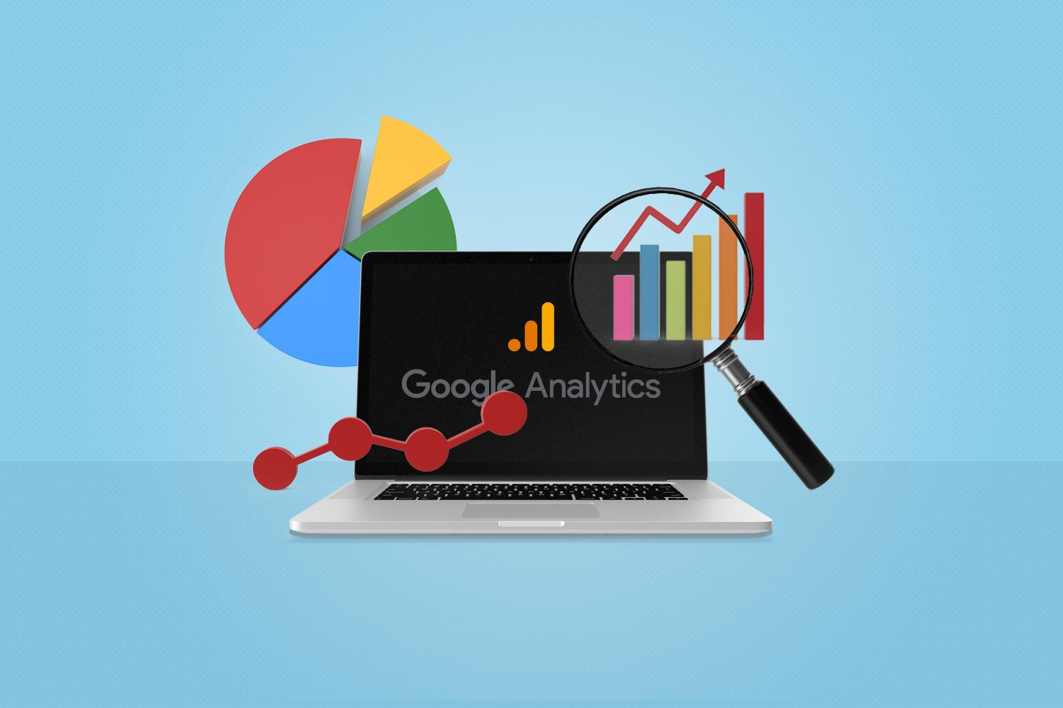

Q&A with Jon Finkel, Magic Champion, On Gizmodo Date Scandal & Alyssa Bereznak

jon-finkel

The Internet was set ablaze on Monday when Gizmodo intern Alyssa Bereznak wrote an essay detailing her OKCupid-arranged dates with Jon Finkel. The reason for the resulting firestorm: in her post, Bereznak harshly leveled Finkel for committing the crime of being a world-renowned Magic the Gathering champion, and not posting that detail in his OKCupid […]

The Internet was set ablaze on Monday when Gizmodo intern Alyssa Bereznak wrote an essay detailing her OKCupid-arranged dates with Jon Finkel. The reason for the resulting firestorm: in her post, Bereznak harshly leveled Finkel for committing the crime of being a world-renowned Magic the Gathering champion, and not posting that detail in his OKCupid profile. (Apparently, being awesome at something played by hundreds of thousands – if not millions – of people is a big turn off.) Magic and non-Magic fans came to Finkel’s defense in droves, and the story has received national coverage.

We recently corresponded with Finkel over email to get his take on the dates, the article, and the world’s reaction to both.

Flightpath: I want to start off by asking if you could tell your side of the story. What was the tone of your dates like with Alyssa? Did she seem upset or angry in person when you revealed you were a Magic champion?

Jon Finkel: They were completely uneventful. Two people being friendly and talking without much of a spark. Unless I am completely awful at reading people, which despite being a Magic playing nerd, I’m not – no one was upset or angry.

Flightpath: I’m kind of curious – for someone who would turn around and write a pretty scathing article about you because she doesn’t like one of your hobbies, how did you actually connect on OKCupid? Did you have anything in common?

Jon Finkel: She seemed bright and was in grad school for journalism, which I think is pretty awesome. When she told me to Google her, I found a heartfelt article she’d written about Ayn Rand and her dad and that sealed it for me.

Flightpath: How did you find out about Alyssa’s post, in which she really kind of eviscerated you just for being good at a game? How did you feel?

Jon Finkel: I rode home with my partner from work. He dropped me off where he usually does, a few blocks from my apartment, and after I got out I checked my iPhone. I had 40 emails from my Magic playing email list alone, laughing about it – being supportive in between brutal mockery – which was pretty much the standard. I definitely got a weird chill down my spine and was thinking, “What just happened?” I think the word I used before was “violated.” When I got home it became pretty clear the Internet had my back, but it still took a few hours for that weird, icky feeling to fade.

Flightpath: Are you surprised at how this thing has kind of caught wildfire on the Internet, and a lot of people have come to your defense?

Jon Finkel: I was very pleasantly surprised. I mean, reading the article, it seems like it would be most people’s response, but it was awesome that before it had really registered on my radar, countless people all over the world already had my back. It’s also nice to know that all the young Magic players still remember an old “retired” player like myself. I’m reading a lot of articles/posts where people seem to think I’m still the champion or the best or going to tons of tournaments, which is not the case, and hasn’t been since 2003. But it’s great to see so many people still care.

Flightpath: Have you had any interaction on the phone or over email with Alyssa after the story blew up? If not, would you talk to her?

Jon Finkel: Nope. I probably would just say, “Whoops.” Clearly this worked out positively for me and not so hot for her. People are really being brutal to her, much more than is necessary. She’s still young, she did something that wasn’t that cool, but in the grand scheme of things it’s really just not that bad, and doesn’t invalidate her as a person or anything.

Flightpath: Finally, are you done with OKCupid? Or will this just go in the “Bad Date” trash heap, and you start again?

Jon Finkel: I’m pretty good at understanding that one event doesn’t really mean that much, and not extrapolating from it to assume the whole world will be like that. I think OKCupid’s a great site. I actually think one of the founders is a PTQ player (semi-pro equivalent) who lives in New York. Maybe he’ll end up coming to play with us sometime. I think I will take a little bit of a break though.

Netflix Increases Prices: Reason to Get Angry?

netflix-increases-prices

Much has been made over the last few weeks about Netflix’s announcement that prices would be increasing: unlimited streaming and unlimited DVDs (one at a time) combined in one plan has gone up from $9.99 to $15.98, or you can get either for $7.99. Netflix was always seen as a trustworthy underdog, cutting-edge and young. […]

Much has been made over the last few weeks about Netflix’s announcement that prices would be increasing: unlimited streaming and unlimited DVDs (one at a time) combined in one plan has gone up from $9.99 to $15.98, or you can get either for $7.99. Netflix was always seen as a trustworthy underdog, cutting-edge and young. The Apple to Blockbuster’s Microsoft. But now, people are mad. Many feel the price increase is too steep, too soon, and with no major additions to the streaming library, too unjust. Has Netflix become everything it once set out to destroy, or at the very least, that we hoped it would destroy?

The reaction online – Twitter, Facebook, news sites, and seemingly everywhere it was covered – was pretty vitriolic. Here are some selections from the Netflix blog (grammar kept in the posts’ original form):

“Dear Netflix,

Individually your DVD and steaming services do not offer enough to justify their expense. As a bundled service they supplement each other and provide the value that made Netflix wonderful. DVDs allowed you to view newer releases in a fairly timely manner. Streaming allowed for viewing of the older catalog of movies that come up when you think of it but might not be worth waiting for to arrive in the mail.

I average 5 DVDs a month. I can replace these rentals with RedBox for $5 and save $3 based on your subscription prices. This replacement would also remove the 28 day wait that comes with most new releases available through Netflix. Likewise, I can replace your streaming service with Amazon Prime and save an additional $2 a month. Again, this would eliminate the unnecessary delay in availability of newer releases.” – Willie Williams

“Dear Netflix,
After 3 years, I’m sorry but it’s over. If I switch to blockbuster I will have a greater streaming selection, with newer movies, plus games, and it will cost me only 75% of your new rates. Its been great, but its over. It’s not us, its you. Enjoy the bankruptcy.” – Adam Lundquist

“You can spin this any way you want, Netflix, but it comes down to simple greed. With limited new content on your streaming service, I will be definitely be canceling that and will probably cancel DVD service as well just on principle. Time to sign up for Hulu Plus! Go ahead and change your name to Blockbuster, because with more stupid decisions like this, it’s only a matter of time before you go by the wayside like they did.” – Anonymous

And now some comments from The Onion AV Club (again, grammar kept in its original form):

“Their streaming catalog isn’t nearly vast enough to justify dropping the physical disc aspect of the service. There’s too much content only available in disc form, including most new releases. People aren’t going to go for a streaming only service until they add more worthwhile content.” – realmike15

“we can start our own company! we’ll call it Webfilmz. we’ll be the little guy at first, pounding the pavement for sales, but with lots of hard work and luck, our plucky company would succeed in bringing affordable entertainment to everyone!

then, once we have the trust of our clients, we can jack up the prices and live like kings! it’s the american dream!” – Or

“I, for one, have decided to switch to gulp Blockbuster Online for Blu-ray rentals and Amazon.com for streaming. You can join Amazon Prime for $79/yr and basically get the same old crap that Netflix streams plus you get free 2-day shipping from Amazon. I’ll still come out a few dollars ahead of the new Netflix rate.” – The Jewish Brad Pitt

My opinion? The price hike is annoying, but it’s no reason to storm the castle in the way we’ve seen. $15.98 isn’t a bad deal for the selection provided; in fact, while it’s 60% higher than what we used to pay, it’s actually still a pretty good deal. I can catch up on Breaking Bad via discs, while at the same time stream every season of Futurama, weird Troma horror movies, and Wet Hot American Summer whenever I want, for less than what I pay for HBO and HBO On Demand? That’s not bad. As Willie Williams mentioned above, I can combine different services to save a couple of bucks compared to this new pricing structure, but A) I’m too lazy for that, B) the convenience of having it all come from one place outweighs the money I’d be saving, and C) I can stream Netflix on my PS3, which I do almost daily. Plus, I still like the company. I don’t think Netflix has gone to the Dark Side yet (I blame the cost of shipping and the movie studios as the main culprits in the price increase) and when this all gets to where it’s going – a complete, streaming library – my hunch is that Netflix will be leading the pack in terms of content and affordability. They’re really the ones who’ve led us this far, and I still respect them for offering an easy, enjoyable alternative to the old ways.

So, I’m still on board with Netflix. Just so long as they don’t remove Futurama from streaming. Then I might have to grab my pitchfork (which is weird that I have one, considering I live in an apartment in Brooklyn).

Facebook Friday: Analysis of Facebook Campaigns – Amex makes online shopping something you can truly Like

Welcome back to Facebook Friday, where we look at various Facebook marketing campaigns and examine what went right, what went wrong, and everything in-between. For this particular analysis we are going to be examining the new offering from American Express (AMEX) that integrates ‘Likes” with online shopping. This is more than just a campaign in […]

Welcome back to Facebook Friday, where we look at various Facebook marketing campaigns and examine what went right, what went wrong, and everything in-between. For this particular analysis we are going to be examining the new offering from American Express (AMEX) that integrates ‘Likes” with online shopping.

This is more than just a campaign in the traditional Facebook marketing sense; this offering is an entirely new platform that integrates “Links, Likes and Loves” with one’s AMEX credit card.

The Campaign:

The crux of the campaign is tying in deals and offers to AMEX cardholders’ social activity.

Users are directed to the application, which is hosted on the AMEX Facebook page.

They then enter their credit card number into the application in order to connect their card. Once the user has hooked up his/her card, an original deals list is populated. This list is based on the user’s Facebook activity, pages they have liked or places they have checked into, as well as the activity of their online “friends.” Over time, the deals being shown will continue to be adjusted based on deals they or their friends may engage or share with, as well as new activity within their Facebook graph.

The Results:

While the campaign has only been running for a week, one success factor has been the amount of buzz it has generated. Numerous articles and postings are being written about this new platform with almost all of them positive. As far as actual impact on the users, I have not seen any data up to this point about enrollments or redemption of deals, so it’s hard to quantify success at this point.

According to monitor.wildfireapp.com, the AMEX fan page has not shown much growth, increasing by less than 1% since the new offering launched. However, most of the consumers who could take advantage of this deal would most likely be active on Facebook and probably already liked the page, so this may not be a fair number to represent success.

What Worked:

  • Buzz Generating – As previously noted, one of the keys to this campaign has been the buzz that AMEX has been able to garner because it is such a new and unique technology. It capitalizes on some larger trends in the online space, including social shopping and deals.
  • Simplicity for the User – The ease of redemption is one of the biggest selling points. The fact that you don’t have to worry about printing a coupon or bother with a code – everything is automatically is taken care of – is huge. This is a big point for not only consumers but also merchants looking to capitalize in the online deal space. I would be remiss to mention that AMEX understands this, and actually launched a program designed specifically for small business to enroll and take advantage of these coupon-less offers. It is called “Go Social” and has tremendous marketing and outreach potential. Now businesses or companies have an easy way to handle these specials, and don’t have to worry about integrating their point-of-sale technology and/or training their staff on redemption methods.

    When a user participates in a deal, AMEX simply updates their statement with the credit that should be received based on the deal the consumer opted into.

Where It May Fall Short*:

*It’s probably too early to say what didn’t work for this campaign. However, I do think there is one hurdle that may seriously hinder this campaign.

  • Privacy – One element of all this that I have not seen addressed in any of the online press for this campaign is the privacy issue. I have to be honest – I was so enthralled with this program that it didn’t even cross my mind. But as one of my colleagues said, “It sounds cool, but I am not sure I would want to give out my credit card to a Facebook application.”

    That makes sense; I still know people who have a hard time handing out that kind of information over to Amazon or online retailers, let alone doing it within Facebook and a third party application. I am not sure if the public is ready for this step or not.

Takeaway:

Regardless if you are willing to give out your information or not, you cannot argue with the “cool” factor surrounding this campaign and the utility that it provides. Being able to be presented with relevant deals based on your likes and interests, as well as that of your social graph, brings new meaning to personalization and is truly a smart way of utilizing social network technology and connections. Knocking down a major barrier related to online deal redemption by making it automatic, and not something a user or merchant has to worry about, should help lift the usage numbers and get more people involved. This could have a big impact on the bottom line of AMEX; in addition, individuals who may not have a card, would be encouraged to get one, because it is the card to have if you are active in social.

Now where is that enrollment link…

Facebook Friday: Weekly Analysis of Facebook Campaigns – Arby’s Chicken Salad Taste-Off

Welcome to Facebook Fridays, our new weekly feature where we look at various Facebook marketing campaigns, and examine what went right, what went wrong, and everything in-between. First up: Arby’s “Chicken Salad Taste-Off” campaign. How do you launch a new product offering to the masses and utilize social media to help you gain buzz and […]

Welcome to Facebook Fridays, our new weekly feature where we look at various Facebook marketing campaigns, and examine what went right, what went wrong, and everything in-between. First up: Arby’s “Chicken Salad Taste-Off” campaign.

How do you launch a new product offering to the masses and utilize social media to help you gain buzz and trial?

Chicken Salad Taste OffWell, if you’re Arby’s, you conduct a taste challenge against a similar offering. So was born the great “Chicken Salad Taste-Off,” which pitted Subway‘s Orchard Chicken Salad Sub against Arby’s Market Fresh Grilled Chicken & Pecan Salad Sandwich and Wrap. (We know which sandwich wins for Most Unnecessarily Long Name. Are you supposed to say, “Yes, I’ll have one Arby’s Market Fresh Grilled Chicken & Pecan Salad Sandwich and Wrap,” every time you order one? But I digress…onto the ins-and-outs of Arby’s Facebook campaign.)

The Campaign:
1. Like gated coupon was given to consumers for the new offering from Arby’s.
2. Consumers were encouraged to try both sandwiches and return to the page to vote for the one they liked best.
3. In order to encourage voting, Arby’s partnered with Share Our Strength’s No Kid Hungry campaign and pledged to donate $1 per vote, and up to $25k, to the charity partner.

The Results:
The campaign recently ended and one of the most glaring results was that Arby’s was unable to achieve their goal of 25K votes. The total vote count, according to the Facebook page which housed the application, was just under 10,000. The good news for Arby’s, however, is that their sandwich did receive over 80% of the votes, making it the clear favorite. (Big Surprise there.)

The impact on the page does seem to be pretty significant, with the total number of Likes increasing by 58% from 323,600 to over 510,000 in just the 12 days the campaign was active (according to monitor.wildfireapp.com).

What Worked:
There are a few significant things that worked about this campaign:
Simplicity of offer: A Like gated coupon is a great way to help build a fan base. It is simple for a user to do, and also gives them a reward for this simple action.
Buzz worthy: Arby’s could have easily designed a landing tab for the coupon and any new fan who liked them would receive the coupon, but left out the challenge aspect of the campaign. By throwing down the gauntlet and directly challenging the competition they created significant buzz around the event.
Support: Arby’s also conducted a blogger outreach campaign to coincide with the launch and pushed the story through traditional media as well. This integrated campaign promotion helped drive the results.

And ultimately, the huge increase in Likes was a big win for Arby’s. That alone makes the campaign a success from a marketing perspective.

Where It Fell Short:
The campaign was successful by most measures in helping to drive awareness and trial of this new product, but where it was lacking was in the continued interaction they were requesting from the consumers. To ask someone to not only visit for your offer once, but then return and re-engage, is a tough task for any brand and one in which Arby’s missed the mark.

Takeaway:
The biggest takeaway is to make sure your goal is tied to a simple action from your fans. If you make things too complicated or ask them to take multiple steps, you will naturally decrease your conversion rate, as you lose those who just don’t have the time to complete the second action. By trying to tie your end goal to a single simple action that a user can take, you are more likely to increase your conversions and the engagement with the brand.

Royal Wedding 2011: Our Favorite Tweets

Today, William and Kate were not the only ones to mark a new beginning. It was truly the coming out party – the “marriage” between traditional media and social media on a world stage, and the results were smashingly brilliant. (Sorry for all the British/marriage puns. We can’t help ourselves.) The social event of the […]

Today, William and Kate were not the only ones to mark a new beginning. It was truly the coming out party – the “marriage” between traditional media and social media on a world stage, and the results were smashingly brilliant. (Sorry for all the British/marriage puns. We can’t help ourselves.)

The social event of the century was easily the biggest social media event in history, and Twitter in particular became the go-to destination for discussion, jokes, and opinions. Here are some of our favorites, illustrating how Twitter is home to all different tones and modes of thought, all equally valid, informative and entertaining:

Royal Wedding 2011 tweets

What were your favorite Tweets? What did you think of the ceremony? Amazing and romantic, or over-hyped and boring? Tell us!

Digital Debate: Media Convergence on One Screen

twitter on television

We here at Flightpath usually get along pretty well. We’re all interested in digital media, technology and how the two continue to change and evolve. We go out to lunch, get drinks, and generally enjoy each other’s company (except for that one person here…). Occasionally, however, we disagree on things (Jets vs. Dolphins, Birch vs. […]

We here at Flightpath usually get along pretty well. We’re all interested in digital media, technology and how the two continue to change and evolve. We go out to lunch, get drinks, and generally enjoy each other’s company (except for that one person here…). Occasionally, however, we disagree on things (Jets vs. Dolphins, Birch vs. Stumptown (both awesome local coffee houses), Brgr vs. New York Burger, etc.). You know how it is.

Today, we’re having a “Digital Debate,” where we’ll offer two opposing views on an issue in the digital world. You decide who – if anyone – is right. In this sparring match, it will be “Smokin’” Social Media Strategist John Whitcomb vs. “Dashing” Digital Marketing Associate Dan Brooks.

The topic: Will there be a one-screen future featuring the convergence of television and Internet interactivity?

John:

As I watched the Oscars and followed my Twitter stream, it got me thinking about how far technology has come. It was amazing that I could connect to other viewers from all over the globe just by searching for a certain topic or hashtag, such as #Oscars or #TheOscars.

My vision of the future, meaning three to five years from now, involves one of convergence. Instead of having to watch one screen and have another to connect to my friends’ opinions on Twitter with my laptop, I will be doing both at the same time on one screen, plus a whole lot more.

Let me indulge you for a minute and so that you can visualize exactly what I am talking about (and make it easier for you to agree with me). It is the year 2014 and you are just settling down for your interactive Oscar experience. You turn on the TV and tune it to your desired channel. Next you bring up your Twitter and Facebook streams and start following the conversations. Since you are a huge behind-the-scenes fan, you have also just downloaded to your TV the behind-the-scenes app, which lets you watch exclusive video that is not available to the general public.

You continue watching the show, participating in the live Facebook chats with the winners and voting in all of the audience participation questions. You change the camera view so you can get a glimpse of the audience, and by clicking on one of the audience members you are instantly greeted with their bio (in case you forgot who they were).

Some of this is already possible, and this year at the Consumer Electronics Show, “Connected Televisions” were one of the largest draws behind, of course, the Tablet craze. But I really do think that this isn’t that far off and we no longer will have to choose between devices, but will have all the options that we currently have on multiple devices on one screen. Oh yeah, and did I mention that this viewing of the Oscars takes place after you have eaten the dinner prepared by your robot butler?

Nice vision, right? Top that, Danny Boy!

Dan:

John is wrong. THE END.

Just kidding. John brings up a good point in that many forms of media have been mixing and converging over the years. Our cell phones are no longer really phones; they’re music players, texting machines and mini-computers. Laptops are recording studios, DVD and movie players, and stereos. But I’m hesitant to lump TVs into this category, especially when it comes to Internet/Twitter/interactive functionality. The reason? The technology to incorporate interactivity and/or the Internet into the television viewing experience has been around for years; it’s been tried, and it’s never worked.

The biggest hindrance to web surfing on television has always been that the web just doesn’t look that good on TV. It’s the same as retrofitting a web site onto on iPad – it doesn’t work. The resolution is terrible and no one likes zooming in and out. Also, with web content on television, it’s really just no fun reading from your couch, which is usually pretty far away from the screen. In addition, no one seems to want a keyboard lying on their coffee table. (And who wants to use a remote to type on the TV? As a gamer, I hate typing messages on the PlayStation Network with my controller, and rarely do I or any of my friends write anything to each other short of highly intellectual quips like, “You suck.”)

But aside from that, even when media companies have tried to introduce web interactivity to TV, it’s been rejected. Remember the great WebTV craze of ’96? You don’t because there was no craze – no one wanted it. Yes, G4’s Attack of the Show does feature some onscreen Twitter messages from viewers, but this is a niche show geared towards tech fans. They’re low-hanging fruit.

And forget Internet or Twitter functionality; this is really all about interactive television, and there’s a vast graveyard filled with failed attempts at interactive television. There was Qube, Videoway, and Time Teletext, among countless others (see Fordham University Professor John Carey’s excellent paper on Interactive TV for more info). They all offered early versions of things that are now routine on the computer – banking, games, brief text news updates – and all were ultimately rejected or failed to make it out of their test markets.

My feeling is that the big change to how we watch TV in relation to the Internet was the adoption of laptops into the living room. Watching the Giants blow a three TD lead in the 4th quarter against the Eagles and want to see if any team has ever choked this badly? Turn right to the laptop and try to find out. (I’m a Jets fan, by the way.) Want to see what people think about Anne Hathaway’s supremely annoying “Woo!” yelp after every introduction during the Oscars? Check the laptop. Just watched a weird Korean horror movie sickly recommended by your boss that you can’t unsee and want to seek professional help? Open the laptop.

I will, of course, acknowledge that there already has been tremendous convergence between television and the Internet. There’s TV content on the Internet, and the TV experience has become more web-like, with Video On Demand, interactive menus and time-shifting via DVR. But I think this might be as far as it goes for TV meets the Internet because ultimately, TV is a passive experience. It’s a one-way street, where you turn it on, sit back and watch. It’s designed to work that way and nothing has ever been able to completely change that.

Checkmate, Whitcomb!

P.S. I have no idea who added that link to John’s “Nice vision” line. No idea AT ALL.

iPhone App Upgrades and Evolving Perspectives

Does the world need really another app?  That’s like saying does the world need another year of new car models.  Hybrids and electric models, yes. All those others, probably not. And if it were left solely up to me, we may still be living in caves, drawing wooly mammoth silhouettes on rock walls and commuting […]

Does the world need really another app?  That’s like saying does the world need another year of new car models.  Hybrids and electric models, yes. All those others, probably not. And if it were left solely up to me, we may still be living in caves, drawing wooly mammoth silhouettes on rock walls and commuting with our v1.0 legs and feet.  It’s not that I’m anti-progress, it’s just that I fall on the necessary side of purposeful innovation.  But new functions and features keep the game exciting and interesting.  And “purpose” can really be as simple as improved design that connects people on a deeper emotional level. These ideas give me a new frame of reference, and this week’s work of brainstorming and planning an upgraded iPhone app has forced me to rapidly evolve my perspective.

The learning curve has been more of a slippery spiral, and what I bring to the table is insight into customer feedback, particularly how the consumers feel about the current application. Valuable, yes. Technologically relevant, not so much. I’ve spent the majority of meetings jotting down tech-jargon to look up on my own, so as not to slow progress. In between, I’ve tried to address my knowledge gap with various industry articles, including the especially helpful App Development 101 for Marketers. But I get hung up on all those little moving parts, features and functions, and the endless possibilities for the end product. It takes all I have to repress a childlike curiosity that wants to stop and ask—can we make it spin and sparkle, too?

Integration adds another level of complexity, too, because you can’t just develop an iPhone app. That’s boring and totally misses the point. Consumers  are highly evolved and now expect constant engagement. Everything needs to be connected: desktop site, social media, and other mobile sites and apps.  Keep everything cyclical, allow for seamless integration, and you have something consumers will actually use and enjoy. Segment your offerings and risk looking like a digital throwback.

A clear blue horizon appears when the big decisions are made.  Once the foundational requirements are set for functionality and integration, possibilities narrow, and logic shines down to illuminate a path through second and third-tier requirements.  With this release and relief comes loss, and you have to say goodbye to some of the spin and sparkle—farewell to the geo-targeted pet-dating feature that syncs with Facebook. Soon, you have a plan for fully formed upgrade that’s shiny, new, and ready to be pitched.  I’ll admit that most of the technology is still magical to me, but I know where I contributed and how/why that shaped the features proposed for the upgrade.

This type of work is challenging and exciting. If you keep your eyes and ears open, you learn so much about the problems your colleagues are trying to solve and how your work fits into the big picture. You also walk away with a better understanding of the medium, and in my case, an evolved outlook on purpose within the development cycle.  Having a better grasp of the possibilities and limitations proves to be immensely valuable when writing for apps and the mobile web.

Happy Hug-a-Days! HomeAgain Brings the Holiday Cuddle to Facebook

We are a little over halfway into a holiday-themed Facebook photo contest that we created for our pet microchipping client, HomeAgain. The results to date are very encouraging—impressions, entries, likes, etc., are all way over-performing. But this blog is not about numbers adding up, though it is about sharing a story of success, even before […]

We are a little over halfway into a holiday-themed Facebook photo contest that we created for our pet microchipping client, HomeAgain. The results to date are very encouraging—impressions, entries, likes, etc., are all way over-performing. But this blog is not about numbers adding up, though it is about sharing a story of success, even before the end of it. Now before you hang up, out of a pending feeling of self-promotion disgust, let me fill you in quickly why we are sharing this story now and hopefully convince you to hang long enough to feel the hugs.

It’s a true story of the holidays. Not a commercial story, not a BOGO story, not even a 60% savings story, but a brand essence story that is all about this time of year. You see, if we waited to tell this story after the New Year, the season to tell you about love, devotion, and great hugs would seem so yesterday. So now is the time, before all the data has been collected, parsed, and analyzed—and clearly, even before our client would ever allow us to share anything.

HomeAgain is a special brand, as it really does special stuff, like helping about 10,000 lost pets a month return home. They aren’t called HomeAgain for nothing.  So how do they get 10,000 families every month to thank their lucky stars and willingly shout out about that feeling of thankfulness?  Through two very important things they do: 1. permanently identifying a pet and linking it to its pet parents through a small piece of technology called a microchip, and 2. providing and enrolling pet parents in an annual service filled with pet protection and recovery benefits.

This year, for the holidays, HomeAgain decided to do something different to spread the cheer. And with our help, they created a sweepstakes campaign on Facebook that celebrates pet/pet parent love and devotion.  Happy Hug-a-Days asks people to enter a holiday “hugshot” of themselves and their pet engaged in a heartwarming, day-lifting, and life-affirming hug. The results have been far greater then we initially hoped for, as we work a transparent social media platform to achieve its most natural end—to create and share joy. Having a client that’s ready and eager to take these new media “risks” is the great catalyst for innovation. We aspire to inspire and, quite literally, live for these opportunities. So thank you, HomeAgain, for being so damn huggable!

My desire to do this blog has nothing to do with sucking up to our client, though I do run the risk, but I have been guilty of worse.  It has all to do with what we, at Flightpath (and many other digital shops), love most: getting deep into the human reality of today’s social and digital landscape. Consider HomeAgain, who may have started in the technology business, but that business clearly became way more and about the human-animal relationship, than simply the product they sold. Same with us programming, production, and digital marketing “creative types.” We all started somewhere else in the business, but have mostly all come back to the human-most side of why we do what we do.

So here we are, at the one time of year when hugging co-workers and pals is not only allowed, but expected, maybe even celebrated with a chest bump or low five.  It’s the holidays, and if you’re in the pet protection business or the digital agency “human protection” business, then this is our time of year! And psst, if you have a furbaby, be sure to enter the Happy Hug-a-Days contest on Facebook today. The world always has room for another good hug.

Lowe’s Black Friday Facebook Sneak Peak Party Takeaways

Black Friday is the biggest shopping day of the year.  People wake up early from their food comas and rush to the big retail stores in the hope of scoring a great deal. But why wait until November 26th for special deals? Lowe’s Home Improvement realized this and leveraged Facebook to run a promotion called […]

Black Friday is the biggest shopping day of the year.  People wake up early from their food comas and rush to the big retail stores in the hope of scoring a great deal. But why wait until November 26th for special deals? Lowe’s Home Improvement realized this and leveraged Facebook to run a promotion called “Lowe’s Black Friday Sneak Peak Party.”
Lowe’s idea was to get Facebook fans to RSVP for the event a week before and get the buzz going.  Then, starting November 5th at midnight, customers waited for Lowe’s to post links to 90% off coupons on various products on their website.  There were thousands of coupons available for the duration of the event, so if you acted fast, you were bound to get a deal.

Being the avid shopper that I am, I RSVPed for the event but actually forgot about checking in at midnight to see what offers were up for grabs.  Turned out to be a good thing, because later that day, I found a stream of negative comments on Lowe’s Facebook wall.  Apparently, at midnight on Friday, 11/5, Lowe’s Black Friday Sneak Party kicked off according to plan.  Then, the first deal for 90% off a KitchenAid stand mixer went up, causing hundreds of shoppers to rush to lowes.com.  That first wave of shoppers caused the site to go down.  And not only that, but Lowe’s did not post the coupon code promptly after announcing the deal, leaving users impatiently waiting and confused.  Another big slip-up was Lowe’s not sticking to their word by posting deals when they said they would, leading to more than 1,000 angry comments on their Facebook wall.

How the promotion failed

A great campaign can easily go sour if not executed properly.  Here are a few hiccups that made anticipated fun turn into a harried ordeal.

  • Lowes.com went down when people were in the middle of the checkout process
  • Confusion on how to get the deal, e.g., Is that automatically added to the cart? Will Lowe’s post the coupon code? When will the code be posted?
  • Lowes.com Facebook and Twitter messages were not in sync
  • Facebook messages were not timed right:
    • Lowe’s said they would post a code within 20 minutes; it took close to an hour
    • Over 1600 comments were posted by frustrated fans who sat at their PCs constantly refreshing the Facebook page to see if the code had been posted

How to do it right

From my past experiences as a shopper, and working on many client websites, here are some tips to take into account when launching a promotion:

  • Be prepared: Account for a surge of traffic which will tax the webserver
  • Be honest: Don’t post misleading information
  • Be timely: Sync your Facebook posts and tweets; you don’t want to confuse your customers
  • Stay in touch: If you are having issues, let customers know right away
  • Set expectations: Disclose the time the promotion will be announced and stick to it
  • Control backlash: Find a way to manage the anger from people that felt entitled to win and didn’t, or they’ll overshadow the happy winners

Social media platforms are a viral medium.  People spread the word on good experiences and bad ones, too.  So even if there is a bad experience, try to turn it around.  Acknowledge you slipped and make it up to the customer.

From this Lowe’s promotion, I did not get the 90% off coupon that I originally wanted, but I received a consolation prize of 20% off a specific product.  And I received $10 off my purchase.  Was $10 worth my time?  Maybe not.  Will I participate in another Lowe’s promotion?  Probably, but that’s up in the air, too.

Five Tips to Make a Facebook Wall Post Communicate

Almost anyone’s Facebook wall is a torrent of posts and comments flowing forth at a pace that would make the fastest stream-of-consciousness poet dizzy. And it’s not merely that it’s a stream-of-consciousness medium, but rather, that it’s a stream-of-many-consciousnesses medium. So how does your brand keep up? How do you break into that fluidity and […]

Almost anyone’s Facebook wall is a torrent of posts and comments flowing forth at a pace that would make the fastest stream-of-consciousness poet dizzy. And it’s not merely that it’s a stream-of-consciousness medium, but rather, that it’s a stream-of-many-consciousnesses medium. So how does your brand keep up? How do you break into that fluidity and actually communicate?

It’s easier than you might think, but you may have to change or break free from your normal (comfortable) communication style. Being successful with Facebook wall posts requires that you learn some new rules and abandon that me-brand, you-consumer mold. Here’s a few tips to help you get started:

1. Start a conversation. The biggest reason anyone comes to Facebook is for social interaction, so give your fans what they want. Introduce yourself and open up the lines of communication. Start asking questions your fans want to answer. Try asking lifestyle questions, which are much more effective for rallying fans around a brand, instead of direct product or service questions. And get ready to take up the art of active listening.

2. Use their lingo. This requires some study, but the payoff in comments and conversations is well worth it. Scout your own page and learn how fans are talking to each other. This is about both the style of communication as well as the exact vocabulary used. Visit similar fan pages and take notes from pages with lively and active feeds. Just like in real life, it’s much easier to talk to someone who’s on your level.

3. Keep it short. When you have less than 10 seconds to reach your fans, less is undoubtedly more. Opt for short sentences and get right to the point. Don’t worry about being high-brow or wordy. One-sentence posts are actually preferred. Just looking at a short paragraph of text tells readers they have to invest time in reading and responding. That’s a big turn-off to busy social butterflies. It’s better to craft hard-hitting one-liners, so people know right way if they’re interested.

4. Give fans the spotlight. Even though Facebook is social, it’s undeniably a “me” medium, and you’ve got to let your fans have their time under the big lights. Almost everything you post needs to be about them, or they’re just going to find another page that meets their personal-social needs. Keep people on your page by constantly asking for their feedback and contributions. Transform them into resident heroes, sages, entertainers, and comedians, and you’ll build a real community.

5. Broadcast only when necessary. Your business or brand undoubtedly has some news or information that’s important to share with fans. Shout out about those happenings, but limit these posts to the types of announcements which are truly relevant and interesting. A constant broadcast of your brand and its accomplishments, services, features, or benefits runs the risk of boring and alienating fans.

Live Matrix for What’s When on the Web™

This post won’t change your life, but Live Matrix might. Created by a former SVP at TV Guide and a pioneer in semantic web technology, Live Matrix promises to keep you updated on What’s When on the Web™. In a nutshell, it’s a grid of all the live upcoming events scheduled to happen anywhere on […]

This post won’t change your life, but Live Matrix might. Created by a former SVP at TV Guide and a pioneer in semantic web technology, Live Matrix promises to keep you updated on What’s When on the Web™. In a nutshell, it’s a grid of all the live upcoming events scheduled to happen anywhere on the internet, so you’ll never miss a beat—or a Gilt sale.

Like everything else these days, users create a custom profile and “follow” content channels that interest them.  I signed up yesterday, and currently, I’m following Wired for Wine, Mingle Media TV, G4 TV, The Indy Radio Factor, Gilt Women, and FORA.tv.  There have been some hiccups in this Beta version, such as unreasonable “account suspension” and the profile photo upload appears not to be working.  Little things like that are expected, though, so I’m not holding it against them.  However, as of right now, the whole site seems to be a little bit of an over glorified QVC timetable, as the majority of happenings revolve around product sales, reviews, and web infomercials.  That, too, I’m willing to let slide for awhile because, honestly, this whole idea is a beautiful step forward for the future of intelligent content streaming, channeling, and scheduling on the internet.

It’s refreshing that someone is wrangling up what’s useful on the web and organizing it in a practical way.  And as content improves, which it undoubtedly will, Live Matrix stands to become really, really important to daily life.  My best-of content scenario includes intelligent news hubs, niche lifestyle channels, and maybe even the return of music videos. I know that all of these things do exist out there on the web, but to have them aggregated, scheduled, and frequently updated is something truly advantageous.

There’s a “Face Time” for That! How “Face Time” Changes Everything!

Apple has changed the way many people do business and do living. But most of what Apple has done is show what we were missing, when we had no idea we were missing it. It is Steve Jobs’ genius to be able to create need (and sell that need) as part of the human condition. […]

Apple has changed the way many people do business and do living. But most of what Apple has done is show what we were missing, when we had no idea we were missing it. It is Steve Jobs’ genius to be able to create need (and sell that need) as part of the human condition. Most very successful and ultra creative people become wealthy filling a need in the marketplace, Mr. Jobs is of the rare few able to cultivate need time and time again.
But the need I believe Mr. Jobs intentionally (or unintentionally) brought to life is the need for more interpersonal, inter-business “face time”, but not of his making. Not magically on his iphone4 when connected to another one or even played out via Skype, but real human face time in the same room at the same time. Why? Because we are people, at least most of us reading this, and people- especially emotionally connected ones- connect to other people’s vibes and other people’s visceral output. It’s true, human’s secrete emotional juices when they are excited about an idea and/or about other exciting stuff- can we agree to just leave it at that?!
Given secretion happens, one would think that THAT alone should get any selling or client presentation situation away from Go 2 Meeting time, let alone email it in time, to some face time. But it is so easy not to think of the difference, not to believe being in a real room at the same time could make all the difference in the world in connecting on a human and big idea level. We’ve made it too easy to ignore our human-ness and even easier to buy into our technology enabled plug-in anywhere pluggins!

I am glad our agency has bought into the power and potential to make “meeting in human” whenever possible (and whenever cost smart, time smart) as a better way to do business. We know our client’s see the potential of “real face time” meetings when ideas go from the screen to a sketch (or ipad) to a full blown and totally spontaneous brainstorm. It’s like the truest form of emotional currency taking over and creating a world of its own.

Real time, real human meetings create the unscripted reality that other forms of information sharing just can’t.  It is just this “serendipity” that often gets lost not only in translation, but totally today.  So to be more relevant to your clients and to the creative and digital world we inhabit today, make the effort to make it real- whenever you can.

You’ll be glad you did!!!

Flightpath’s Maiden iPhone App Brings Lost Pets HomeAgain

At Flightpath, we often talk about our “constantly evolving skill set” and how things in the digital world are changing all the time. With that spirit in mind, I’m pleased to announce the release of our first iPhone App, developed on behalf of HomeAgain, the leading national pet recovery service from Schering-Plough Animal Health. The […]

At Flightpath, we often talk about our “constantly evolving skill set” and how things in the digital world are changing all the time. With that spirit in mind, I’m pleased to announce the release of our first iPhone App, developed on behalf of HomeAgain, the leading national pet recovery service from Schering-Plough Animal Health.

The Pet Rescuers app enables users to reunite lost pets with their owners. It has an interactive map of lost pets in their area, plus detailed pet info including photo, name, microchip number, and area last seen. Snoopy and the Peanuts gang help tie it all together with friendly messaging and fun graphics.

You can view a quick demo here or read more about in this story from USA Today.