Currently Viewing Posts in Design and Delight

Goals for Better Collaboration in 2021

It’s a new year, and that brings a great opportunity to assess workflows to better serve company objectives. There could easily be an article dedicated to each step of a project’s process, but this take is more of an overview to getting the best results and design executions. 

Many mistakenly try to problem-solve from the start. To put it simply: companies often fall in love with the wrong solution. For example, a company could come to us and say, “We need to create an app to grow sales.” But is an app the best solution? Could something else come from collaboration?

Assessing past workflows

Our company, as with many worldwide, was forced to pivot in our collaborative process when offices shut down due to the pandemic. What was working with our workflow in February could not entirely be applied to any workflow we’ve had the remainder of the year. For us, that meant our collaborative thinking and whiteboard scribbles within a brainstorming meeting had to be processed through more cloud-based systems. 

Fortunately for our teams, we had already been working in many useful systems, including Google Drive, Invision and Slack. Assessing, and changing, workflows can be a delicate balance. At one point it is good to let your team get a feel for a system and how it works best for them, but if something new comes along that works better it’s important not to ignore new processes or programs because you’ve fallen into comfortable habits. 

Finding new processes

This isn’t just about programs or cloud-based needs. Although we’ve looked into other creative ways to share, like Jamboard or Microsoft Teams, we have also evaluated and updated the types and frequency of meetings to allow for a collaborative environment while we work remotely.

The end goal of your process should be to create an open space for the strongest collaboration. This leads to more creative thinking and better strategies overall. Thinking in this way, it’s also important to use cloud-based systems that are easily accessible to everyone, be it your internal team or clients that are part of the initial process. 

Even within programs, taking advantage of all that is offered can really boost collaboration. Don’t just use Google Spreadsheets to track projects, take advantage of the comments feature to tag and assign tasks, track changes, or update notifications so everyone is aware of new and changing ideas. 

Collaborating with clients

Client collaboration can be very impactful, but is not always within scope. This may be due to client needs, project timelines, or other reasons. But whether or not a client is included, it’s helpful within the process to hone the big ideas into one focused direction. 

If a client is included, this can mean analyzing feedback internally to find that focused direction. Or it could include simple artboards or design concepts to allow everyone, including the client, to be on the same page with next steps. 

In the end, better collaboration begets better strategy. And both of those lead to the best outcomes, designs and executions for every project.

Fundamentals of Data Visualization

Multiple examples of data visualization to help guide users through information.

Visualizing information can seem like an easy fix for any piece of content: simply add an image to the copy and voilà, your job is done. And while it is possible to think in those simple terms, it takes more strategy and depth to visualize data in a way that really draws the reader’s eye, helps them process your information quickly, and keeps them wanting to learn more. 

Thinking about what type of data to visualize or leave as text, and how to visualize, takes into considerations these questions:

  • How much time does a user have to look at the information?
  • What is the value in adding a chart, icon or other visual? 
  • How complex is the information/can it be simplified? 
  • How can the data best be portrayed to keep the viewer interested? 
  • What type of visual will best lead the eye to important parts?

These needs and values can vary depending on who your audience is and how summarized or detailed they need the data set to be. For example, one of the sections below features information for medical professionals, and the other for pet owners. Veterinarians may need, and be interested in, a more detailed chart, whereas a pet owner would digest the same information in a much simpler graphic. Here are a few examples of visualizing data:

Infographics

This is the most simple way to visualize. While some infographics are used simply to keep interest on a page, they can be formed in a way to quickly visualize numbers, or a change in data. This is a great tool when larger graphs or other ways will not fit. 

Example of infographics

It is also possible to add branding to an infographic. This example gives the audience a quick visual of the number highlighted, while at the same time using branded graphics and design to make a deeper impression. 

Example of infographics with branding.

Simple Visuals

Taking infographics to a step above, visuals can be created to share small amounts of data or facts in a way that is easily digestible. Many times these visuals can be accompanied by the fact within text, giving audiences two ways to remember the information. 

Color Coding & Imagery

For large amounts of data, visualizing with colors and recognizable imagery can help people sort complicated information in a faster way. This chart was used to convey a long-term schedule with multiple data points, using colors and icons that could be quickly recognized and cross-referenced to other areas within the website, and product labels, to reiterate importance. 

Example of color coded imagery.

Interactive 

Motion or user-led interaction can simplify or complicate your data, and a good strategy should be in place anytime this type is chosen. When used properly, interactive visuals can keep users fixed on a certain data point for longer than with a static image. This can also help with data recall and other positive communication points. Even though creating these visuals may be more complicated, the end result should feel simple and user-friendly. 

In the example below the date slider at the bottom allows users to see Dog Flu grow within states in a simple way, whereas plotting every case with a dot would have overwhelmed the visual with large clusters, and the point of the visual would have been lost. 

Example of interactive visual data.

When choosing visuals to use, keep in mind all of the options and your audience needs. There isn’t a one-size-fits-all way to visualize. Especially in cases where large amounts of data are included, mixing types can help keep the reader interested. Even text callouts can be just as useful in highlighting data, and may be exactly what the audience needs.

The New Flightpath.com is Live

As a digital agency that seems to always be working to capacity, it was somewhat of a struggle to get this all new Flightpath site launched (it’s the old story of the shoemaker’s children with holes in their shoes). But while we still shake out a few small lingering issues, I wanted to take a […]

As a digital agency that seems to always be working to capacity, it was somewhat of a struggle to get this all new Flightpath site launched (it’s the old story of the shoemaker’s children with holes in their shoes). But while we still shake out a few small lingering issues, I wanted to take a minute to note and appreciate the achievement.

We started with a competitive analysis – reviewing the best sites from the best digital agencies all over the world. Then, we thought long and hard about the story we wanted to express at Flightpath.com. Who are we as an agency? What are our core areas of expertise? What work did we want to share with visitors? How could we attract the best candidates for jobs here?

The SEO analysis, copywriting, design, video production, coding and QA stretched out over a considerable period of time but we always kept our eye on the ball. Contributions came from all over the agency. We’re super-proud of the end results and are already seeing our search rankings rise in Google as we bring our ‘soft-launch’ period to a close.

Of course, we realize that the launch of a new website is only the start of a storytelling arc and we’re already thinking of ways to change, enhance, improve and grow the site. Meanwhile, I’d like to express many thanks to our awesome clients who are a big part of the Flightpath story and kudos and congrats to the pros on our team on a job very well done.

Future of Web Design NYC 2015: Some Takeaways

Flightpath has been sending team members to the Future of Web Design Conference for many many years now. We returned this year for a couple of days of education and inspiration. As our team tends to keep up-to-date on all the new design trends, this conference is not so much about learning something brand new […]

Flightpath has been sending team members to the Future of Web Design Conference for many many years now. We returned this year for a couple of days of education and inspiration. As our team tends to keep up-to-date on all the new design trends, this conference is not so much about learning something brand new but inspiring us to implement new ideas by hearing about things others are actively doing, in person. I have always found that the folk presenting at FoWD not only “talk the talk” but they “walk the walk.” and have the battle scars to prove it.

Every person takes away something different from these conferences, but in general, here are some of our takeaway lessons:

Everything About the Future is Now

Before we can even get into the specifics, ask yourself: are you trying to be different? Do you believe you’re doing everything you can to put out the best product? Whether you’re on the design, or coding, or management team, are you continuing to do things the same way that you did yesterday, or are you looking ahead and embracing new changes? We all find comfort in consistency and routine, but chances are you’re missing out on something big, new, or even better. Adaptive designers should find comfort in flexibility and in knowing that the future of web design is here; we just have to be willing to embrace it.

Collaboration & Ownership

Staff your projects with team members who truly collaborate across all stages of the project. A sense of belonging and ownership should permeate through each person. Use software that provides teams with a single platform to communicate, track and share ideas on. Collaboration should be present throughout the entirety of any project. Encourage ownership by fostering the philosophy that everyone’s ideas – good or bad – can offer value.

Design and Prototype in Code

While static mockups may have a place at the very beginning of a design phase, very soon in the process, still comps become inadequate to demonstrate to stakeholders – and more importantly testers (see User Testing) – how things work from a dynamic, interactive and multiple screen-size perspective. Flightpath designs experiences that are unique for the user from device to device. Static mockups fail to demonstrate these diverse interactions during the critical design phase. Web designers should never sit idle or wait for visual QA to find inconsistencies or inaccurate excecutions of the original designs. For design teams whose designers don’t code, provide a system in which they can learn and have hands on experience with coding. Think of Photoshop, Sketch, etc. mock-ups as mere design concepts that you can flush out and iterate as needed in code.

User Testing

Everything we do is to serve the user. Business goals, stakeholder opinion, designer intuition, etc. mean nothing if the users don’t understand the interface or believe there is an easier solution to their task/problem. As much as possible, include user testing throughout the process of designing a project. Even a half an hour of user testing a week can go a long way to hone design decisions. Experience can only take you so far, and relying only on designer experience, with or without client input and direction, will increase your risk of missing the best option or even risk the failure of the design entirely.

Minimum Viable Product

“Less is more” is an adage we often use, as we find apps and sites are frequently ‘over-featured’ to the point they are very hard to use. Try to design, build and release product in iterative fashion. Arrive at something that is a minimum viable product (MVP), ship, get feedback and iterate. A minimum viable product doesn’t have to be weak – in fact, it ought to be good and useful, but it doesn’t have to do everything.  Trying to “bite off” too much at once often results in a compromised or over-complicated product which takes too long to release often with features that were unnecessary.

Even more than for learning about new ideas and techniques, we find these conferences are an excellent place to find a wake up call. When we take home ‘homework’ and scrawled notes about new things others are doing, we come back to the workplace inspired not only to employ the new strategies we’ve learned, but to build on them, and continue to adapt and improve our approach to design.

Fundamentals of Responsive Website Design

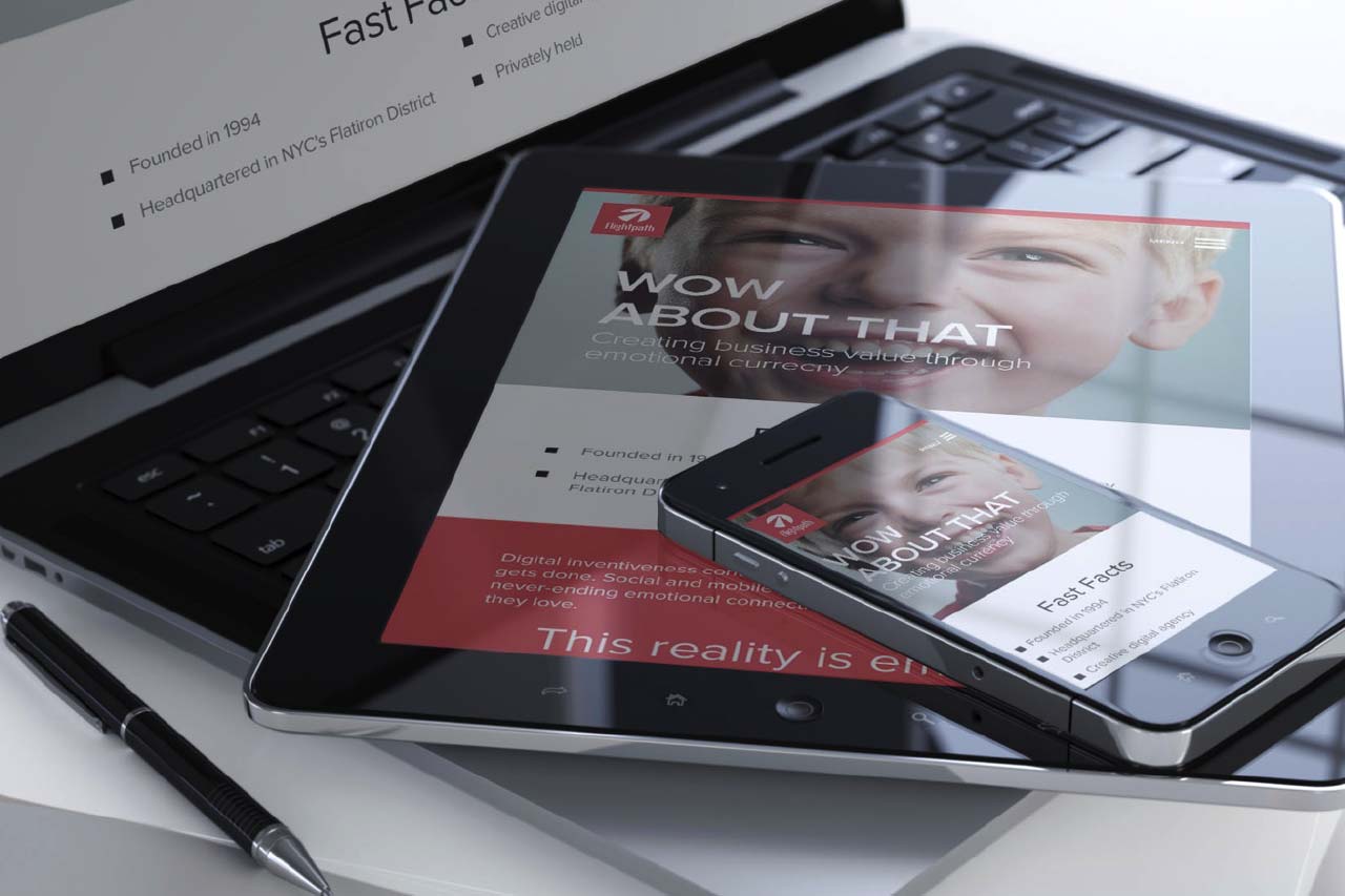
As you probably know, Responsive Web Design (RWD) delivers one website, with one code base, to a multitude of devices from laptops to tablets to mobile phones. At Flightpath, we get so many questions from clients and potential clients about responsive website design these days that we thought it would be a good idea to […]

As you probably know, Responsive Web Design (RWD) delivers one website, with one code base, to a multitude of devices from laptops to tablets to mobile phones. At Flightpath, we get so many questions from clients and potential clients about responsive website design these days that we thought it would be a good idea to briefly summarize some fundamentals and best practices.


Responsive Web Design Benefits


  • Better user experience by supporting a wide range of devices, particularly mobile
  • Better Google search engine ranking – With Google’s recent mobile-friendly algorithm update, websites that are responsive have a higher likelihood of ranking higher than desktop-only
  • Easier and cheaper site management compared to maintaining separate desktop and mobile websites


Responsive Web Design Conventions


  • RWD utilizes flexible images and media atop fluid grids that ebb and flow with a devices’ screen size
  • Major “breakpoints” are established to allow a design to adapt and optimize better to certain screen widths. Typical breakpoints are as follows:

 Screen Shot 2015-09-24 at 11.02.23 AM


Responsive Web Design Creative and Production Considerations


  • A non-responsive site cannot be simply “converted” to a responsive site.
  • The code framework is entirely different
  • Non-responsive website design elements will likely not work well on small screens
  • To start, website content and design should be developed with smaller mobile screens in mind – where the focus is only on core content and functionality.
  • While one of the hallmarks of RWD is to provide the same content to all devices, it is not only permissible but recommended to optimize some site attributes for different device sizes. (Example: Use show/hide button to limit the amount of content that shows at one time on small mobile screen.)


Responsive Web Design and Google Rankings


Google has updated its algorithm to prioritize search results per a variety of criteria associated with mobile usability and responsive design. These include:


  • Font sizes
  • Touch/tap element size & relative proximity
  • Pop-up/interstitial usage
  • Viewport configuration
  • Flash usage

These factors should be borne in mind to ensure optimal search engine visibility for your responsive site. You can learn more about this via this blog from Google.

SXSW Sessions: The UX of Realtime Site Personalization

The static website is dying. We are at an age where having a website just isn’t good enough any more. With our attention spans constantly shortening, and typical web users multitasking, no one wants to dig through content to find what they’re looking for. Your site needs to know your user, and deliver them the […]

The static website is dying. We are at an age where having a website just isn’t good enough any more. With our attention spans constantly shortening, and typical web users multitasking, no one wants to dig through content to find what they’re looking for. Your site needs to know your user, and deliver them the content that they need, with as little effort as possible.

Currently the only major player that has come close to mastering their users needs is Google. I type in a search for “brunch”, and I am immediately presented with restaurants in my area, their user ratings, a map of their locations, and sites listing the top 10 best brunch spots in New York City. The utility navigation underneath the search bar, even rearranges itself making “maps” my second option right after search. I didn’t have to tell it I was in New York, or that I would be looking for the best brunch spots. Google simply knew what content I was looking for, and delivered it right to me.Screen Shot 2014-03-18 at 10.12.37 PM

While all companies may not have the engineering geniuses at Google, let alone their budget, there are still accessible technologies available that can make your site more personalized for your individual users. Geolocating, media queries, and cookies are all technologies that we have at our disposal now, but I feel that the simplest method that can be implemented almost immediately is utilizing hard user data. Most sites are built now with some kind of analytics, tracking page views and click throughs of different users on different devices. That information can, and should be utilized in the design of your product.

There are certain assumptions can already be made about mobile, tablet and desktop users, and understanding their different needs and limitations is the first step in creating a more efficient experience for each device. Desktop users are typical stationary, they are in one place, and will be connected to a stronger internet connection, thus have the time to click through more pages, and the signal strenght to load them. A mobile user on the other hand, may not be stationary, or even connected to wifi, so they will not want to explore your site, or have the capacity to load additional pages. If we take that basic information into consideration, it is easier to create an experience catered to their specialized needs.

Hard numbers are also a great way to understand how your user is interacting with your site, and how to cater to them accordingly. For example, if you see your mobile users frequenting the “our location” section of your site, it may be a smart move to have the information at the ready when they visit your mobile homepage, rather than making them look for it. Your desktop user may have the time to sit and click through two pages to find your address, but your mobile user is possibly on the go, and may not be connected to a wi-fi hotspot. Making a change as simple as that gives your users a better experience, without using seemingly advanced technologies.

As long as we can learn from our users, and iterate accordingly, serving up a personalized web experience may be entirely within our reach.

Impressions from attending a SXSW session by Jesse Friedman

Still using stock photos on social? It’s really time to stop.

If your grandparents looked like they crawled off a Clairol box, then congrats on hitting the genetic lottery. For the rest of us, stock images showing perfect people in perfect families just aren’t relatable. They also just don’t work well on social and here is why…

What is one of the worst things brands can do on social media? Use stock photos! Stock photos and product shots on social make us cringe, but the practice is all too common. If your social media marketing strategy involves stock imagery and products shots we have rounded up the top reasons to convince you to change it up.

Here are the top reasons not to use stock photos in your social posts:

1. Who are these people anyway?

Screen Shot 2013-04-24 at 11.13.04 AM

If your grandparents looked like they crawled off a Clairol box, then congrats on hitting the genetic lottery. For the rest of us, stock images showing perfect people in perfect families just aren’t relatable.

Showing images of real people using your products, who are truly enthusiastic, are going to go much further with your target audience. Your brand’s likes,  share and overall engagement will go up.

2. Cans lack soul.

Screen Shot 2013-04-24 at 1.38.36 PM

It’s a can of cat food. Yes, if you are a cat owner you probably have a brand of cat food that you like. And, if you are the cat food company then you probably paid thousands for a photo shoot in which each piece of niblet of meat in this can was arranged.

But, chances are if you saw this can of cat food pop up in your newsfeed accompanied by copy like “Like this if your cat eats this”- you would not even pause for a second look. Even if it had the most gorgeous label in the world. It’s still just a can.

On the other hand….

If you are a cat food company and post a pic of a real cat a user shared on your wall or on another social platform, who is super cute, and put your branding on it, BOOM. Magic happens…

Screen Shot 2013-04-24 at 11.24.23 AM

People will share. Fancy Feast rocks this tactic all the time on Facebook, and their images get a lot of love. Always think about your brand’s content from the user’s perspective- not just the brand perspective.

If your brand is posting cans, bags and other product shots- not matter how lovingly poised that product may be, it will never have the soul of a user generated image.

3. Stock photos aren’t funny, smart or interesting

Couple brushing teeth in the bathroom

Think about it for a moment. You went to school for photography. You have to make extra cash. So, you create the most generic images possible like the above “couple brushing teeth” and add a million random tags to the photo in the hopes that your image will be downloaded enough times that you can buy groceries this week.

The result: Boring images.

Screen Shot 2013-04-24 at 11.39.15 AM

This image was posted on Colgate’s wall. A consumer is proving the whitening power of their toothpaste with a photo taken in black light.

That would be a very funny post from the brand as well, but instead Colgate responded “HAHAHA” and let the post wither on the “Recent Posts by Others” vine, instead of using the image in a post on their own wall with thanks to the user who submitted it.

Instead they use images like this…

Screen Shot 2013-04-24 at 1.27.46 PM

I don’t mean to pick on Colgate or their agency or in-house person tasked with picking stock photos of perfect people with perfecter teeth.

They are just typical of the way brands use images to little effect on social.

So, use real user generated image on your wall and consumers will see that you are paying attention to them, and even better that you are celebrating their relationship with your brand. They may also post a pic in the hopes that they will get a star turn in your brand’s posts.

Have you made the switch from product beauty shots and stock images to user generated on social? Leave a comment and share your thoughts!

4 Awesome Hockey Websites

4 Awesome Hockey Websites

If you’re like me, early and mid-April is among the most exciting times of year to be a sports fan. But it’s not because of the return of baseball; it’s the fact that the NHL playoffs are about to begin, and playoff hockey is awesome. Just in time for the run for Lord Stanley’s Cup […]

If you’re like me, early and mid-April is among the most exciting times of year to be a sports fan. But it’s not because of the return of baseball; it’s the fact that the NHL playoffs are about to begin, and playoff hockey is awesome.

Just in time for the run for Lord Stanley’s Cup (Ahem. Go Rangers.), we’ve put together a list of four excellent online destinations for hockey coverage. Whether you’re bananas for the sport or just want to dip your toe in the water (or on the ice, zing), these will all help bring you up to speed. Game on!

  1. The Puck Podcast

Puck Podcast

Hosted by Eddie Garcia and Doug Stolhand, The Puck Podcast is both professional-sounding and fun – not something easily accomplished. Eddie and Doug are extremely knowledgeable about everything going on with every team, so you’ll get a chance to learn about franchises in other markets and their third-line wingers you didn’t know existed. They’re opinionated (words are not minced regarding the controversial NHL shootout, or concussions and how the league deals with the questionable hits that cause them) and have great chemistry, with an easy banter. The show features audio highlights and clips and is updated regularly; on the technical side, the sound quality is excellent and the editing is seamless. It may go a little too deep for some, but The Puck Podcast is the most in-depth coverage of hockey you can find in podcast form.

  1. Puckin’ Idiots

Hartnell lk Hogan

Probably the funniest hockey website around, poking fun at the sport as only true fans could. Whether it’s the Phoenix Coyotes’ attendance woes or Scott Hartnell mocking a Hulk Hogan-lookalike Penguins fan, Puckin’ Idiots presents the absurdities of hockey in really clever ways. Easily worth a daily check-in.

  1. NHL.com

NHL.com

I originally considered leaving NHL.com off this list because it’s kind of obvious, but the truth is, this site is the best resource for league news, videos and updates. In the past, we’ve covered the NHL’s excellent use of social media, but NHL.com is really the main hub of the league’s online presence. And it doesn’t disappoint, featuring well-written articles, a stunning amount of highlights and layers upon layers of statistics. Essential for staying current with what’s happening in the sport.

  1. HFBoards

The best online community for hockey fans, HFBoards is a message board featuring individual forums for each team, the playoffs, prospects and more. You can visit and get into really interesting discussions with like-minded fans on anything, from should-they-trade-this-guy to help on where to purchase a certain player’s jersey. Most importantly, it’s a friendly place (at least within your favorite team’s board), making for good conversation and community feeling.


How to Design Web Sites and Products for Women – SXSW Session Recap

A tactical mistake that brands and agencies make when marketing products to women online is to take a regular website and “shrink it and pink it”. This means there is little product info, and stereotypes are resorted to which can insult women and alienate men.

Walking through the halls of SXSW its hard not to notice that most attendees are male, since men still outnumber women in tech. This extends to the experience women have on the web. SXSW we attended a really interesting panel by Brad Nunnally and Jessica Ivins titled “Designing Experiences for Women.” In which they discussed how to create web sites for women and how to create products for women.

Women make up 58% of e-commerce shoppers and 80% of online purchases. So it is important to consider how women use sites and products when marketing to them. However, when brands and agencies are tasked with designing a site or launching a product for women there are some classic mistakes that are made.

Case in point, the iPad. Though now it is a household name, we were reminded of all the feminine hygiene jokes that arose when women first heard the name iPad. The presenters questioned whether Apple considered female users or even talked to any woman when developing the name for their new tablet.

A tactical mistake that brands and agencies make when marketing products to women online is to take a regular website and “shrink it and pink it”. This means there is little product info, and stereotypes are resorted to which can insult women and alienate men.

Products that could be used by either gender are marketed to ladies by taking the same product and turning it and it’s accompanying website pink. For instance, Dell made a micro site to sell laptops to women. According to the copy on the site, women could use this laptop to calculate calories, count carbs and look up recipes. The site’s design scheme was also predominately pink. The panel pointed out that not only is this resorting to stereotypes about women, but would alienate men who may want to buy the product.

When designing a site to promote a product for a male audience, the pendulum swings the other way. Brands and agencies have a tendency to “overmanify” sites and marketing campaigns that promote products for men.

For instance, Dr. Pepper 10 is a low calorie soda. In order to market to men the commercial are “overmanified” with phrases like “10 manly calories” and boldly declarations that the soda is “not for women.”

The presenters pointed out that women make up the vast majority of diet soda drinkers and this approach will alienate them, as well as men who may feel the messaging is too stereotypical. They suggested a more gender-neutral approach, which would have wider appeal.

When designing for women avoid myths, stereotypes, and assumptions. One myth is that women do not play video games. The truth is that 75% of casual gamers are women. They tend to be less likely to play a game all day than men, seeking shorter gaming experiences especially on mobile devices.

To avoid stereotypes- check if your site passes the Buchannan test. Do the site images feature women outside of the home? Are images restricted to women in a mother role? Are women featured doing yoga?  Then that is a fail.

By focusing on other activities, brands and agencies can make a stronger connection with women. Stock images of women laughing while they eat salad are just not relatable. Brands and agencies also frequently feature women smiling while doing yoga when promoting an active lifestyle or healthy living brand, women are less likely to be featured playing golf, tennis or running.

Another common myth is that women only take care of children. Women take care of many people other than children. By making social sharing prominent on a site, this encourages sharing of site information. Women take on a care giving role with adult parents, siblings, co-workers and friends.  They are often researching products and services for others than themselves. Women do not just stay at home with children all day, even if a woman is a stay at home mom she has connections and activities outside of the home. Women will relate to sites that feature women in all the roles they assume, including but not limited to motherhood.

For instance, women often use social sharing to send potential purchases to spouses and friends for approval before they finalize a purchase. By making social sharing prominent on a site, sales increase.

Agencies and brands should put themselves in the shoes of their user. Even if the user is of the opposite gender.

The presenters also discussed visible vs. transparent design. Visible design is obviously geared towards one gender. Such a site can have a gender specific color scheme and copy without worrying about alienating the other gender, since the product is only used by one gender.

The panel used the Gillette Venus razor for women as an example. The product was specifically designed to be used by women in the shower and on legs. The razor was not designed to be used by men for facial shaving, therefore the site’s feminine color scheme and design works.

Transparent design should be used to promote a product that may be used by either gender, even if it is typically used by one gender. Transparent design doesn’t overtly tout one gender. The panel put forward the example of the Nintendo Wii. This product was marketed in a gender-neutral fashion. The imagery includes women, men and children and has been a hit among families.

When designing for women, web developers and even product developers focus on color. Instead of turning a site pink, concentrate on creating a great user experience. Women have a low tolerance for bad design and will abandon a site that they find frustrating.

The panel explained that while men will spend time trying to “conquer” sites or products that take time to figure out, women will not because they are busier and spend more time taking care of others in their life.

Women are also more interested in product descriptions that are direct and inform her of what task the product accomplishes or what benefit it will have to her life or the lives of people she cares about, rather than a list of product specs. Craft product narrative around product features and user benefits instead of specs.

Answering the question, How to design products for women, is a tough one, but a fair one. Final thought from the panel: rather than making beer pink, ask women why they don’t drink beer then design against your findings.