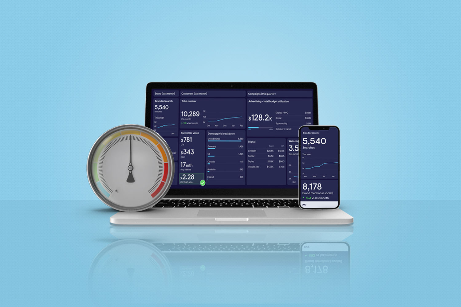
Non-profit organizations rely heavily on digital performance metrics to measure the success of their online campaigns and outreach efforts. However, many non-profit organizations struggle to keep up with the disruptive impact of the data revolution and the challenges posed by fragmented customer experiences.
To combat this, building efficient digital performance KPI Metric dashboards is increasingly important to better understand your audience’s behavior and preferences, including their interests, giving habits, and financial situation.
To fully leverage the benefits of digital performance dashboards, it’s essential to have a solid understanding of the principles behind them. This blog post will explore the key principles of building digital performance KPI metric dashboards for non-profits, providing actionable tips and insights along the way.
Key Metrics and Data Points

Source: who.int
Organizations can quickly understand their constituents and monitor trends with the correct use of dashboards. One of the key benefits of dashboards is their ability to facilitate faster learning and drive impact. An effective dashboard will provide clear insights into donor behavior and needs, allowing them to make data-driven decisions and improve their overall performance.
When building a dashboard, it’s important to choose relevant KPI metrics for your audience to avoid overwhelming them with too much data. Keep in mind that the purpose of the dashboard is to quickly convey insights and drive action. To provide more context, consider contextualizing your metrics with ancillary visualizations and include external data points.

Source: datapine.com
This will help your audience better understand the metrics and their impact on the overall campaign. Summarizing financials in a clean and clear view is important to ensure that everyone is on the same page when it comes to budget vs. actuals.
The ability to filter down to specific attributes is also important to drive insights. This will allow stakeholders to hone in on specific areas of the campaign and understand what’s working and what’s not. Don’t forget about operational dashes for quality control to ensure that your campaign is running smoothly. Lastly, keep in mind that different stakeholders have different needs, so it’s important to create different dashboards for different audiences.
Create Effective Dashboards

Source: Funraise
Create effective dashboards that truly serve their purpose. First, ask yourself who the dashboard is for and what its purpose is. This will help determine the appropriate combination of charts and numbers to use. Remember to avoid burying data with too many views, as this can quickly become overwhelming. Instead, limit data in one view and ensure that it relates to the insight needed.
It’s also important to experiment, iterate, and solicit feedback when creating dashboards. This ensures that they are constantly evolving to meet the needs of the audience. Collaboration is key when creating dashboards, so don’t overestimate its importance. By working together, you can create a dashboard that truly drives impact.
Identify Your Needs
In order to create effective dashboards, it’s important to identify your needs. This includes understanding your audience and identifying the most important metrics for your organization. It’s also crucial to address gaps in data that may be needed and align visualizations with the story you want to tell. When organizing your dashboard, it’s important to make it user-friendly and decide on the appropriate number of views.

Source: WHO Financial Statements
You should consider how you want to summarize financials and the importance of operational dashes for quality control. Different dashboards may be needed for different stakeholders, so it’s important to keep that in mind as well. Experimenting, iterating, and soliciting feedback can also help improve the effectiveness of your dashboard.
Final Thoughts
Dashboards play a critical role in helping organizations make data-driven decisions and drive impact. It’s important to understand the behavior of your audience and identify the most critical metrics to include in your dashboard. By limiting data in one view and ensuring it relates to the insight needed, you can avoid burying important information and create a user-friendly experience.
Experimentation, iteration, and collaboration are key components in creating an effective dashboard. Soliciting feedback from stakeholders and testing different visualizations can lead to better insights and more impactful decisions. Additionally, aligning visualizations with the story you want to tell and organizing the dashboard in a clear and concise manner can make it more impactful.
Dashboards are essential for organizations looking to make data-driven decisions and drive impact. By following these best practices and continually refining your approach, you can create effective dashboards that provide critical insights and drive success.
