Increasing user retention
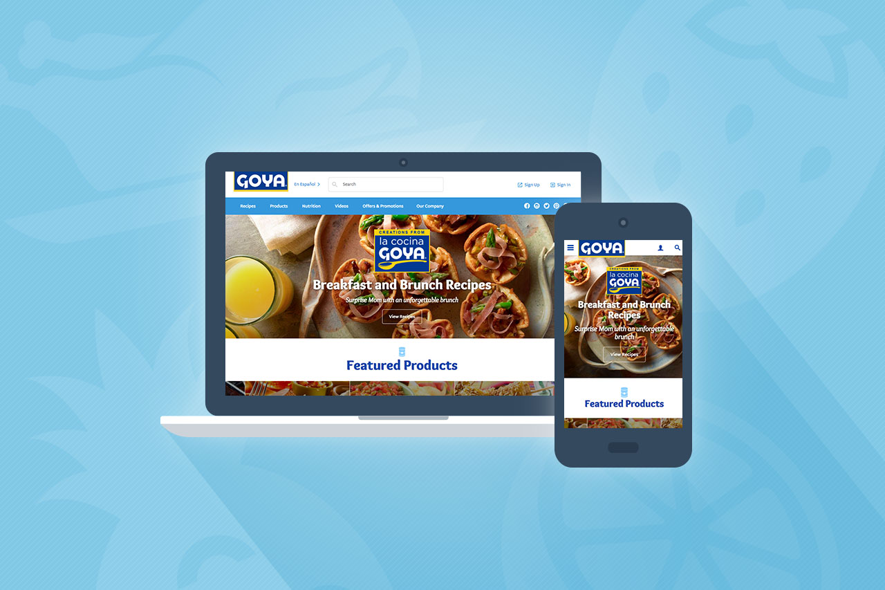
Lowering bounce rateEmploying a modern, responsive design With these goals in mind, we set out to create a plan to leverage the brand’s existing digital presence to achieve their goals with a cross-functional platform just as diverse as the brand itself.
The Umbraco CMS
At Flightpath, we’re Umbraco Gold partners, meaning we have a number of developers and designers in-house who are experts on the Umbraco content management system. We selected Umbraco over other CMSs in order to provide the client with the simplest editor experience.
The Goya site is a 1:1 multilingual site, so for every piece of English content on the site, there’s a Spanish translation. We were able to do this with the Vorto property editor, an Umbraco package that allows fields to store multilingual content. For SEO purposes, we decided to host this on a single domain with subdirectories for each language.
An optimized user experience
To improve UX and increase engagement, we incorporated faceted search with suggestions into the site, allowing users to explore information by applying filters. We implemented this by integrating Umbraco with Azure Search, a cloud search service.
With the site’s extensive content and design features, we wanted to ensure it would load quickly, so we put the entire site (rather than just the media) behind a content delivery network. Moving the site to a CDN also ensured a speedy site for a primarily North American audience despite Umbraco Cloud hosting from Europe.
Additionally, we used the ASP.NET Identity Umbraco package and OWIN middleware to enable Facebook and Google authentication for a simplified user experience. Users are now able to create an account to receive offers and save recipes with the click of a button.
Creating evangelists
One of Goya’s primary goals was to increase user retention. Many users were one-time visitors, so we wanted to create an experience that would turn one-time users into loyal customers. We added to the experience by syncing products with recipes to allow users to search by product.
For example, a user could search for salad recipes that incorporated chicken and rice. The easy-to-use search capabilities encouraged users to surf the site for recipe information according to ingredients they already had.
Encouraging engagement
Prior to the redesign, the website had a relatively high bounce rate. Users were visiting the site for a recipe, printing it out, then exiting the site. While Goya was happy to be a trusted recipe source, we knew there was an opportunity to engage site visitors to stay longer and explore the site’s other offerings.
Our product/recipe syncing encouraged users to explore other recipes with similar ingredients. The website’s featured recipes section showcases the recipe’s main ingredient to provide further product information and cross reference other recipes.
We also added a ratings and reviews section that’s encouraged users to engage with the recipe and product content. Social media integrations allow users to share Goya recipes and blog posts with friends and family.
The end result
The new site offers parallax scrolling and bright, colorful imagery sure to make any site visitor hungry. Migrating Goya’s site to the Umbraco CMS greatly reduces the time it takes the client to update content, and we’ve already seen a steep decline in bounce rate after making these adjustments to the site.
The end result is a dynamic, multi-faceted initiative that tells the Goya story in a fashion that’s rich, fun, informative, and engaging.]]>

