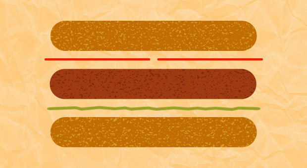
Over the past several weeks, the hamburger menu has received some seriously bad internet PR for being a poor navigation tool that destroys engagement. One article even referred to the three-lined menu item as “the devil”.
Whether you love or loathe the hamburger icon, it is hard to deny that is has become somewhat of a design standard over the past 5 years, thanks to growing mobile apps and users. Also, now that responsive design is the norm, the hamburger icon is even more prevalent across all screens.
In a recent article, one UX designer raised a very valid question: “Why kill a ubiquitous icon, which our users know and understand, and replace it with a new iteration for them to learn all over again?”
We would have to agree with this logic. We have bigger design problems than the hamburger menu for which we could be finding solutions. Why not simply improve on this design foundation that we worked so hard to build?
In hopes of saving the hamburger menu, we’d like to offer 5 ways to enhance it:
- Streamline your IA no matter what. Menu bar items should serve a necessary purpose and be prioritized based on the users needs. Hamburger menus should not be a dumping ground for worthless content.
- Add a ‘menu’ label to the icon if you are worried about users not identifying the navigation action. It’s all about knowing your audience; most mobile users recognize that this icon signifies action so it may not be necessary.
- Leave user utility items such as ‘sign-in’ or ‘donate’ on the main screen in addition to having them in the sidebar menu. Without overloaded navigation tabs, this can actually emphasize these important conversion points.
- On desktop, increase efficiency and changes in navigation patterns by allowing the menu to remain static once it has been opened. At least for large desktop screens, the existing content should be able to scale accordingly without overwhelming the user with too much information.
- Have some fun with it. A major reason the design community is so up in arms about the hamburger icon may in part be due to our own laziness and reliance on it. If nothing else, standardizing the icon should give us more opportunities to present this menu in surprising, exploratory ways.
That being said, there are times when designers should not utilize the hamburger menu: e-commerce and transactional sites (for the most part) and sites with very few navigation tabs. In these cases, there are plenty of alternative navigation menu options designers can use instead of the hamburger menu.
As designers, we need to make smart, strategic decisions when determining a design format. It doesn’t make sense to completely write off a design element that serves an important purpose, like the hamburger icon, but it’s important we don’t throw all caution to the wind and abuse it. There are rules and there are no rules; just guidelines.
